252 Purple Color Shades & Swatches with HEX Codes and Names
Purple isn’t just another color in design — it’s a statement. From soft lavender that whispers calm to deep royal violet that radiates prestige, purple has always carried a sense of mystery, creativity, and sophistication. That’s why you’ll see it everywhere: luxury packaging, beauty brands, meditation apps, and even bold tech startups.
But here’s the challenge:
Designers lose hours hunting for the “right purple” — something that feels luxurious, but not gloomy.
Developers struggle with mismatched HEX codes that look different across screens.
Brands risk inconsistency — one shade of violet on the website, another on print.
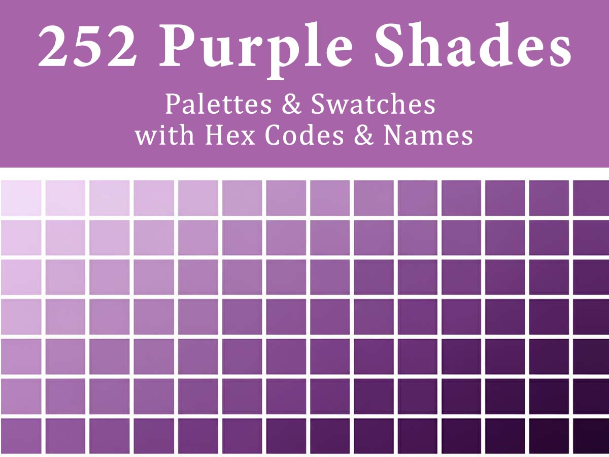
That’s exactly why we created this curated bundle of 252 purple color palettes with HEX codes and names — organized into styles so you can move faster, design smarter, and keep your brand identity rock-solid.
Why Purple Represents Creativity and Luxury
Purple has long been associated with imagination, exclusivity, and high-end appeal:
Creativity & Imagination – Purple encourages originality, often used in artistic, tech, and innovative brands.
Luxury & Prestige – Deep purples convey richness and sophistication without relying on gold or black.
Spiritual & Mystical Feel – Lighter purples and lavenders evoke calm, introspection, and elegance.
Distinctiveness – Purple is less common in branding, helping designs stand out while still feeling refined.
With purple, design feels expressive, premium, and intellectually rich.
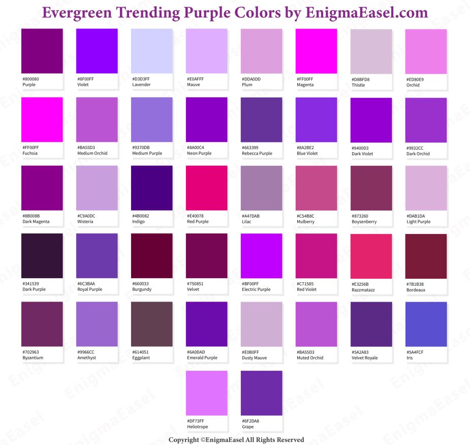
Evergreen Trending Purple Colors
Purple’s timeless appeal comes from its association with creativity and sophistication. These evergreen purple shades remain popular for designs that aim to feel distinctive, artistic, and subtly luxurious.
Full color data (HEX, RGB, CMYK, HSB) available in the Color Swatches Library.
Sneak Peek: A Teaser of Our Shades of Purple with HEX Codes & Names
Think of this as a peek inside a color treasure chest — a taste of lavender calm, plum richness, and neon violet energy.
This is just the preview. The full collection holds 252 named, HEX-coded shades across 7 ready-to-use formats — no guesswork, just pro palettes for any project, from luxury branding to bold UI design.
1 – Velvet Royale – Deep and Elegant Tones
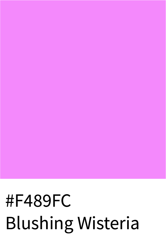
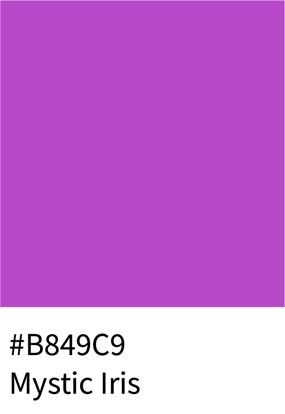
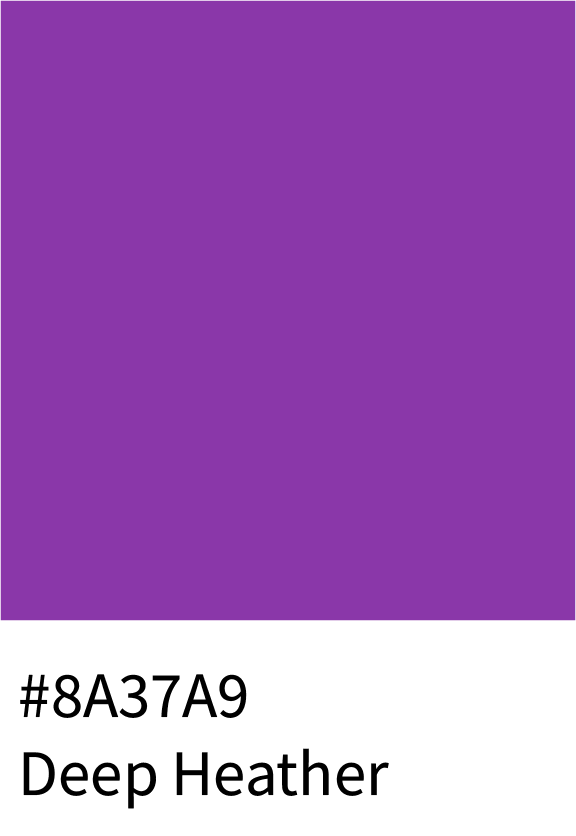
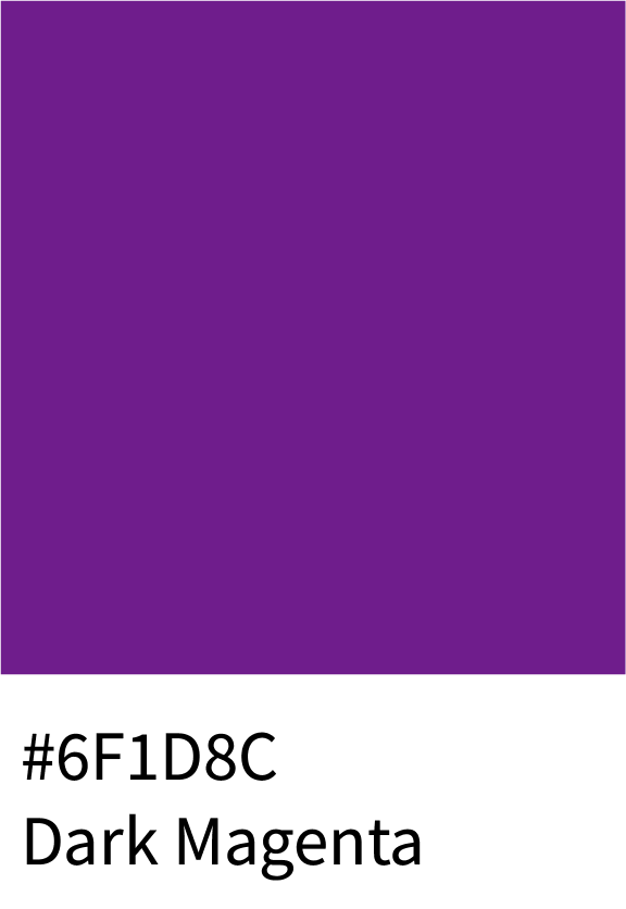
This luxurious palette captures regal depth — starting with Blushing Wisteria (#F489FC) and flowing into Mystic Iris (#B849C9), Deep Heather (#8A37A9), and finally Dark Magenta (#6F1D8C). These rich purples convey power, elegance, and timeless sophistication.
Best for:
Luxury brands, high-end fashion, jewelry packaging, or royal-themed visuals.
2 – Plum & Deep Violet Color Hex Codes
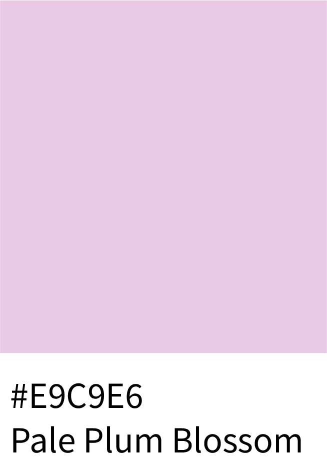
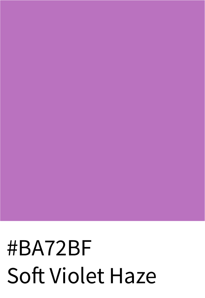
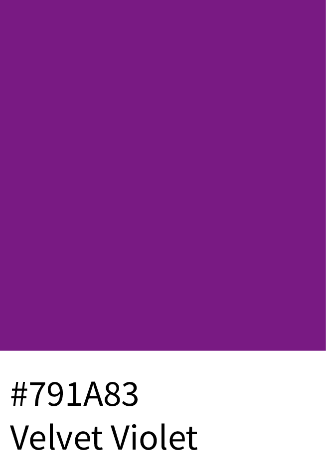
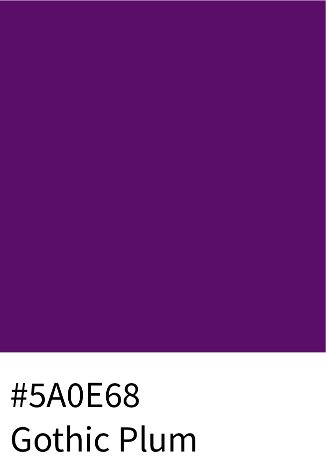
The Plum & Deep Violet palette blends mystery with charm — from Pale Plum Blossom (#E9C9E6) and Soft Violet Haze (#BA72BF) to Velvet Violet (#791A83) and Gothic Plum (#5A0E68). These moody violets add creative depth and emotional warmth.
Best for:
Boutique branding, artistic photography, and editorial visuals.
3 – Lilac & Soft Orchid Shades
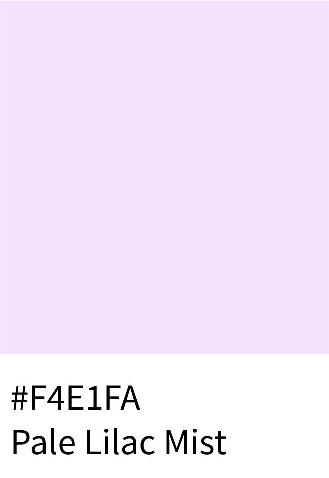
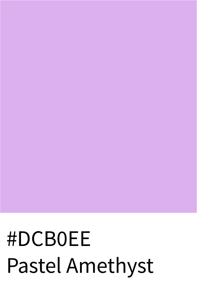
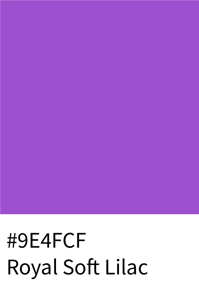
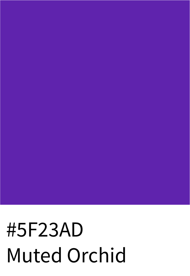
Soft and feminine, this range moves gracefully from Pale Lilac Mist (#F4E1FA) to Pastel Amethyst (#DCB0EE), Royal Soft Lilac (#9E4FCF), and Muted Orchid (#5F23AD). A perfect balance of sophistication and tenderness in design.
Best for:
Beauty, wellness, and romantic lifestyle brands.
(Total: 26 colors)
4 – Lilac and Lavender Shades
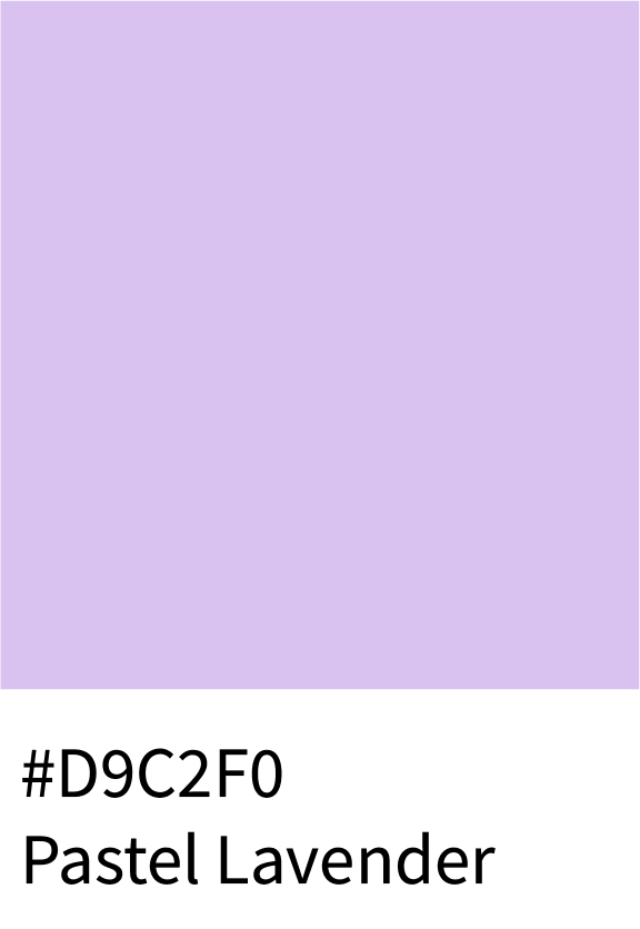
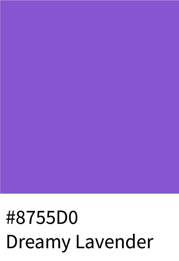
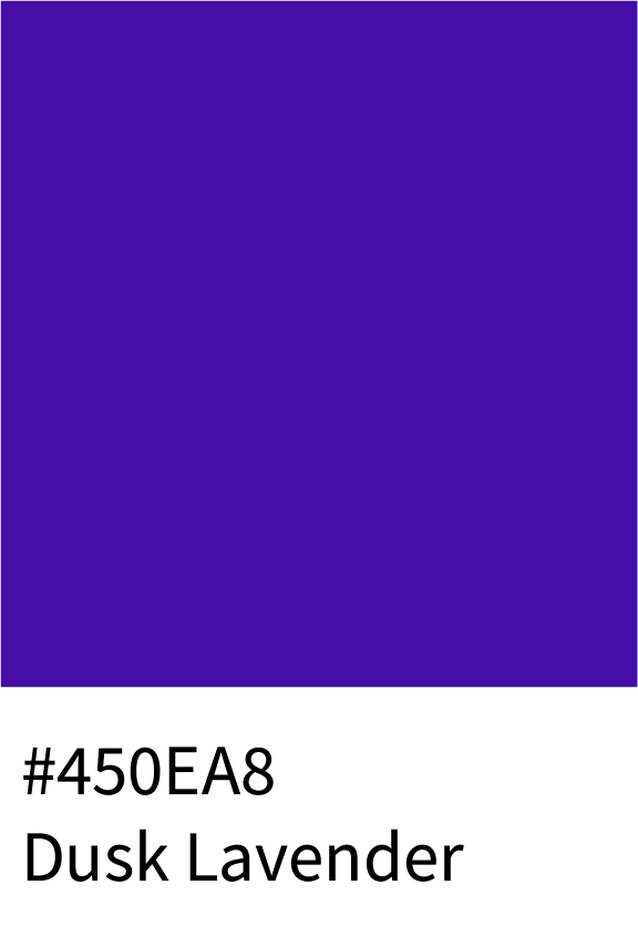
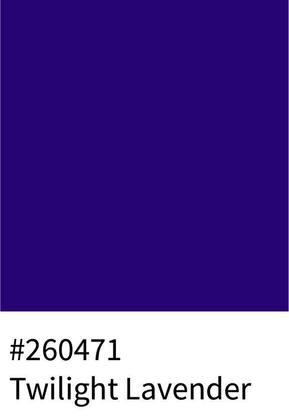
The Lavender family soothes with balance — Pastel Lavender (#D9C2F0), Dreamy Lavender (#8755D0), Dusk Lavender (#450EA8), and Twilight Lavender (#260471) transition from airy to dramatic. Each evokes calm creativity and subtle luxury.
Best for:
Spa, skincare, and minimalist web design.
(Total: 26 colors)
5 – Magenta-Violet Shades
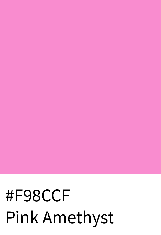
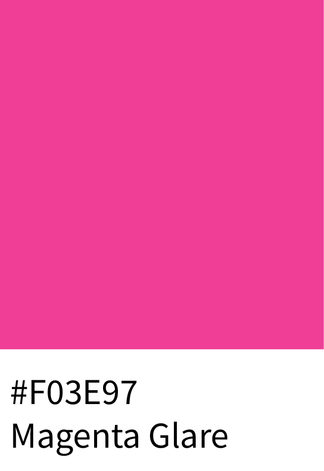
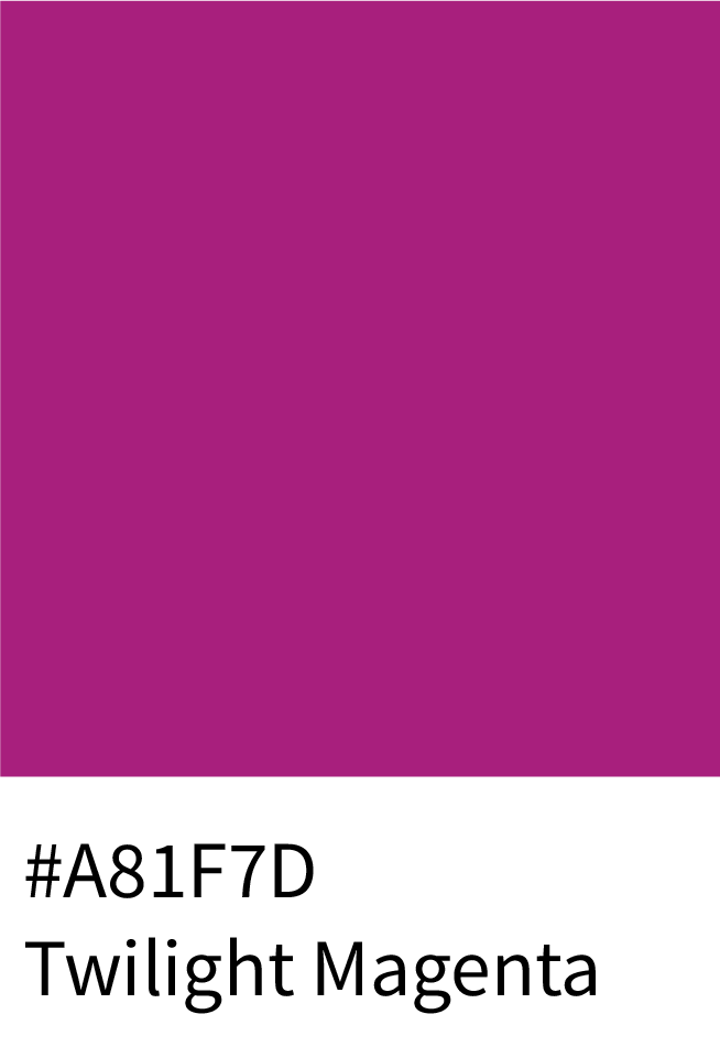
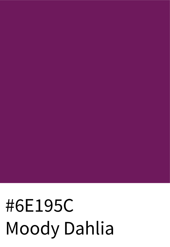
Electric and modern, this palette radiates energy — starting with Pink Amethyst (#F98CCF), pulsing through Magenta Glare (#F03E97), Twilight Magenta (#A81F7D), and finishing with Moody Dahlia (#6E195C). These vivid tones are confident and expressive.
Best for:
Youth brands, event promotions, and digital art.
(Total: 32 colors)
6 – Dusty Mauve & Muted Purple Shades
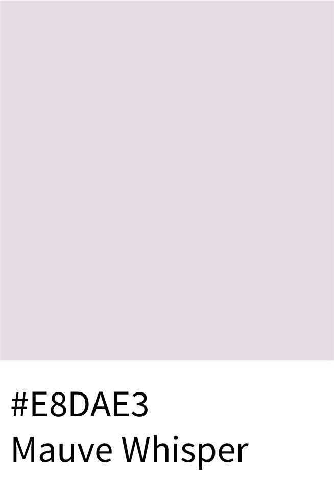
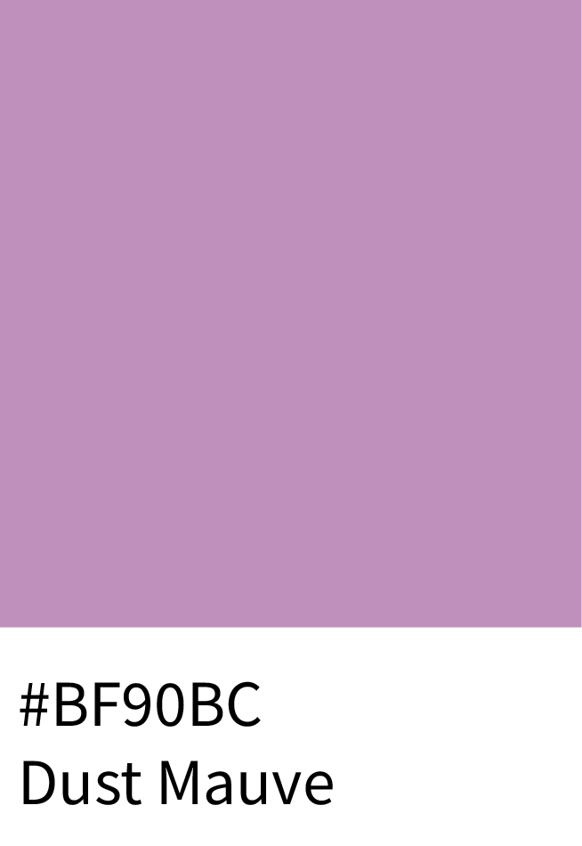
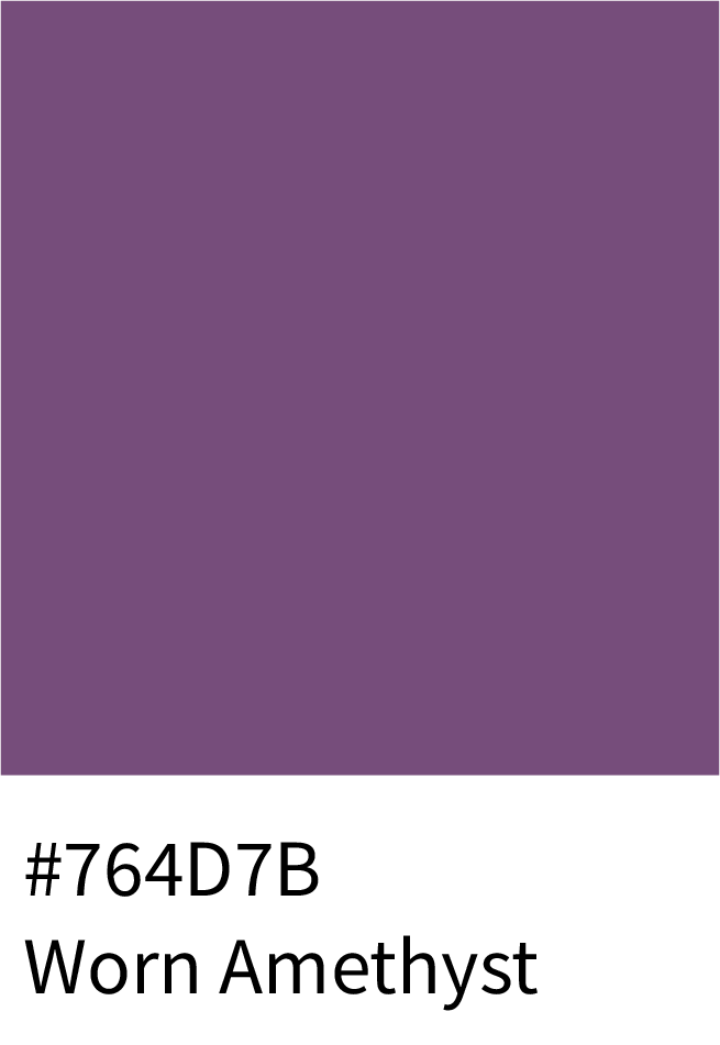
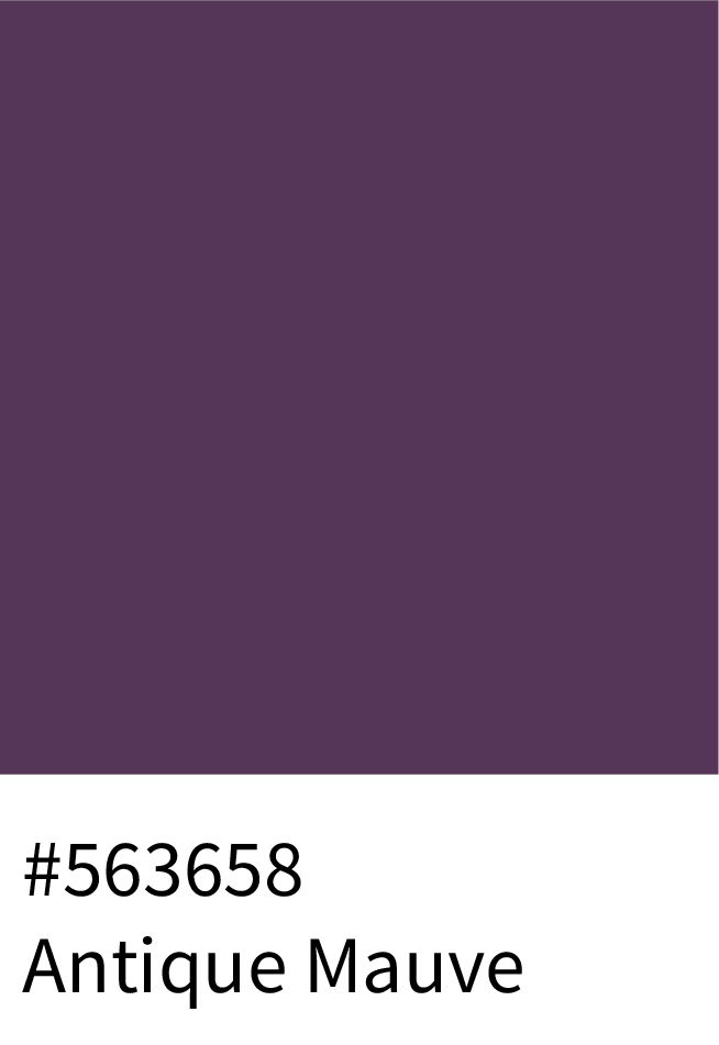
This elegant palette tones down vibrancy for vintage charm — from Mauve Whisper (#E8DAE3) to Dust Mauve (#BF90BC), Worn Amethyst (#764D7B), and Antique Mauve (#563658). Ideal for nostalgic yet modern designs.
Best for:
Editorial, retro packaging, and cozy home décor brands.
(Total: 32 colors)
7 – Purple-Blues Shades
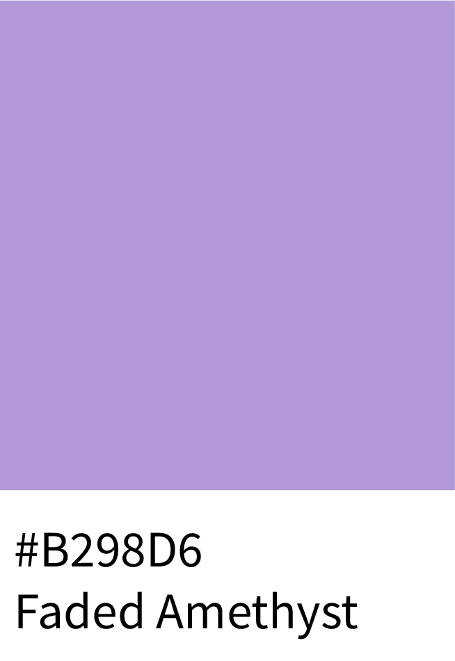
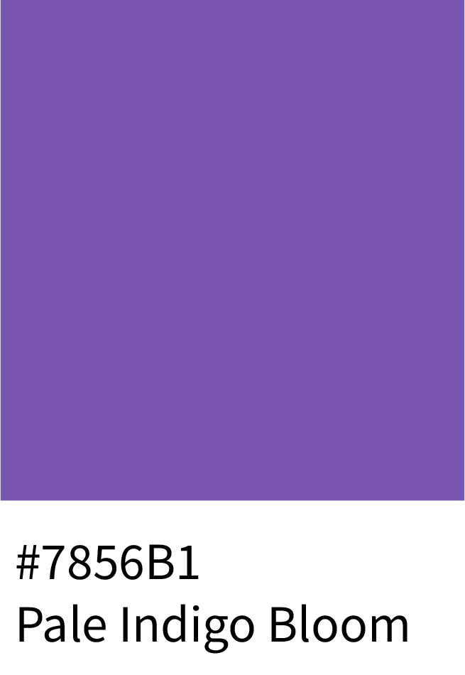
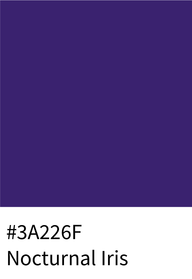
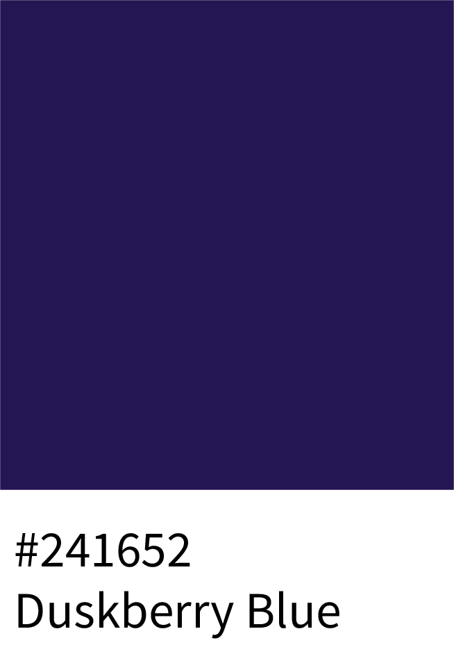
Balancing between purple and blue, this palette features Faded Amethyst (#B298D6), Pale Indigo Bloom (#7856B1), Nocturnal Iris (#3A226F), and Duskberry Blue (#241652) — hues that feel introspective, mysterious, and futuristic.
Best for:
Tech startups, gaming, and cosmic-inspired branding.
(Total: 32 colors)
8 – Neon Bright Purple & Violet Shades
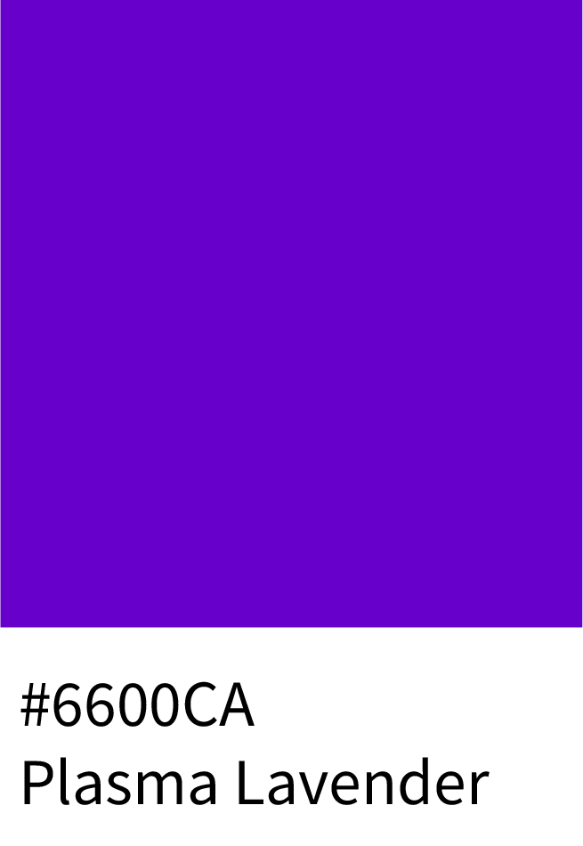
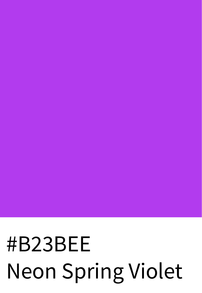
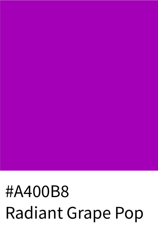
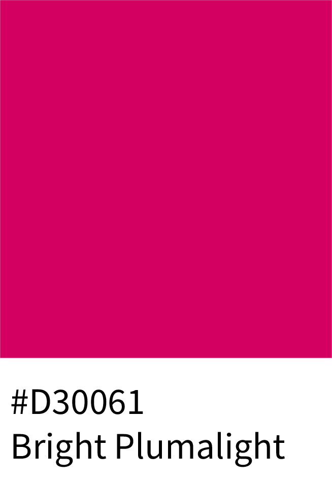
Vibrant and digital-ready, these electrifying tones — Plasma Lavender (#6600CA), Neon Spring Violet (#B23BEE), Radiant Grape Pop (#A400B8), and Bright Plumalight (#D30061) — bring bold visibility and trend-forward attitude.
Best for:
Music, nightlife, digital campaigns, and futuristic branding.
(Total: 32 colors)
9 – Pastel Purple & Violet Shades
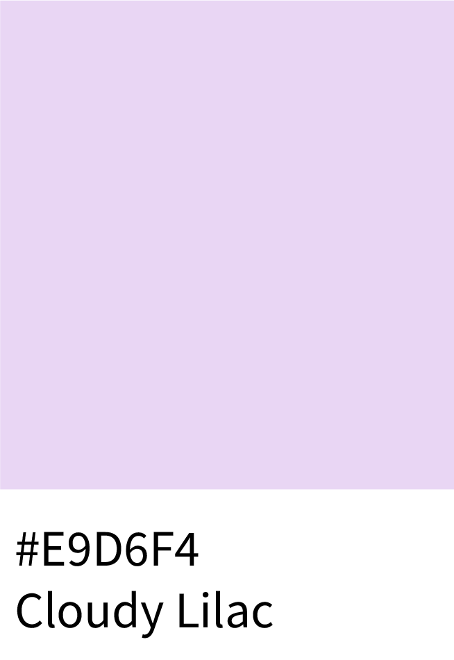
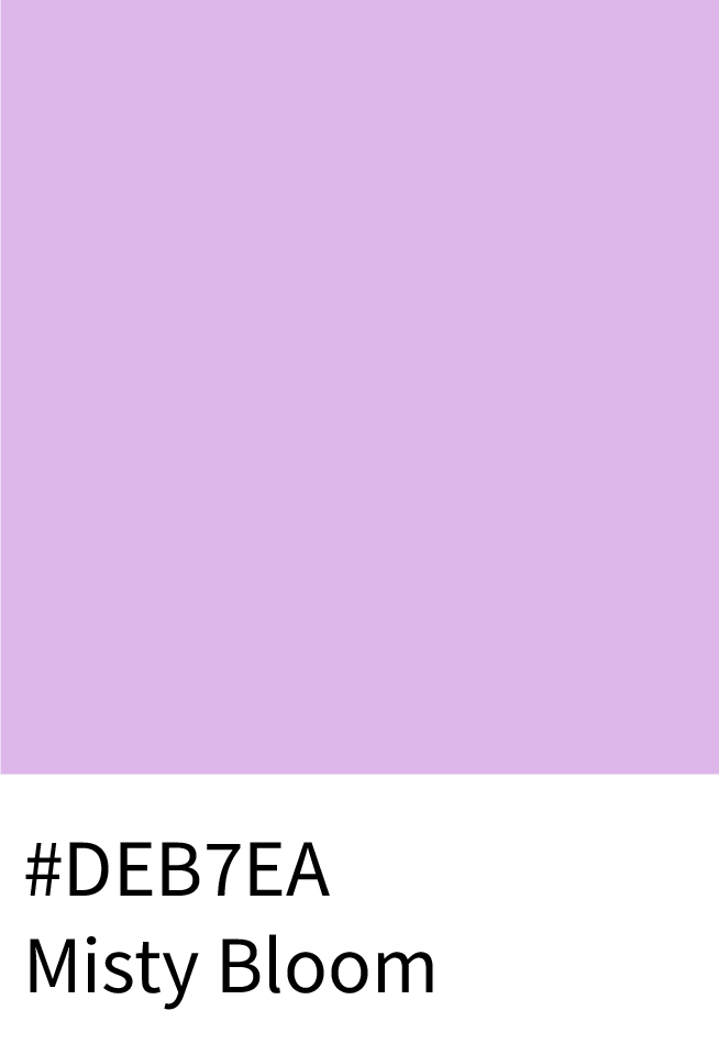
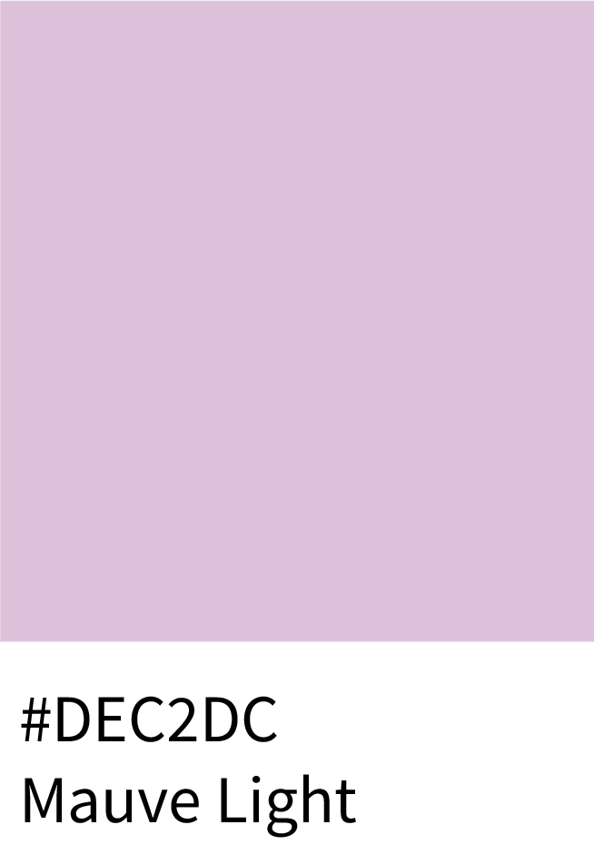
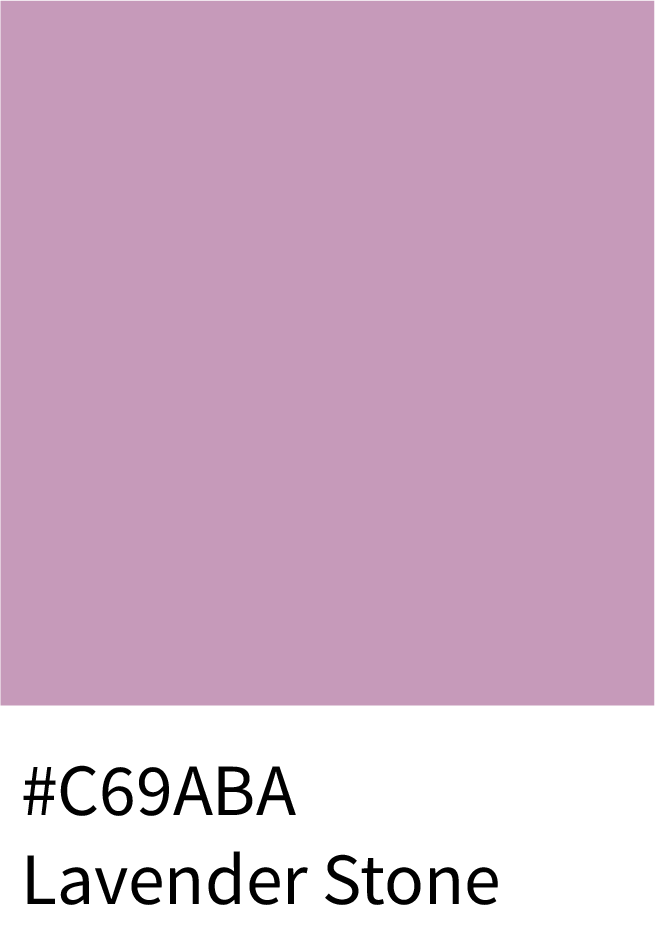
Gentle and airy, this palette glows softly from Cloudy Lilac (#E9D6F4) to Misty Bloom (#DEB7EA), Mauve Light (#DEC2DC), and Lavender Stone (#C69ABA). These muted tones enhance calm, feminine, and editorial spaces.
Best for:
Lifestyle blogs, wedding brands, and modern minimalist design.
(Total: 32 colors)
Psychology of Purple Color Shades
Purple stands at the intersection of creativity and sophistication:
Purple feels expressive and imaginative, often associated with originality and unconventional thinking.
It carries a subtle sense of luxury and exclusivity, even without metallic or dark accents.
Lighter purples feel artistic and calm, while deeper tones feel confident and refined.
Because purple is used less frequently than other colors, it helps designs stand out without shouting.
Purple is ideal when a brand wants to feel distinctive, thoughtful, and premium.
How to Use Purple Palettes in Branding & Web Design
Purple is the color of creativity, luxury, and imagination — often associated with royalty, spirituality, and artistic expression. From soft lilacs to bold violets, purple shades can instantly elevate a brand’s identity. Here’s how you can use the most popular and trending purple tones in design:
1. For Luxury & Premium Branding
Deep, regal tones evoke elegance and sophistication — ideal for high-end fashion, beauty, and luxury products.
Use:
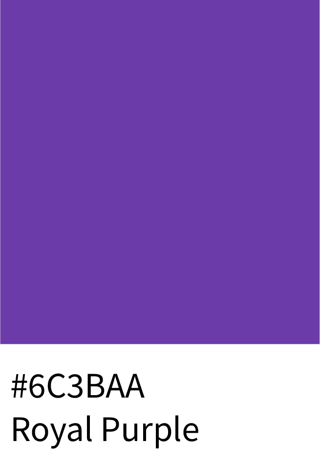
Royal Purple (#6C3BAA) – Rich and sophisticated; perfect for premium visuals.
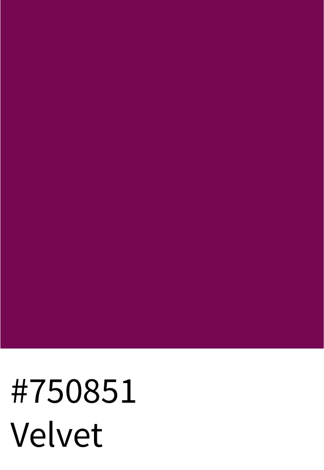
Velvet (#750851) – Deep and dramatic, ideal for packaging and luxury themes.
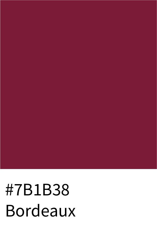
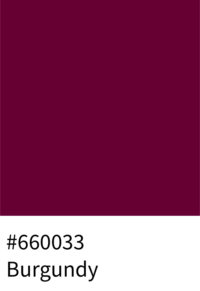
Bordeaux (#7B1B38) and Burgundy (#660033) – Add intensity and depth to luxury branding.
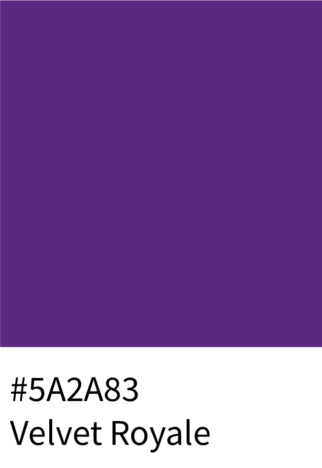
Velvet Royale (#5A2A83) – Elegant and timeless with a mysterious undertone.
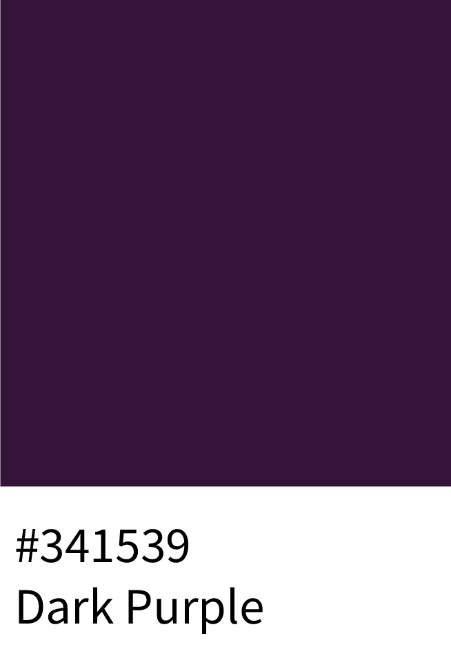
Dark Purple (#341539) – Excellent for luxury background gradients.
2. For Feminine, Lifestyle & Wellness Brands
Soft and balanced purples create a feeling of calm, harmony, and femininity.
Use:
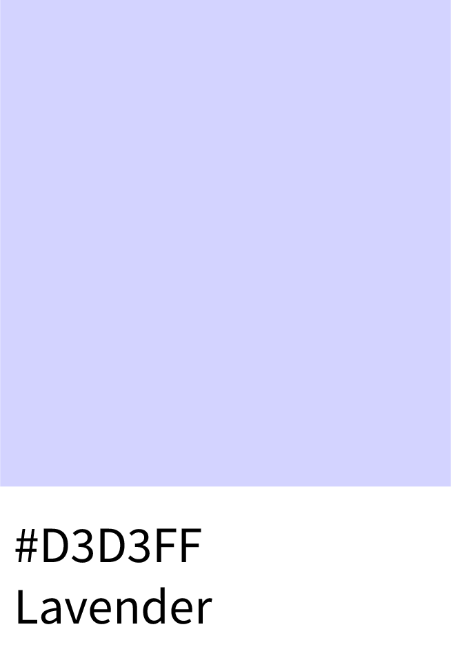
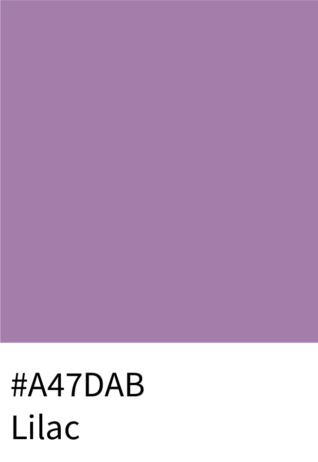
Lavender (#D3D3FF) and Lilac (#A47DAB) – Ideal for wellness brands, skincare, or meditation sites.
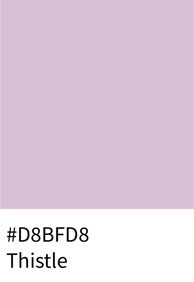
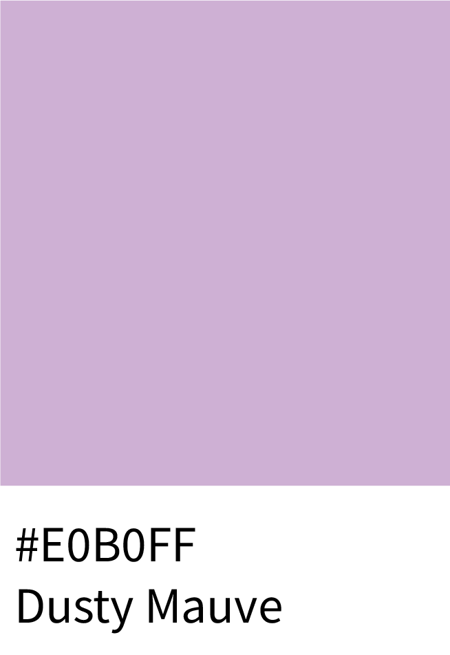
Thistle (#D8BFD8) and Dusty Mauve (#E0B0FF) – Add subtlety and softness for blog aesthetics.
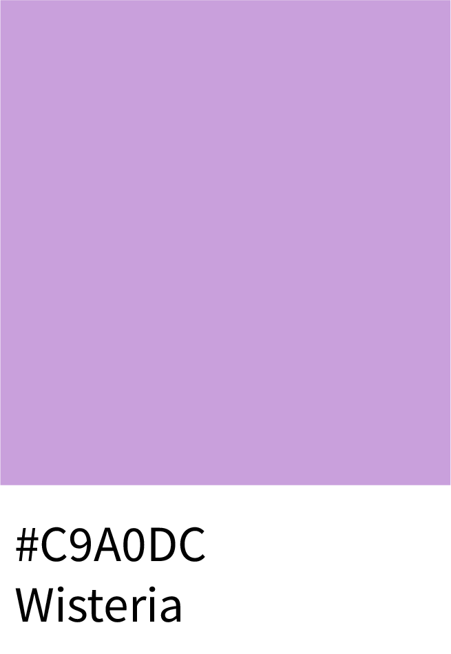
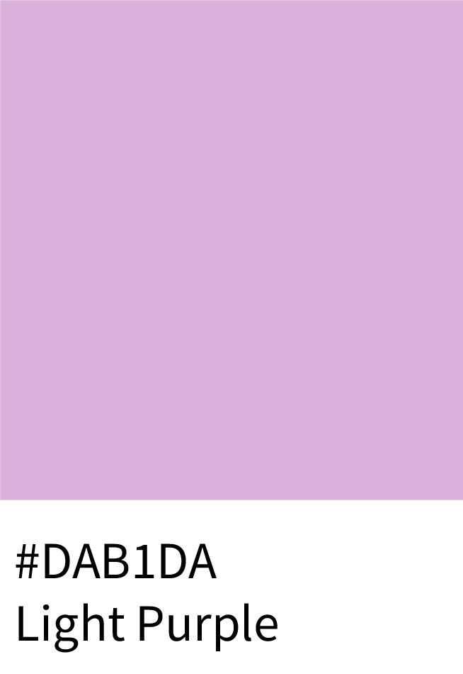
Wisteria (#C9A0DC) and Light Purple (#DAB1DA) – Convey romance and elegance.
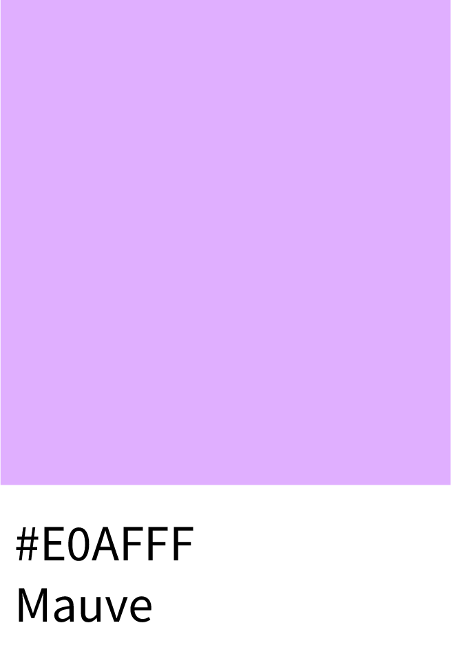
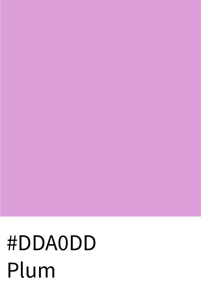
Mauve (#E0AFFF) and Plum (#DDA0DD) – Perfect for beauty and home décor branding.
3. For Modern, Bold & Tech-Focused Brands
Vibrant, neon purples express innovation and futuristic appeal — great for digital and creative agencies.
Use:
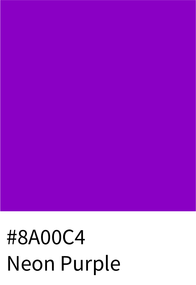
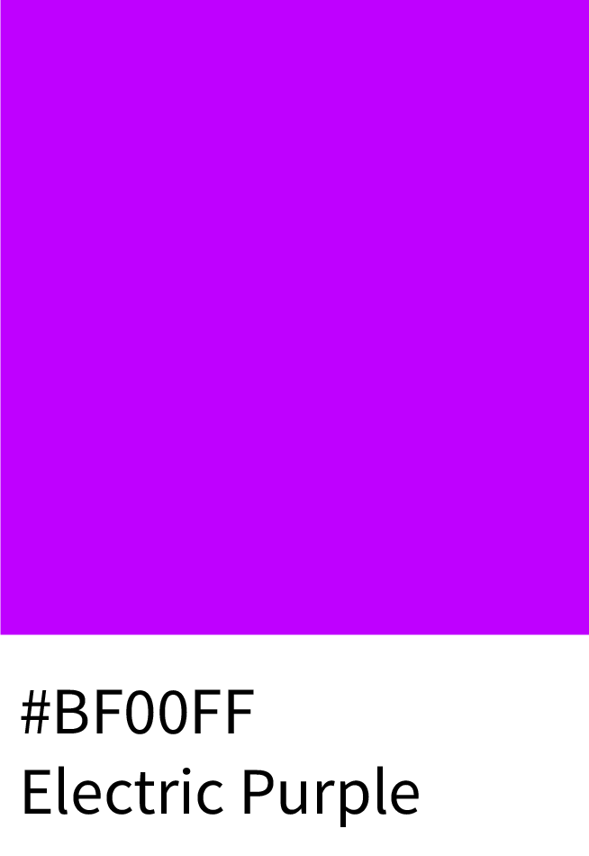
Neon Purple (#8A00C4) and Electric Purple (#BF00FF) – Strong, eye-catching hues for modern logos.
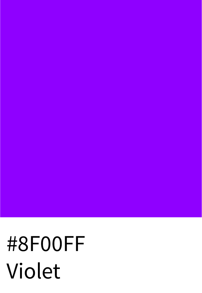
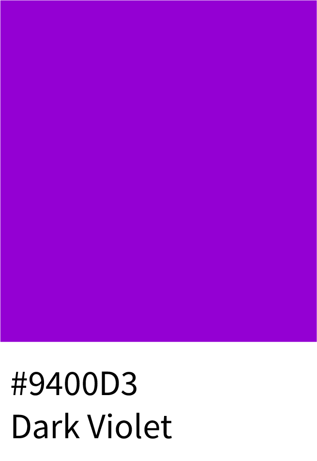
Violet (#8F00FF) and Dark Violet (#9400D3) – Bold and dynamic, suitable for high-contrast UI.
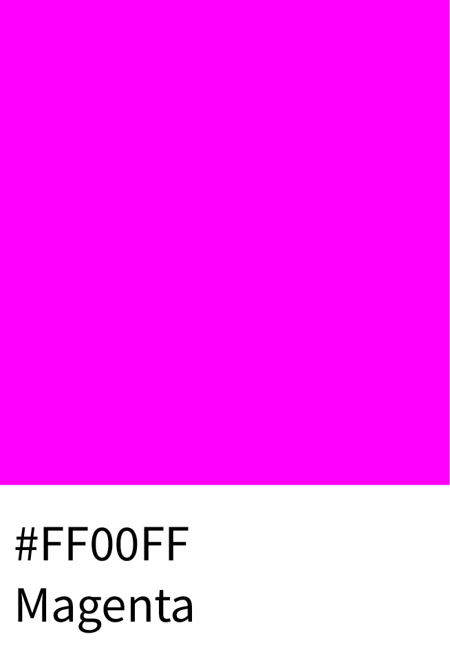
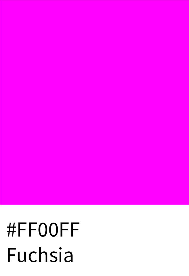
Magenta (#FF00FF) and Fuchsia (#FF00FF) – Energetic, playful, and versatile for digital campaigns.
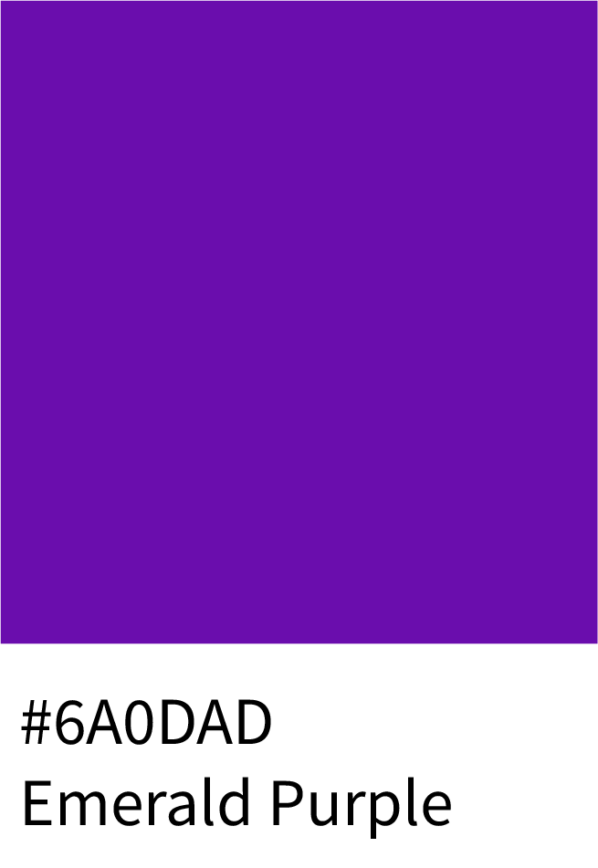
Emerald Purple (#6A0DAD) – Distinct and modern, fits perfectly into tech design themes.
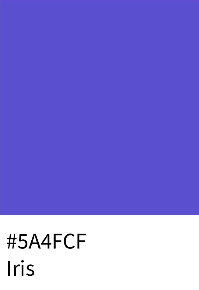
Iris (#5A4FCF) – A trending 2025 shade blending royal tones with tech sophistication.
4. For Artistic, Creative & Entertainment Brands
Purple’s creative side shines when paired with rich, unconventional shades.
Use:
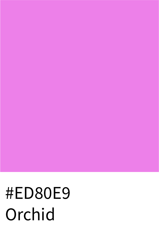
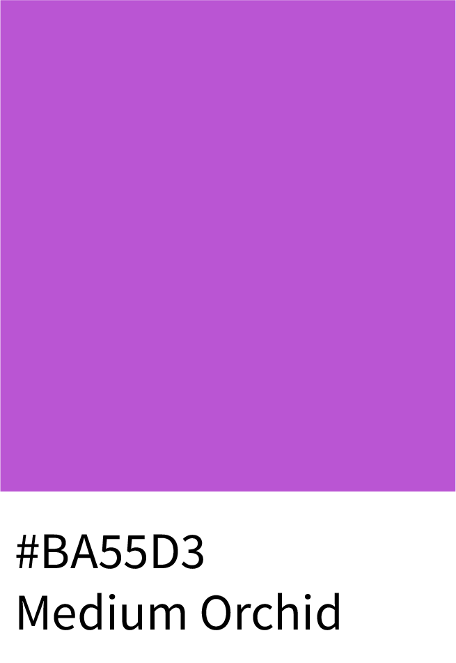
Orchid (#ED80E9) and Medium Orchid (#BA55D3) – Ideal for creative studios or event branding.
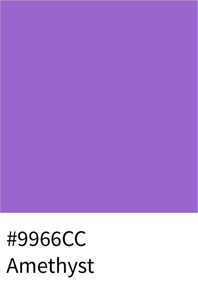
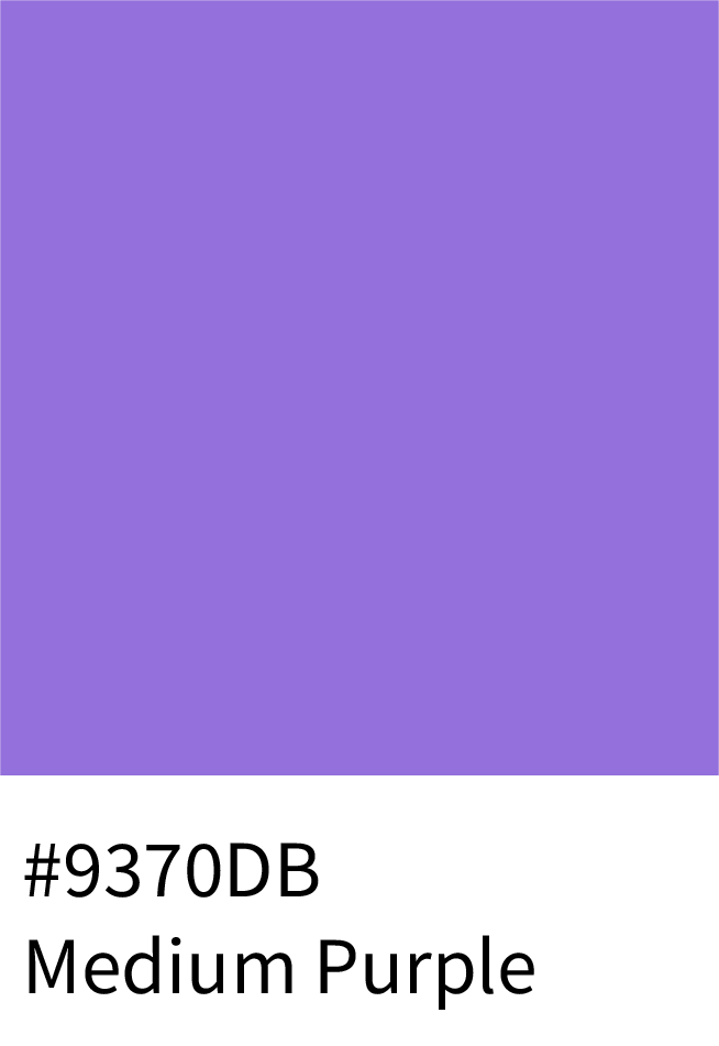
Amethyst (#9966CC) and Medium Purple (#9370DB) – Perfect for artistic and interior visuals.
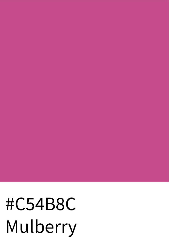
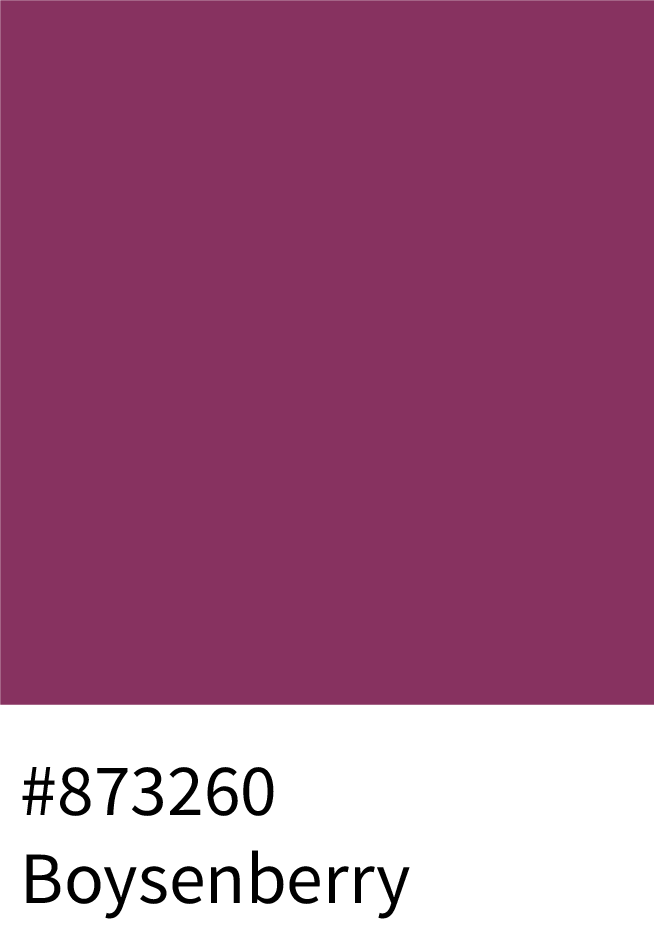
Mulberry (#C54B8C) and Boysenberry (#873260) – Add warmth and richness for digital illustrations.
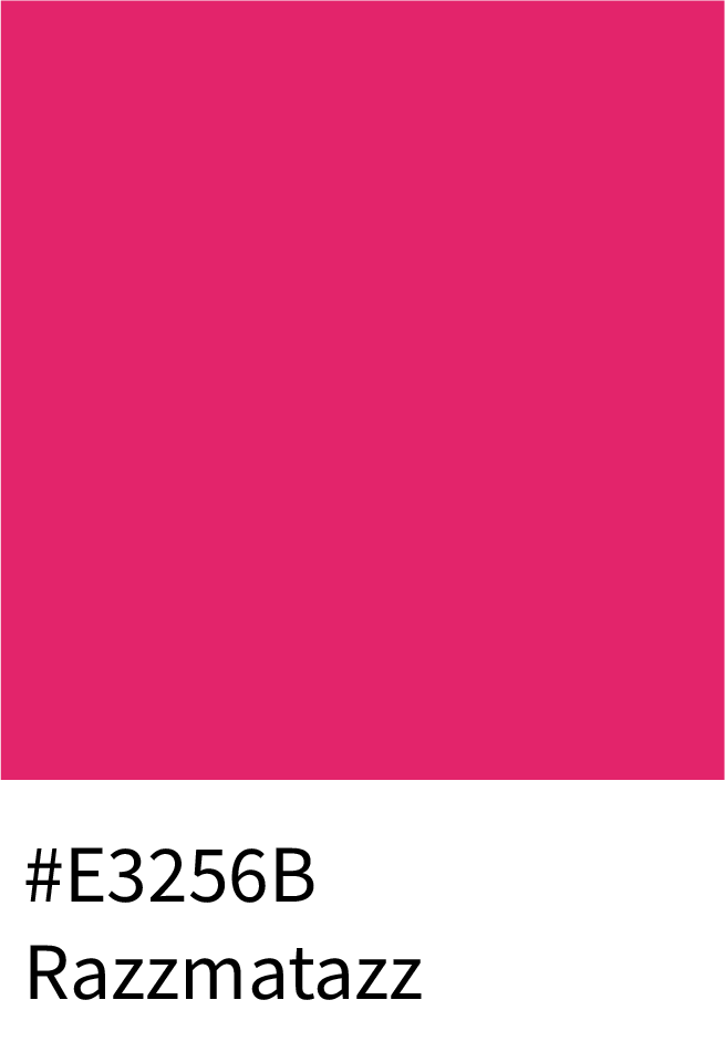
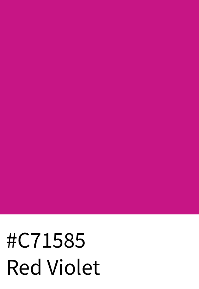
Razzmatazz (#E3256B) and Red Violet (#C71585) – High-energy tones great for performance or pop culture projects.
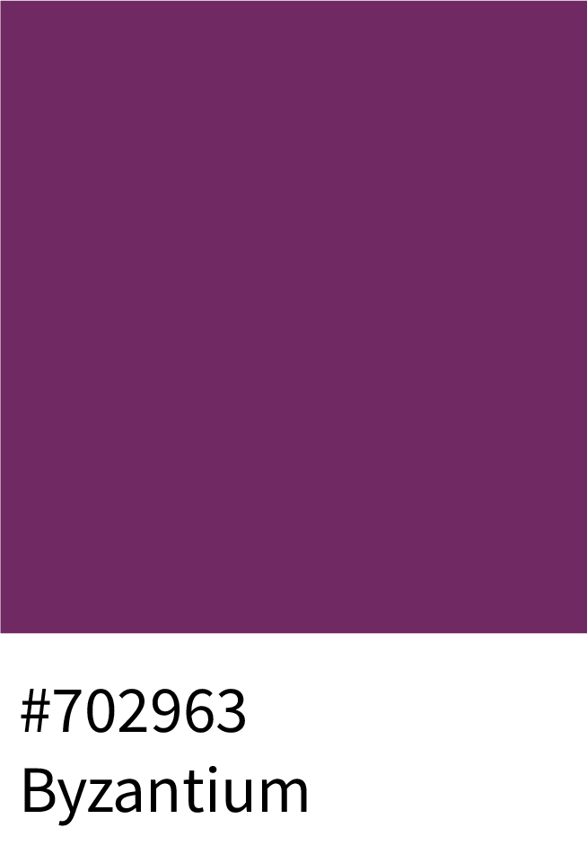
Byzantium (#702963) – Deeply artistic, ideal for bold visual storytelling.
5. For Spiritual, Cultural & Inspirational Designs
Purples that symbolize mystery and mindfulness — perfect for meditation, art, or cultural projects.
Use:
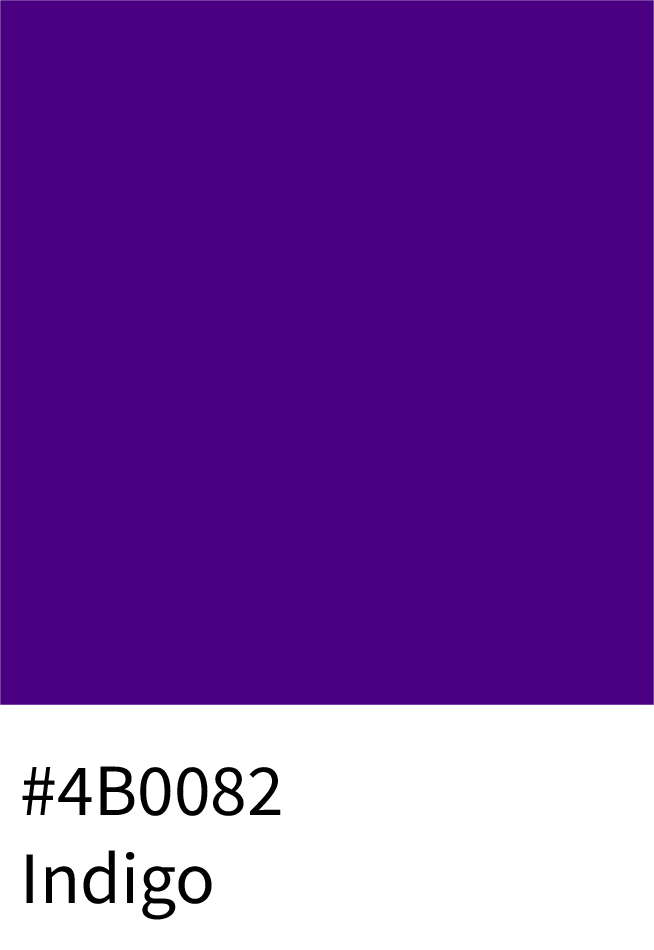
Indigo (#4B0082) – Represents spirituality and intuition.
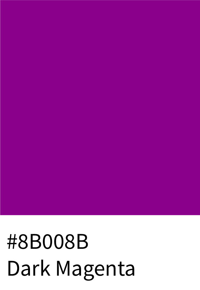
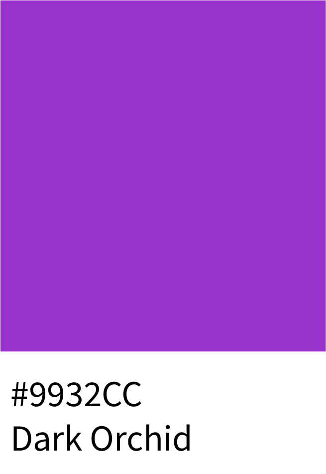
Dark Magenta (#8B008B) and Dark Orchid (#9932CC) – Excellent for deep emotional visuals.
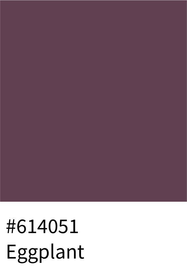
Eggplant (#614051) – Adds grounding warmth to spiritual designs.
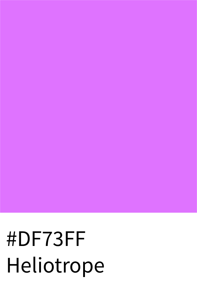
Heliotrope (#DF73FF) – Modern yet mystical; trending in 2025 for meditation visuals.
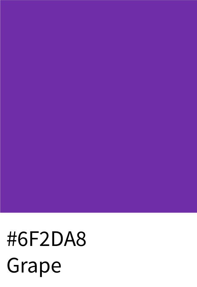
Grape (#6F2DA8) – Classic and introspective, perfect for balanced, calming palettes.
6. Other Trending Purple Palette Swatches
Dusty Mauve (#E0B0FF) – Loved in lifestyle and editorial aesthetics.
Emerald Purple (#6A0DAD) – A rich, unexpected hue trending in fashion and UI.
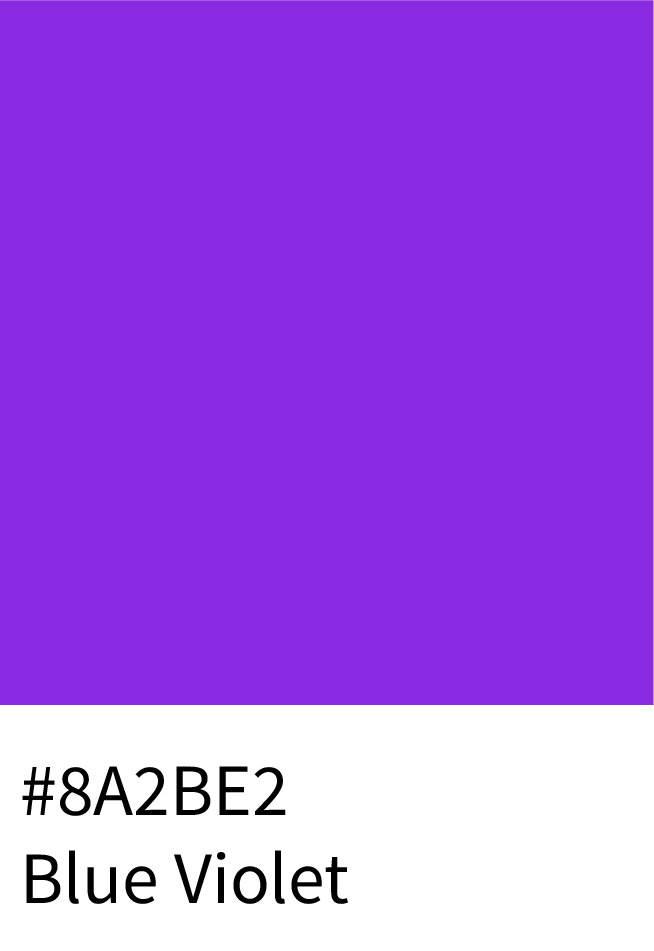
Blue Violet (#8A2BE2) – Frequently featured in minimalist UI palettes.
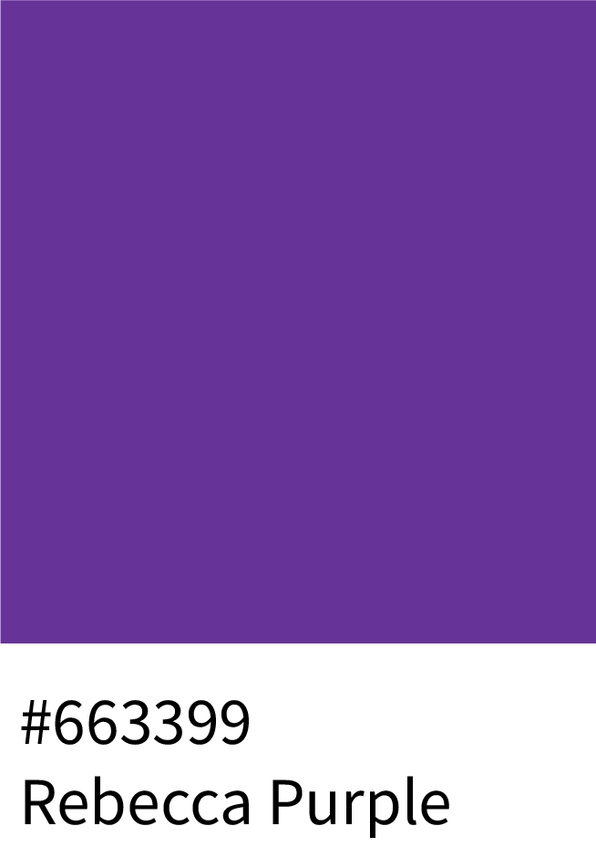
Rebecca Purple (#663399) – A deep, refined hue symbolizing creativity and sophistication.
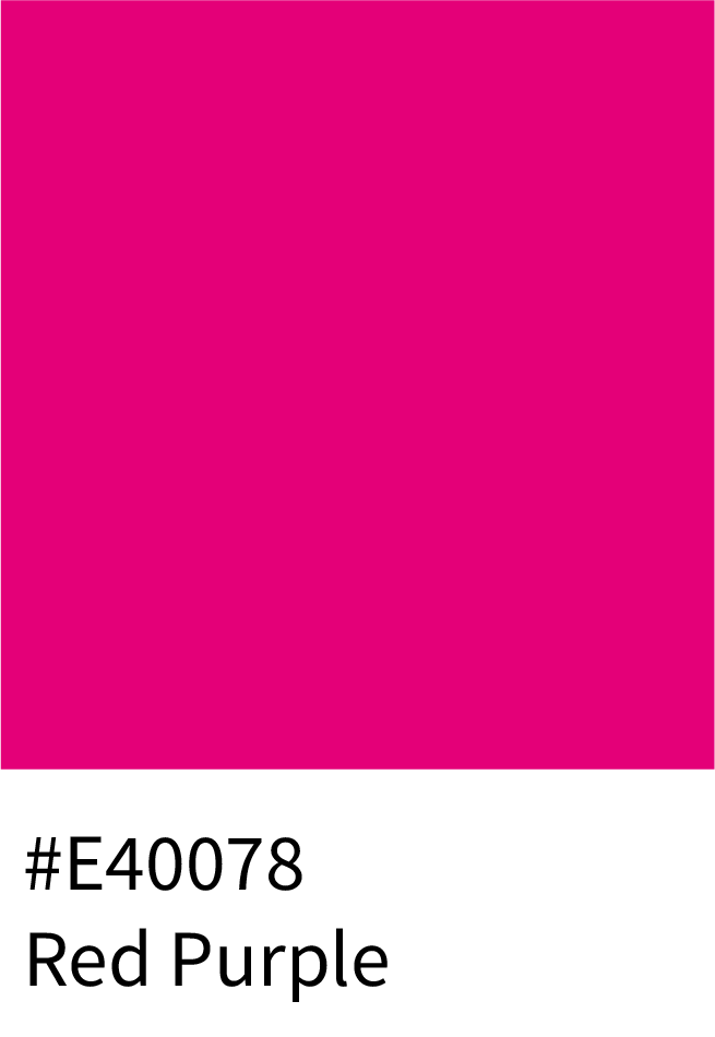
Red Purple (#E40078) – Bold and expressive, perfect for energetic digital campaigns.


Frequently Asked Questions (FAQs)
Q1: What are the most popular purple shades in design?
Some of the most popular purple shades include Lavender (#E6E6FA), Plum (#673147), Violet (#8F00FF), Mauve (#E0B0FF), and Royal Purple (#6B3FA0). Each brings a unique mood — from calm and romantic to luxurious and creative.
Q2: How can I use purple in branding and design?
Use light purples for lifestyle, beauty, and wellness brands; deeper tones like royal or plum for premium or luxury branding; and bright neon purples for modern or tech-focused designs.
Q3: Which colors go best with purple?
Purple pairs beautifully with gold, white, gray, teal, and pink. These combinations balance purple’s richness while keeping the design harmonious.
Q4: What are the HEX, RGB, and CMYK codes for popular purple shades?
Each shade has unique values — for example,
Lavender: HEX #E6E6FA | RGB (230,230,250) | CMYK (8,8,0,2)
Violet: HEX #8F00FF | RGB (143,0,255) | CMYK (44,100,0,0)
Mauve: HEX #E0B0FF | RGB (224,176,255) | CMYK (12,31,0,0)
Wrapping It Up – The Power of Purple in Design
Purple isn’t just a color — it’s a brand storyteller. With this set of 252 HEX-coded palettes, you’ll:
Save hours searching for consistent shades.
Keep branding aligned across web, print, and digital.
Unlock inspiration for luxury, tech, wellness, and creative industries.
This is your ultimate purple resource, built to inspire bold ideas and timeless designs.
