How Lighting Affects Interior Color Palettes (Natural vs Artificial Light)
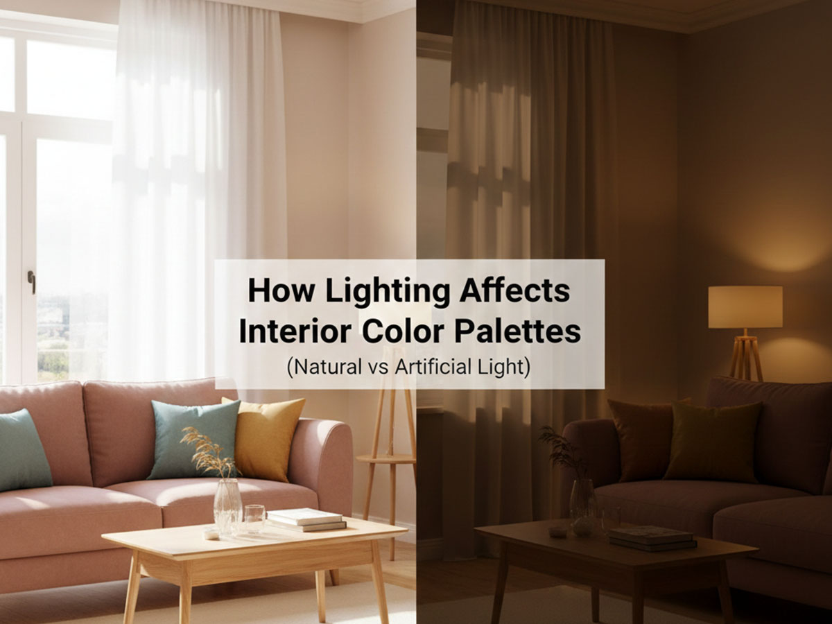
Lighting is the single most underestimated factor in interior color design. The same color palette can feel calm, dull, warm, or overwhelming depending entirely on how light interacts with it. This is why colors chosen from swatches or screens often look different once applied to walls.
In the previous guide, Interior vs Exterior Color Palettes: Key Differences & Design Rules, we established that interiors operate under controlled lighting conditions. This article builds on that foundation by explaining how natural and artificial light change interior color palettes, and how to choose palettes that stay balanced throughout the day.
Why Lighting Comes Before Color Selection
Many people choose colors first and think about lighting later. In professional interior design, the order is reversed.
Light affects:
Brightness and depth of colors
Warmth or coolness perception
Contrast between palette elements
Visual comfort over long periods
A well-designed palette is not just visually pleasing—it is light-aware.
You can also experiment with combinations yourself using the Color Palette Generator and Builder, which lets you create thematic and harmonious palettes before applying them to interior or exterior spaces.
Natural Light and Interior Color Palettes
Natural light changes continuously throughout the day and varies by room orientation. This makes it the most influential factor in interior color perception.
North-Facing Rooms
North-facing rooms receive cooler, indirect light.
How colors behave:
- Warm colors appear muted
- Cool colors can feel flat or dull
- Neutrals may shift gray
Recommended palette example:
- Soft warm greige –
#D6CEC4 - Muted beige –
#CBBBAA - Warm off-white –
#F4F1EC - Subtle clay accent –
#B89A7D
This palette adds warmth without overpowering the space.
#D6CEC4
#CBBBAA
#F4F1EC
#B89A7D
Additional palette variations:
- Warm mushroom –
#CFC6BB - Soft caramel –
#C2A98F - Ivory white –
#F6F2EC - Muted terracotta –
#B07D5A
- Warm mushroom –
#CFC6BB
#C2A98F
#F6F2EC
#B07D5A
- Light almond –
#D8CCBE - Pale sand –
#E3D7C8 - Warm linen –
#F4EFE8 - Dusty bronze accent –
#9A7A5F
#D8CCBE
#E3D7C8
#F4EFE8
#9A7A5F
South-Facing Rooms
South-facing rooms receive strong, consistent daylight.
How colors behave:
- Colors appear brighter and clearer
- Dark shades feel heavier
- High contrast becomes more noticeable
Recommended palette example:
- Balanced taupe –
#C7BEB5 - Soft stone –
#DAD5CF - Clean white –
#F7F7F5 - Muted charcoal accent –
#6E6A66
Here, restraint matters more than saturation.
#C7BEB5
#DAD5CF
#F7F7F5
#6E6A66
Additional palette variations:
- Cool beige –
#D2CBC2 - Light ash gray –
#C4C7C6 - Soft white –
#FAFAF8 - Deep graphite accent –
#5F6366
- Cool beige –
#D2CBC2
#C4C7C6
#FAFAF8
#5F6366
- Pale greige –
#DDD7CF - Soft sage gray –
#BFC6BF - Neutral white –
#F5F6F4 - Muted navy accent –
#4F5F6E
#DDD7CF
#BFC6BF
#F5F6F4
#4F5F6E
East- and West-Facing Rooms
These rooms experience dramatic light shifts.
- East-facing: warm morning light, cooler afternoons
- West-facing: neutral mornings, warm and intense evenings
Recommended palette example:
- Neutral greige –
#CEC7BD - Soft warm gray –
#BFB8AF - Creamy white –
#F5F2ED - Dusty blue accent –
#7C8A92
This palette adapts well across changing light conditions.
#CEC7BD
#BFB8AF
#F5F2ED
#7C8A92
Additional palette variations:
- Balanced beige –
#D4CBBF - Pale taupe –
#C6BEB4 - Soft ivory –
#F7F3ED - Muted teal accent –
#6E8A8A
- Balanced beige –
#D4CBBF
#C6BEB4
#F7F3ED
#6E8A8A
- Light greige –
#DAD3C9 - Warm gray –
#C2BCB4 - Cream white –
#F4EFE7 - Dusty blue-gray –
#7F8F9A
#DAD3C9
#C2BCB4
#F4EFE7
#7F8F9A
Artificial Light and Color Perception
Artificial lighting takes over in the evening and in low-light rooms. Its color temperature dramatically alters how palettes feel.Warm Artificial Light (2700K–3000K)
Common in living rooms and bedrooms.Effect on colors:- Enhances warm tones
- Dulls cool colors
- Softens contrast
- Warm beige –
#D1C3B4 - Soft tan –
#C1A995 - Cream –
#F3EDE5 - Muted olive accent –
#8A8F6A
- Soft biscuit –
#E0D2C2 - Warm camel –
#C7AD93 - Creamy off-white –
#F5EFE6 - Olive-brown accent –
#7D8465
- Light mocha –
#D5C6B8 - Muted tan –
#BFA68F - Linen white –
#F2ECE3 - Soft rust accent –
#A56E4E
Cool Artificial Light (4000K–5000K)
Common in kitchens, bathrooms, and workspaces.Effect on colors:- Sharpens cool tones
- Makes warm colors look yellow
- Increases contrast
- Cool light gray –
#D9DCE0 - Soft blue-gray –
#B8C1CC - Crisp white –
#F8FAFC - Slate accent –
#6B7A8C
- Cool pearl gray –
#E1E5EA - Misty blue –
#C7D1DB - Clean white –
#F9FBFD - Steel gray accent –
#6E7C8A
- Light silver –
#DDE2E7 - Frosted blue-gray –
#BFC9D4 - Neutral white –
#F7F9FB - Charcoal-blue accent –
#556370
Shadow Zones and Uneven Lighting
Corners, hallways, and recessed areas receive less light and can distort palettes.Design rules for shadow-prone areas:- Avoid deep saturated colors
- Use mid-tones instead of extremes
- Maintain low-contrast transitions
- Soft greige –
#D0C9BF - Light stone –
#E2DDD6 - Warm white –
#F6F4EF
- Pale greige –
#E0DBD3 - Light warm gray –
#D5D0C8 - Soft ivory –
#F7F5F1
- Airy beige –
#E6DED4 - Soft stone –
#DDD6CD - Warm off-white –
#F5F3EE
Testing Palettes Before Painting
Lighting conditions vary widely between homes. Before committing to paint:
Test palettes in the actual room
Observe colors at different times of day
Compare artificial light scenarios
Using a Color Palette Generator and Builder allows you to:
Build palettes from HEX values
Generate harmonious variations
Adjust warmth and contrast intentionally
This reduces guesswork and prevents costly repainting.
How This Article Fits Into the Series
This guide focuses on how light changes palettes. The next step is understanding temperature-based palette selection.
Recommended next reads:
Warm vs Cool Color Palettes for Interior Spaces: When & Why to Use Each (Coming Soon)
Neutral Color Palettes for Interiors (Beyond White & Beige) (Coming Soon)
For the foundational rules behind these decisions, refer back to:
Interior vs Exterior Color Palettes: Key Differences & Design Rules (Coming Soon)
Final Thoughts
Lighting is not a secondary detail—it defines how color is experienced. Interior color palettes that ignore lighting often feel disappointing, regardless of how good they look on paper.
By choosing palettes that respond intelligently to natural and artificial light, you create interiors that remain balanced, comfortable, and visually consistent throughout the day.
FAQs
1: Why does the same color look different in different rooms?
Because lighting changes how color is perceived. Natural light direction, bulb temperature, and shadow zones can make colors appear warmer, cooler, darker, or flatter than expected.
2: Should lighting be considered before choosing a color palette?
Yes. In professional interior design, lighting is evaluated first. A palette that ignores lighting often looks unbalanced once applied to walls.
3: How does natural light affect interior color palettes?
Natural light varies by room orientation and time of day. North-facing rooms mute colors, while south-facing rooms intensify brightness and contrast.
4: How does artificial lighting change color palettes?
Warm bulbs enhance warm tones and soften contrast, while cool bulbs sharpen cool tones and make warm colors appear yellow or harsh.
5: How many colors should an interior color palette have?
Most interior palettes work best with 4 colors: a main wall color, a secondary tone, a neutral (trim or ceiling), and a soft accent.
6: What colors work best in low-light or shadow-prone areas?
Light to mid-tone neutrals with low contrast work best. Very dark or highly saturated colors can make shadowed areas feel smaller and dull.
7: How can I test color palettes before painting?
Test palettes in the actual room under different lighting conditions, or use a color palette generator to preview harmonious combinations before committing.