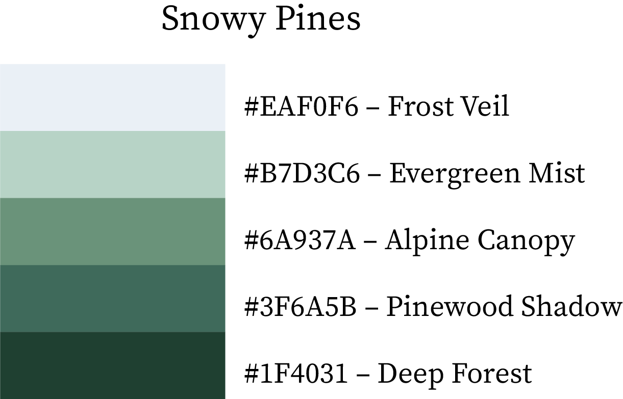
Winter Colour Palettes & Swatches – Warm, Cool & True Shades with Hex Codes and Names

Winter Colour Palettes Swatches and Combinations

The Ultimate Winter Colour Swatches & Palette Combinations with HEX Codes & Names

Winter is a season of contrast — glowing embers meet frosty air, and deep shadows blend into soft snow light.
Designers love winter palettes for their balance between warm comfort and cool elegance.
This curated collection of Winter Colour Swatches and HEX Palettes captures the season’s mood — from Mulled Wine and Cozy Latte to Arctic Chill and Midnight Blue — ready for use in branding, UI design, fashion, and seasonal campaigns.

1. Warm Color Swatches of Winter

These warm hues mirror winter’s inner comfort — fireside glow, cinnamon warmth, and festive coziness. Perfect for packaging, lifestyle visuals, or any design that needs depth and emotional warmth.

Color NameHEX CodeDescription
Mulled Wine#A23A2CDeep red-brown with a cozy, spiced wine undertone.
Holly Berry#C84235A festive red with cheerful vibrancy for holiday designs.
Winter Ember#D64E41A glowing red-orange, like firelight in snow.
Festive Cranberry#E0594ELively red-pink, perfect for cheerful accents.
Merry Blush#F26A5ARosy coral that adds softness and charm.
Frostbitten Peach#FF7F6BPlayful coral-peach with a frosted brightness.
Golden Caramel#E37A58Soft golden-orange reminiscent of caramel glaze.
Nutmeg Warmth#C76A44Earthy brown-orange with warm spice undertones.
Toasted Pecan#AD5738Medium brown with nutty depth and soft warmth.
Chestnut Roast#9B4727Classic dark brown with a roasted warmth.
Burning Log#84361BRustic brown-red with fireplace depth.
Cinnamon Glow#6D2C14Dark brown-red that radiates spiced richness.
Winter Sunrise#F5A76AGolden peach hue that captures early winter sunlight.
Spiced Orange#E5925BVibrant orange-tan evoking citrus warmth.
Cozy Latte#D89F6BLight coffee hue with creamy softness.
Hot Cocoa#C37A59Rich chocolate tone ideal for warm, organic themes.
Candied Toffee#A66746Sweet caramel brown perfect for cozy aesthetics.
Gingerbread#8E5738Spiced brown inspired by winter treats.

Best For: Perfect for holiday campaigns, artisanal branding, and food & beverage design. These hues give warmth to packaging, lifestyle photos, interior palettes, and cozy seasonal graphics.

Mulled Wine Color Hex Code #A23A2C
Holly Berry Color Hex Code #C84235
Winter Ember Color Hex Code #D64E41
Festive Cranberry Color Hex Code #E0594E
Merry Blush Color Hex Code #F26A5A
Frostbitten Peach Color Hex Code #FF7F6B
Golden Caramel Color Hex Code #E37A58
Nutmeg Warmth Color Hex Code #C76A44
Toasted Pecan Color Hex Code #AD5738
Chestnut Roast Color Hex Code #9B4727
Burning Log Color Hex Code #84361B
Cinnamon Glow Color Hex Code #6D2C14
Winter Sunrise Color Hex Code #F5A76A
Spiced Orange Color Hex Code #E5925B
Cozy Latte Color Hex Code #D89F6B
Hot Cocoa Color Hex Code #C37A59
Candied Toffee Color Hex Code #A66746
Gingerbread Color Hex Code #8E5738

2. Cool Color Swatches of Winter

Cool tones define winter’s quiet side — frozen lakes, soft fog, and crisp morning air. These shades give a refined, tranquil, and professional impression.

Color NameHEX CodeDescription
Frozen Pine#354959Deep green-blue evoking evergreen forests in frost.
Iceberg Drift#7AB6D6Light blue reminiscent of drifting glacier ice.
Icy Reflection#4E8795Muted teal-blue that mirrors frozen surfaces.
Frosty Mist#B8C5D1Pale bluish-grey symbolizing cold morning fog.
Polar Midnight#213546Near-black navy suggesting arctic night skies.
Frozen Lake#5CACD9Bright aqua-blue reflecting icy waters.
Frozen Dawn#357580Balanced teal-blue with a crisp undertone.
Overcast Sky#97A9B9Gentle grey-blue with soft atmospheric depth.
Icy Twilight#152637Cool navy with mysterious winter-night depth.
Arctic Chill#3D91BBFresh blue tone that feels brisk and clean.
Deep Glacier#1F6470Dark cyan echoing glacier depths.
Winter Fog#778B9CMisty grey-blue that adds elegance and calm.
Arctic Shadow#0D1C29Deep shadowy navy ideal for contrast.
Winter Wave#1C7EADMedium blue with cool oceanic character.
Cold Sapphire#0E525DJewel-toned teal reflecting icy gemstones.
Hushed Frost#5F7486Muted slate-blue perfect for minimalist designs.
Winter Void#071421Nearly black blue evoking frozen stillness.
Frosted Blue#076E9CCrisp icy blue suited for digital and modern designs.

Best For: Excellent for tech interfaces, winter campaigns, fashion lookbooks, or luxury branding. These tones deliver calmness, modernity, and clean contrast when paired with whites or silvers.

Frozen Pine Color Hex Code #354959
Iceberg Drift Color Hex Code #7AB6D6
Icy Reflection Color Hex Code #4E8795
Frosty Mist Color Hex Code #B8C5D1
Polar Midnight Color Hex Code #213546
Frozen Lake Color Hex Code #5CACD9
Frozen Dawn Color Hex Code #357580
Overcast Sky Color Hex Code #97A9B9
Icy Twilight Color Hex Code #152637
Arctic Chill Color Hex Code #3D91BB
Deep Glacier Color Hex Code #1F6470
Winter Fog Color Hex Code #778B9C
Arctic Shadow Color Hex Code #0D1C29
Winter Wave Color Hex Code #1C7EAD
Cold Sapphire Color Hex Code #0E525D
Hushed Frost Color Hex Code #5F7486
Winter Void Color Hex Code #071421
Frosted Blue Color Hex Code #076E9C

3. True Color Swatches of Winter

True winter shades are rich, clean, and balanced — they bring sophistication, clarity, and luxury to any design. These tones combine the stillness of ice with the depth of shadow.

Color NameHEX CodeDescription
Stormy Slate#4A5369Medium grey-blue for modern, moody aesthetics.
Frosted Steel#838CA0Silvery grey-blue with metallic clarity.
Winter Ash#ADB5C4Pale blue-grey perfect for minimalist backdrops.
Ice Crystal#DCE1E9Soft icy white-blue that brightens designs.
Iced Plum#6E0072Deep violet with icy, royal intensity.
Velvet Orchid#94268FRegal purple that adds depth and contrast.
Frosted Magenta#BD52A1Cool magenta hue for a modern feminine accent.
Winter Bloom#E49DD3Gentle pink-purple suggesting frosted petals.
Crimson Chill#A40808Bold winter red with an elegant, dramatic tone.
Frostbite Red#C82D32Vivid red that stands out in cold-themed visuals.
Winter Poppy#F4696ABright red-coral adding warmth to winter palettes.
Snow Blush#FFE6E6Soft pastel pink that lightens dark palettes.
Midnight Blue#0A0F1CDeep navy representing winter’s longest nights.
Twilight Navy#1A2639A classic, balanced navy ideal for elegant contrasts.
Winter Deep Sea#223E5BMuted blue inspired by icy ocean depths.
Frozen Ocean#30597ACool blue with subtle grey undertones.

Best For: Perfect for editorial layouts, high-end branding, luxury packaging, or digital design systems. These balanced hues offer clarity, depth, and timeless elegance — ideal for brands seeking a refined winter identity.

Stormy Slate Color Hex Code #4A5369
Frosted Steel Color Hex Code #838CA0
Winter Ash Color Hex Code #ADB5C4
Ice Crystal Color Hex Code #DCE1E9
Iced Plum Color Hex Code #6E0072
Velvet Orchid Color Hex Code #94268F
Frosted Magenta Color Hex Code #BD52A1
Winter Bloom Color Hex Code #E49DD3
Crimson Chill Color Hex Code #A40808
Frostbite Red Color Hex Code #C82D32
Winter Poppy Color Hex Code #F4696A
Snow Blush Color Hex Code #FFE6E6
Midnight Blue Color Hex Code #0A0F1C
Twilight Navy Color Hex Code #1A2639
Winter Deep Sea Color Hex Code #223E5B
Frozen Ocean Color Hex Code #30597A

4. Cool & Warm Colour Combinations of Winter (5-Color Combo Palettes)

Snowy Pines

A serene forest-inspired palette that captures the calm and quiet of snow-covered woods.
Frost Veil (#EAF0F6) lays the soft white base of snow, while Evergreen Mist (#B7D3C6) and Alpine Canopy (#6A937A) bring the muted greens of pine trees to life. Pinewood Shadow (#3F6A5B) adds depth, and Deep Forest (#1F4031) grounds the palette with a bold, natural touch.
Best for: nature-inspired winter designs, organic brand palettes, and eco-themed products.
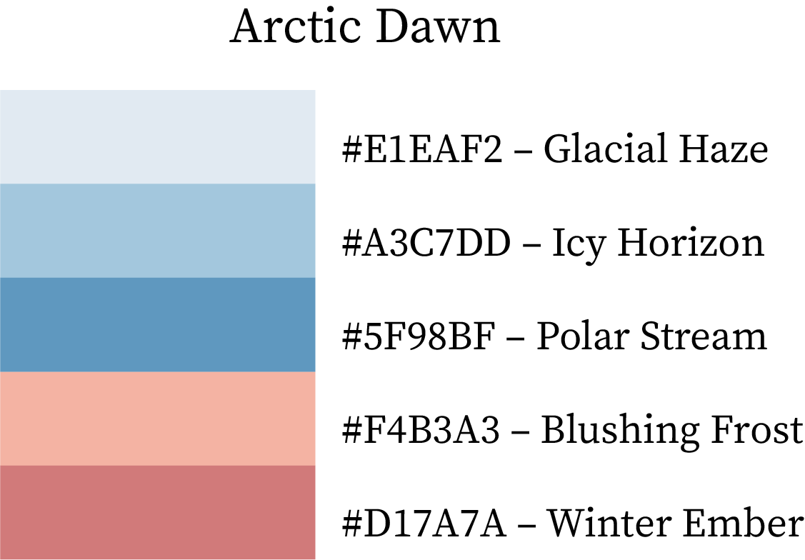
Cool Winter Color Palette

Arctic Dawn

This palette blends the tranquility of icy mornings with a warm blush of sunlight. Glacial Haze (#E1EAF2) and Icy Horizon (#A3C7DD) form the cool sky backdrop, while Polar Stream (#5F98BF) introduces depth. The warmth of Blushing Frost (#F4B3A3) and Winter Ember (#D17A7A) adds a beautiful transition from cold to cozy.
Best for: cozy winter fashion campaigns, seasonal packaging, or calm modern interiors.
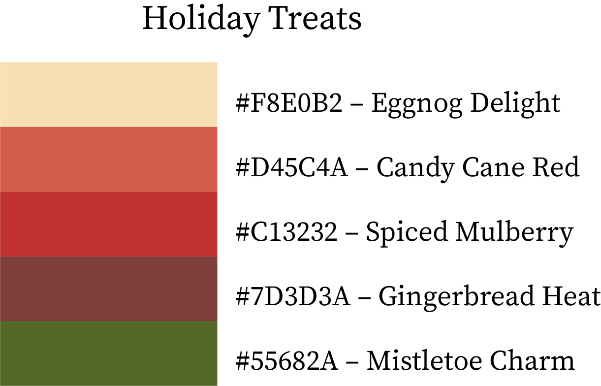
Winter Colour Palette Combination

Holiday Treats

A festive combination that feels like a cozy holiday gathering. Eggnog Delight (#F8E0B2) provides a creamy base, paired with Candy Cane Red (#D45C4A) and Spiced Mulberry (#C13232) for cheerful warmth. Gingerbread Heat (#7D3D3A) adds earthy comfort, while Mistletoe Charm (#55682A) brings a touch of evergreen freshness.
Best for: Christmas branding, festive cards, and bakery packaging.

Winter Color Combos

Mulled Wine Magic

Inspired by cozy winter evenings and spiced aromas, this palette is rich and romantic. Mulled Merlot (#8B304E) and Cranberry Steam (#B54666) create a deep red foundation, complemented by Pomegranate Frost (#D86F8E) for contrast. Plum Warmth (#915373) and Winter Grape (#604151) finish the palette with a luxurious purple tone.
Best for: wine brands, cozy cafés, or romantic winter aesthetics.
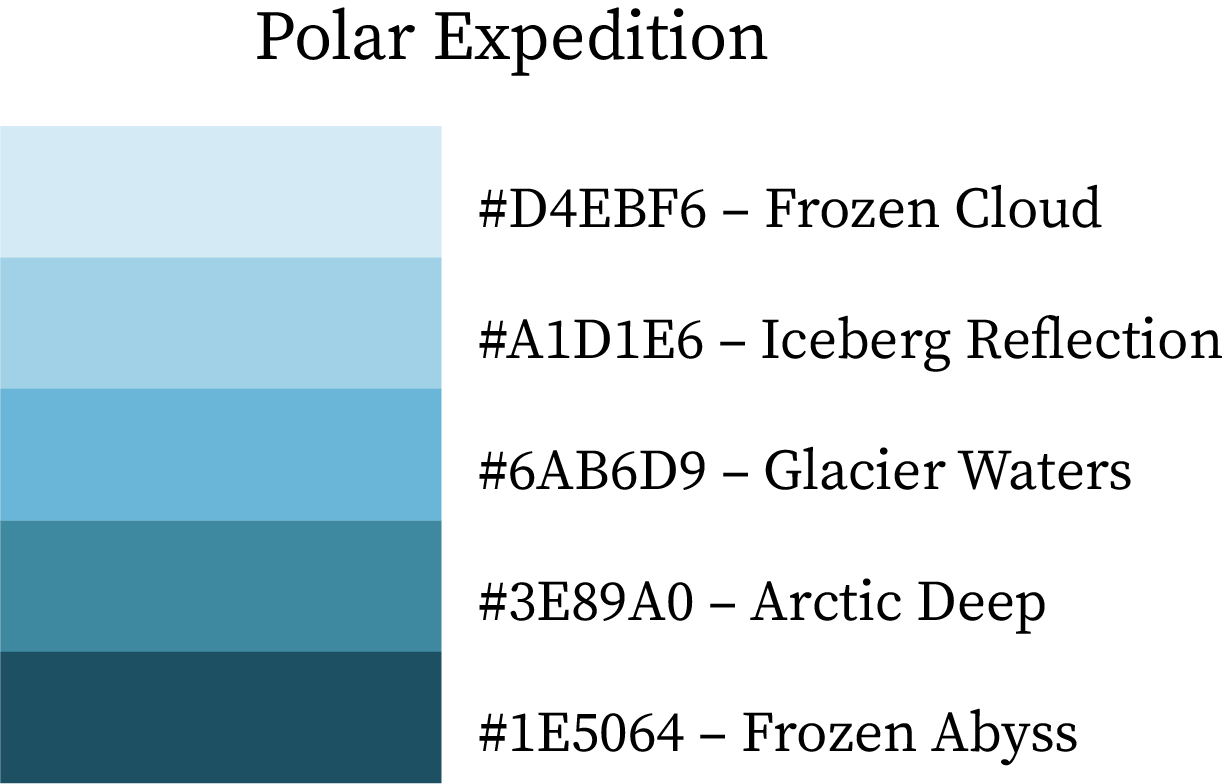
Winter Colour Palette

Polar Expedition

This palette captures the essence of frozen landscapes and glacial adventures. Frozen Cloud (#D4EBF6) and Iceberg Reflection (#A1D1E6) mirror the serenity of icy air, while Glacier Waters (#6AB6D9) and Arctic Deep (#3E89A0) evoke depth and clarity. Frozen Abyss (#1E5064) anchors the set with bold coolness.
Best for: tech brands, travel themes, or clean winter UI design.
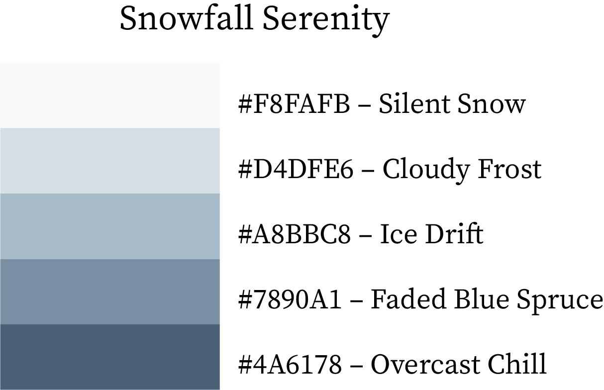
Winter Color Scheme

Snowfall Serenity

A delicate and peaceful winter palette that mirrors the hush of falling snow. Silent Snow (#F8FAFB) and Cloudy Frost (#D4DFE6) offer a misty softness, while Ice Drift (#A8BBC8) and Faded Blue Spruce (#7890A1) add subtle coolness. Overcast Chill (#4A6178) completes the palette with depth and contrast.
Best for: wellness brands, minimalist winter aesthetics, and calm interior palettes.
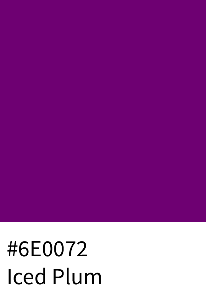
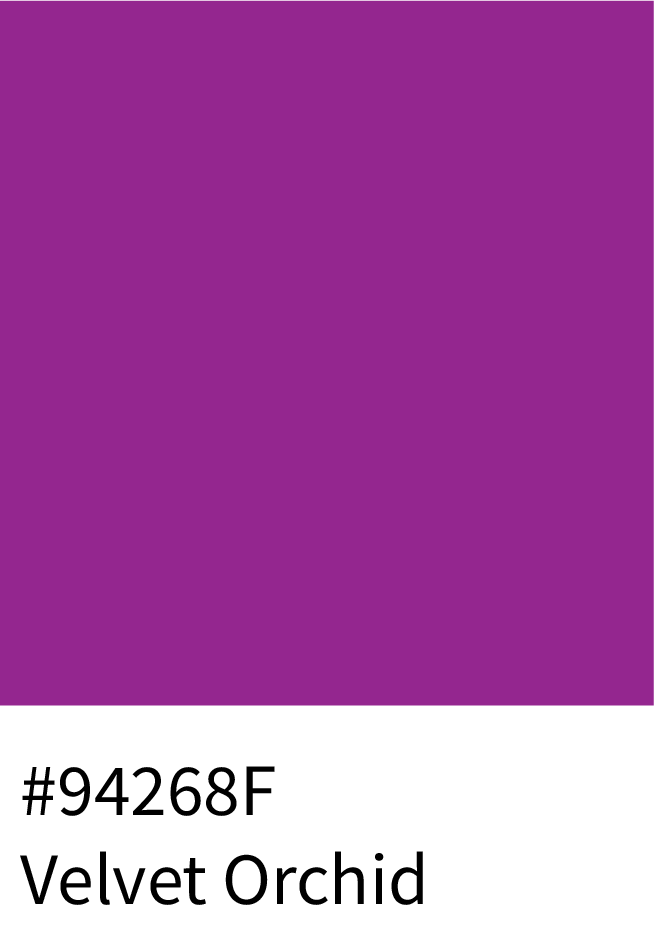
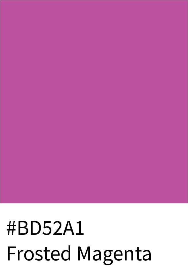
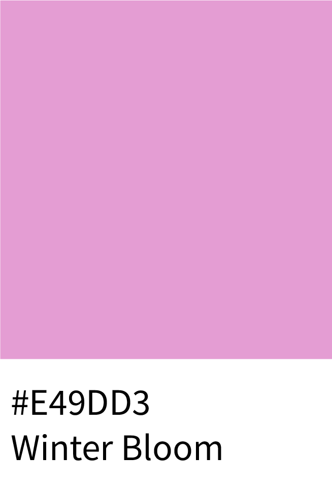
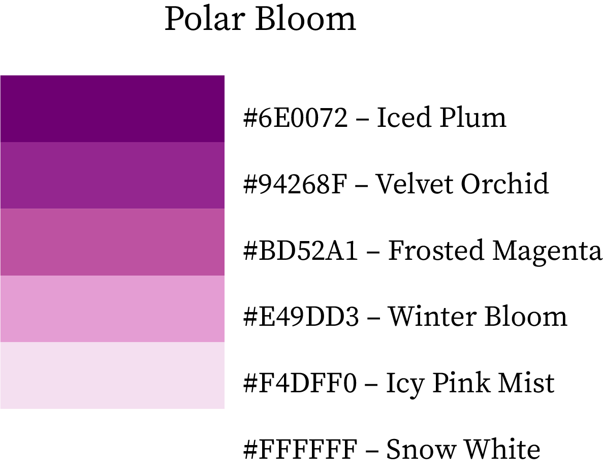
Winter Colour Scheme

5. True Color Combinations of Winter (6-Color Palettes)

Polar Bloom

This palette celebrates winter’s softer side through plum and pink undertones. Iced Plum (#6E0072) and Velvet Orchid (#94268F) bring deep sophistication, while Frosted Magenta (#BD52A1) and Winter Bloom (#E49DD3) brighten it with elegance. Icy Pink Mist (#F4DFF0) and Snow White (#FFFFFF) balance the set beautifully.
Best for: feminine branding, luxury fashion, and modern beauty products.
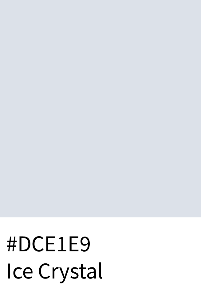
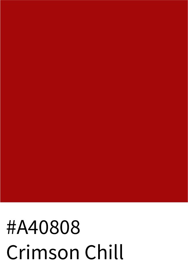
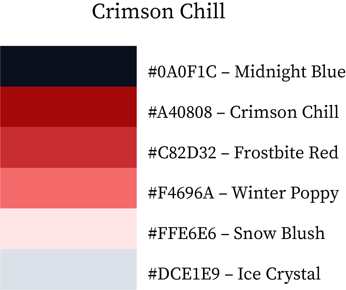
True Winter Colour Palette

Crimson Chill

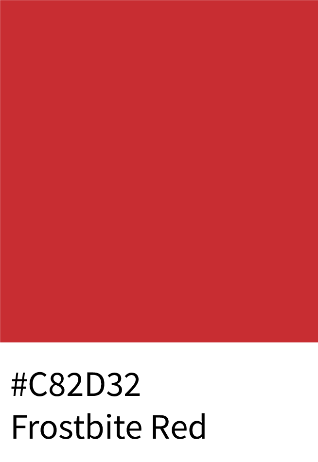
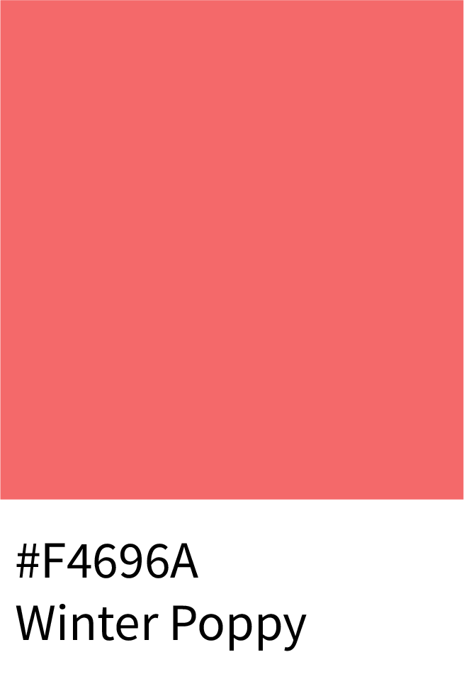
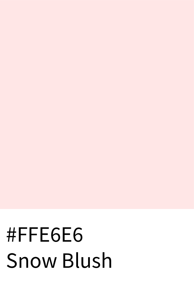
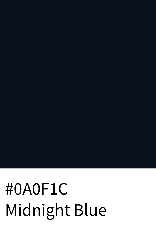
A bold palette inspired by frosty nights and vibrant winter reds. Midnight Blue (#0A0F1C) sets a dark backdrop, while Crimson Chill (#A40808) and Frostbite Red (#C82D32) add warmth and passion. Winter Poppy (#F4696A) and Snow Blush (#FFE6E6) bring gentle contrast, with Ice Crystal (#DCE1E9) tying it all together.
Best for: energetic winter campaigns, digital art, and striking product packaging.
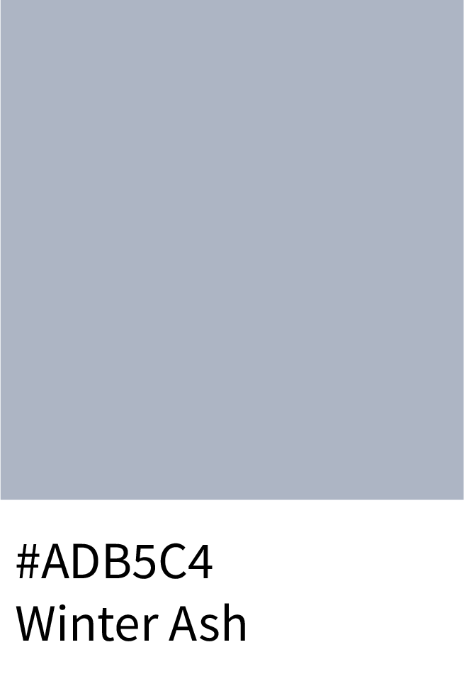
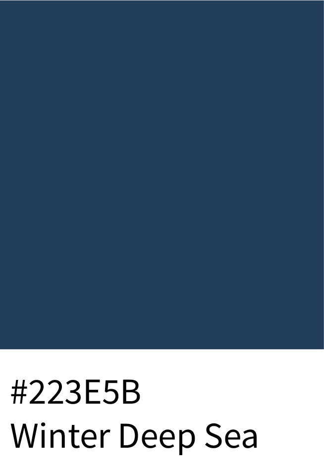
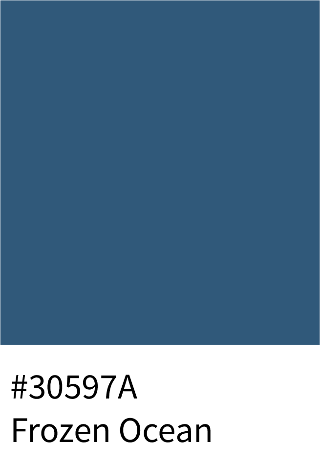
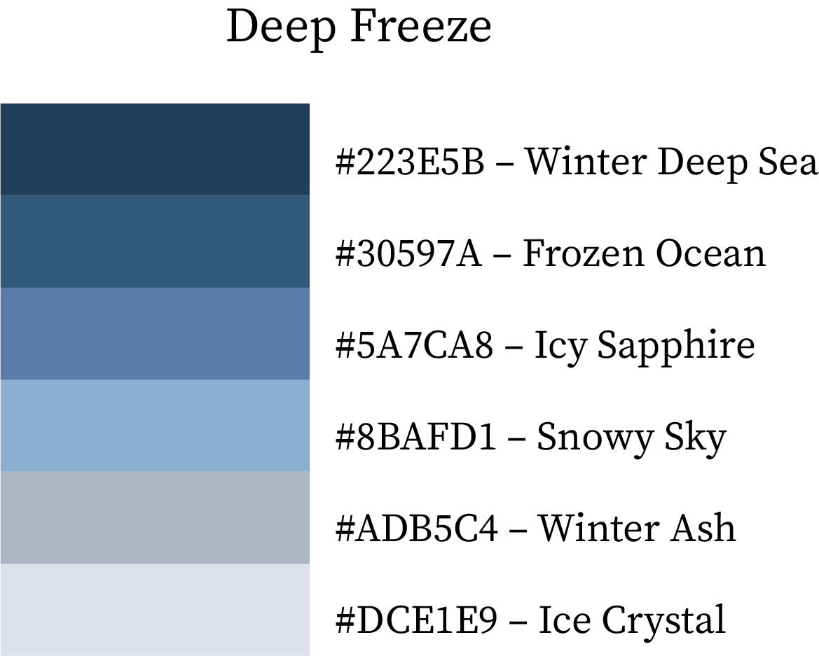
Warm Winter Color Palette Combination

Deep Freeze

Cool, clean, and perfectly balanced for modern design. Winter Deep Sea (#223E5B) and Frozen Ocean (#30597A) build depth, complemented by Icy Sapphire (#5A7CA8) and Snowy Sky (#8BAFD1) for a layered chill effect. Winter Ash (#ADB5C4) and Ice Crystal (#DCE1E9) bring refinement and calm.
Best for: corporate branding, winter web UI, and minimalist creative projects.
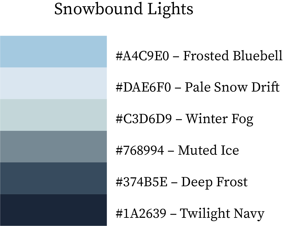
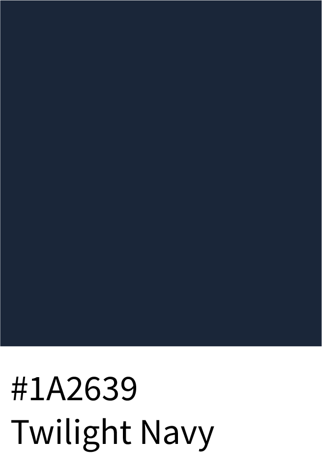
True Winter Color Palette

Snowbound Lights

A subtle yet stunning palette with cool blues and soft neutrals. Frosted Bluebell (#A4C9E0) and Pale Snow Drift (#DAE6F0) open with freshness, while Winter Fog (#C3D6D9) and Muted Ice (#768994) add tranquility. Deep Frost (#374B5E) and Twilight Navy (#1A2639) anchor the palette with quiet strength.
Best for: interior décor, winter-inspired prints, or clean visual storytelling.

Cool Winter Color Schemes

Instant Download Winter Colour Palettes in Multiple Formats

Other:

Frequently Asked Questions (FAQs)

1. What are the best color palettes for the winter season?

The best winter palettes combine cool blues, icy grays, and rich warm hues like cranberry, plum, and caramel. They reflect the calm and depth of winter while maintaining a sense of warmth and luxury.

2. How can I use winter colors in design projects?

Use cool tones like Frozen Lake (#5CACD9) or Twilight Navy (#1A2639) for backgrounds and accents, and add warmth with Mulled Merlot (#8B304E) or Golden Caramel (#E37A58) to create contrast and coziness in your visuals.

3. Which winter colors go well together?

Pair cool shades like Arctic Blue with warm hues like Spiced Orange or Cranberry Steam. This creates a balanced, seasonal look that feels both elegant and inviting.

4. Are winter color palettes suitable for branding?

Yes, winter color palettes are ideal for brands that want a sophisticated, timeless aesthetic. Cool tones convey trust and clarity, while warmer accents add emotion and luxury.

5. How do winter colors differ from summer palettes?

Winter colors are generally deeper, cooler, and more dramatic — think navy, plum, and frost blue — while summer palettes are lighter, softer, and pastel-toned.

Conclusion: Embrace the Winter Palette Magic

Winter is more than just cold and snow — it’s a season of depth, elegance, and emotional warmth. From the spiced oranges and cranberry reds of cozy winter nights to the icy blues and deep navies of frozen mornings, these palettes blend nature’s calm with festive richness.

Whether you’re designing a brand identity, refreshing your home décor, or planning a fashion collection, winter’s color combinations help you strike the perfect balance between comfort and sophistication.
Experiment with warm and cool contrasts, explore true winter tones, and let these carefully crafted swatches inspire your next creative project.

Tip: Always test contrast (especially with text), and balance deep, cool hues with crisp neutrals for that perfect winter sophistication.

Leave a Reply

Shopping cart

0
image/svg+xml

No products in the cart.

Continue Shopping
TOC