The Smartest Way to Generate Color Palettes (Most Designers Are Still Doing It Wrong)
Most designers still generate color palettes the same way they did ten years ago.
Open a tool, hit a random button, stare at combinations until something feels right, and move on. It works — sort of. But it is slow, inconsistent, and almost never produces a palette that feels genuinely intentional.
The problem is not the designer. It is the workflow.
Color palette generation has evolved significantly. AI text-to-palette, image extraction with mood filtering, live UI preview, accessibility testing — these methods exist and work well. But most designers are still using a single random generator for everything, then jumping to four separate tools to validate, check contrast, and preview results.
This article breaks down the five most effective methods for generating color palettes — and exactly when to use each one depending on what you are actually designing.
Method 1: AI Text-to-Palette — For When You Have a Vision but Not the Colors
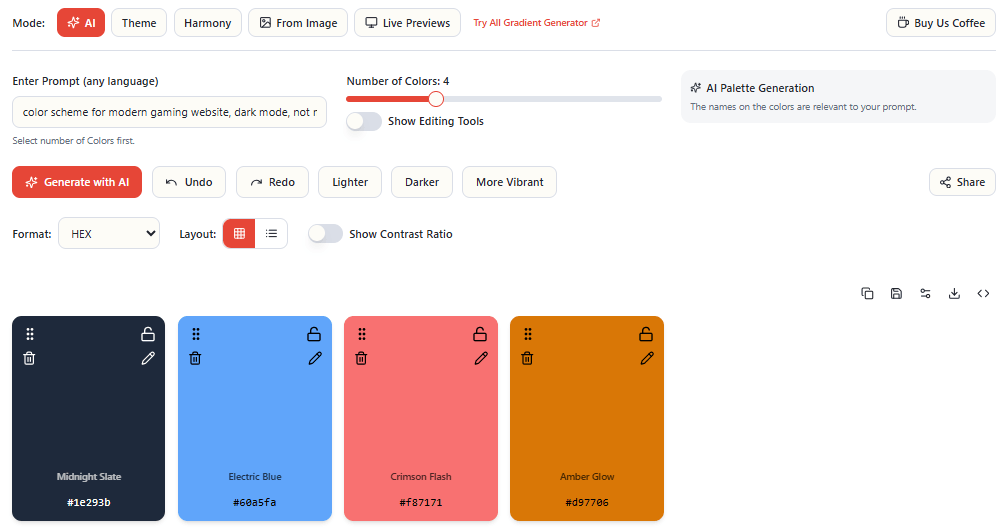
This is the most powerful method available for concept-driven design work.
Instead of starting with a color picker or a wheel, you start with language. You describe a mood, a scene, or a brand concept in natural language — and AI generates a matching palette with color names that reflect your description.
Type “Rainy Tokyo Night” and you do not get a list of generic hex codes. You get colors named “Wet Pavement,” “Neon Rainfall,” “Midnight Circuit” — colors that feel like they belong to that concept.
This approach works best for three specific use cases:
Brand identity work — when a client says “we want to feel modern but approachable” you can type exactly that and get a starting palette that matches the brief instantly. It is faster than building from a color wheel and more conceptually grounded than random generation.
Mood-driven design — editorial, packaging, and campaign work often starts with an emotional direction rather than a specific color. AI text-to-palette bridges the gap between brief and visual output.
Building design systems with named colors — having colors named after concepts rather than just values makes a design system more communicable to clients, teams, and developers. “Midnight Circuit” is easier to discuss in a meeting than “#1a1f2e.”
The key to getting great results from AI palette generation is specificity in your prompts. “Blue brand” is a weak prompt. “Luxury fintech brand — confident, minimal, dark mode first” is a strong one. The more context you give, the more intentional the output.
EnigmaEasel’s AI Color Palette Generator lets you set color count from 2 to 12, generate unlimited variations, and lock colors you love while regenerating the rest — all without creating an account. Try it at enigmaeasel.com/tools/color-palette-generator/
Method 2: Image Extraction — For When Inspiration Already Exists
Sometimes the best color palette is not invented — it is discovered.
A photograph of a Kyoto temple at dusk. A product shot from a brand you admire. A screenshot of a UI that resonates with you. These images already contain the color relationships you are looking for — you just need to extract them intelligently.
Basic image extraction pulls dominant colors. That is useful but limited — it gives you whatever the algorithm considers most prominent, which is often the largest areas of color rather than the most interesting or useful ones.
More advanced extraction uses mood filtering — biasing the algorithm toward specific parts of the color spectrum depending on what you need:
- Warm extraction pulls reds, oranges, and ambers from the image
- Jewel Tones extraction finds the rich, saturated accent colors
- Muted extraction finds the desaturated, nuanced tones that are often the most sophisticated
- Pastel extraction finds the soft, light tones that basic extraction often misses
- Neon extraction amplifies vivid, high-saturation moments in an image
The most precise approach is manual marker picking — dragging sample points directly onto the exact pixels you want to capture. This gives you color from a specific shadow, highlight, or accent that the automatic algorithm would skip entirely.
Image extraction works best when you have a clear visual reference — photography you want to match, a competitor’s design you want to analyze, or an inspiration image you have been saving for this project.

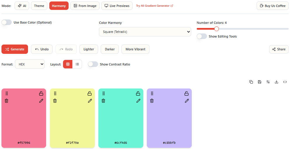
Method 3: Color Harmony Theory — For Structured, Defensible Palettes
Color theory exists for a reason. Mathematically derived color relationships produce combinations that feel balanced and coherent — not because they are safe, but because the human eye is naturally attuned to harmonic relationships.
The seven core harmony types each solve a different design problem:
Complementary — two colors opposite on the color wheel. Maximum contrast, high energy. Works for CTAs, sports brands, and anything that needs to demand attention. Use the secondary color sparingly or it creates tension.
Analogous — three adjacent colors on the wheel. Naturally calm and cohesive. Ideal for wellness, lifestyle, and editorial brands where harmony matters more than contrast.
Triadic — three colors equally spaced at 120°. Vibrant and balanced even when desaturated. Works well for playful, creative brands when one color clearly dominates.
Split Complementary — a base color plus two colors adjacent to its complement. High contrast with less visual tension than straight complementary. A more practical choice for high-contrast work.
Monochromatic — variations of a single hue across lightness and saturation. The most cohesive harmony possible. Makes everything feel considered and intentional. Excellent for luxury and minimal brands.
Square and Rectangle (Tetradic) — four colors at 90° or in a rectangular relationship on the wheel. Rich color diversity, but requires one color to clearly dominate or the palette becomes chaotic.
The practical advantage of harmony-based generation is that you can defend your color choices. When a client asks why you chose those colors, “it is a split complementary harmony anchored to your brand blue” is a stronger answer than “it felt right.”
EnigmaEasel’s Harmony mode supports all 7 harmony types with 2 to 12 colors each — anchor with a base hex color or fully randomize. Explore all harmony types and their color palette pages at enigmaeasel.com including Complementary Color Palettes, Analogous Color Palettes, Triadic Color Palettes and more.
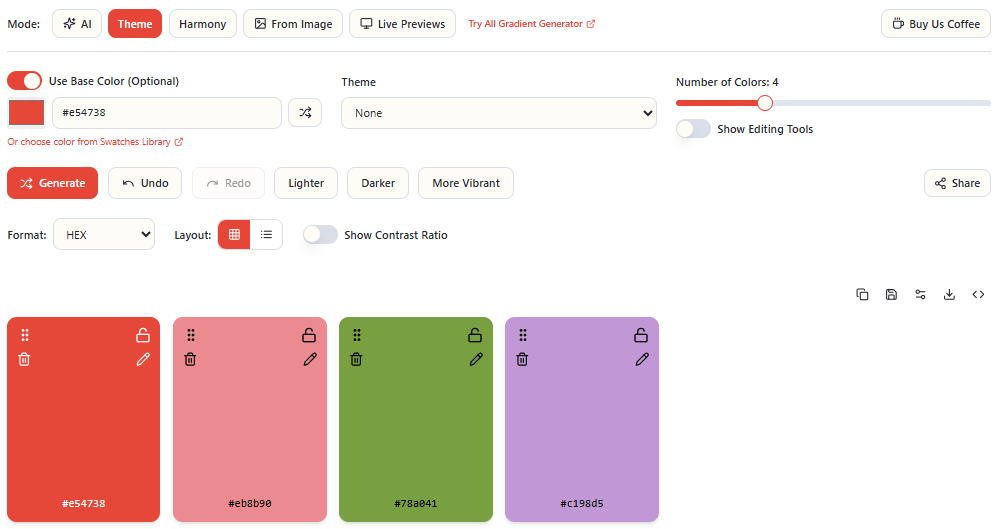
Method 4: Theme Presets — For Speed Without Sacrificing Cohesion
Not every project needs deep color theory work. Sometimes you need a palette that works in the next ten minutes.
Theme presets generate cohesive palettes tuned to a specific aesthetic direction — without requiring you to manually build from a color wheel or spend time crafting AI prompts.
The most useful preset categories for digital design:
Dark — deep, rich colors with low lightness. Suited for luxury brands, dark mode UIs, and cinematic projects.
Light/Pastel — soft, airy colors with high lightness. Effective for wellness, baby products, and feminine brands.
Bright/Neon — vivid, high-saturation colors. Ideal for gaming, nightlife, and bold marketing campaigns.
Retro — nostalgic warm palettes with muted character. Strong for vintage brands and editorial design.
Gradient — smoothly transitioning color sequences. Essential for modern UI backgrounds and overlay design.
Aesthetic — trendy, social-media-worthy combinations currently popular on Instagram and Pinterest.
The most powerful use of theme presets is anchoring them to a specific base color. Instead of generating a generic Dark palette, you generate a Dark palette anchored to your client’s specific brand blue. You get the aesthetic direction you need with the brand constraint already applied.
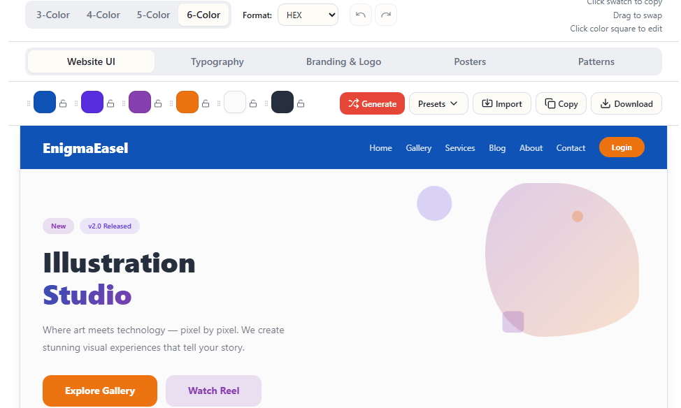
Method 5: Live Preview — For Validating Before Committing
This is the step most designers skip — and it is the one that prevents the most expensive mistakes.
Generating a beautiful palette in a swatch view tells you almost nothing about how those colors will actually work together on a real design. The relationship between colors changes dramatically when one occupies 60% of a page and another appears only on buttons and links.
Live preview mode applies your palette to complete, realistic mockups across multiple contexts:
- Website mockup — navbar, hero section, feature grid, testimonials, CTA, footer in 4-color, 5-color, and 6-color layout modes
- Branding and logo preview — see how your palette performs on real brand identity layouts
- Typography preview — how your colors interact with different type styles and weights
- Pattern preview — your palette applied to surface and pattern designs
- Poster preview — your palette on poster and print layouts
The difference between a palette that looks good as swatches and a palette that actually works on a real page is significant. Colors that seem balanced in isolation can feel overwhelming at scale. Accent colors that seem strong as swatches can disappear entirely when surrounded by a dominant background.
Previewing across five different contexts before committing gives you a complete picture of how versatile your palette actually is — and saves hours of revision on real projects.
The Complete Color Workflow
The most effective approach combines these five methods deliberately:
- Start with AI or theme presets — establish a directional palette quickly based on concept or aesthetic
- Validate with harmony theory — confirm the color relationships are mathematically sound
- Reference with image extraction — if you have a visual inspiration, check your palette against it
- Lock your strongest colors — regenerate the weaker ones until the whole palette works
- Preview on live mockups — see your palette across website, branding, typography, and pattern contexts before finalizing
- Test accessibility — run contrast ratios and color blindness simulation before shipping anything
This is a complete color workflow from concept to validation — and every step is possible without switching between applications, creating accounts, or hitting a paywall.
Explore Color Resources on EnigmaEasel
Beyond the palette generator, EnigmaEasel has a growing library of color resources:
- 2,800+ color shades — every shade of red, green, blue, and seasonal colors with hex codes
- Harmony palette collections — Complementary, Analogous, Triadic, and every other harmony type as curated reference pages
- Color blogs — wedding color palettes, interior and exterior color guides, website color palettes, logo color guides, and color psychology deep dives
- All Gradient Generator — every CSS gradient type with live preview and code export
- AI Font Pairing Generator — 1,600+ curated Google Fonts pairings with live color preview
- Color Contrast Checker and Generator — standalone WCAG accessibility testing
- All Color Code Converter — convert between every major color format instantly
- Bento Grid Generator — Create Grids with one click with Adobe Illustrator script
- Color Name Finder — Find your Color Names just by typing or by code
- Color Mixer — Mix your colors (2,3,4,5 or 6 Colors together) with Names. (Perceptual, Additive and Subtractive)
Try It Free
Every method described in this article is available in one place — EnigmaEasel’s AI Color Palette Generator.
No sign-up. No paywall. No account required — ever.
→ enigmaeasel.com/tools/color-palette-generator/
EnigmaEasel is a free design toolkit for designers and developers. Color palettes, gradients, font pairing, contrast checking, color conversion, and more — all free at enigmaeasel.com