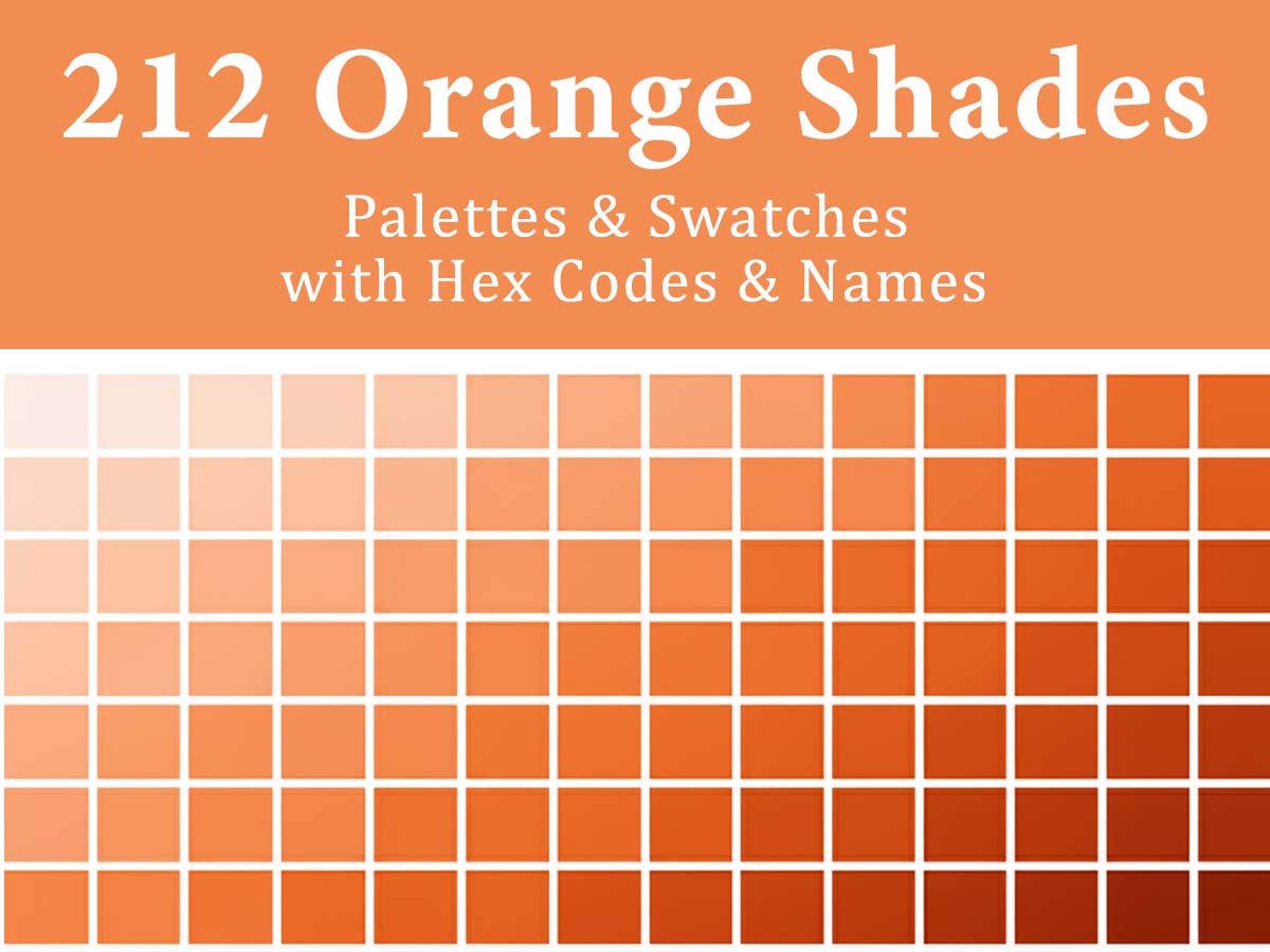
212 Orange Color Palette Shades & Swatches with HEX Codes and Names
Orange is one of the most expressive colors in the design world. It sits between the passion of red and the optimism of yellow, bringing warmth, creativity, and bold energy to visual storytelling. From glowing sunset gradients to deep copper tones, orange can shape everything from playful brand identities to high-impact UI designs.
The challenge? Orange is versatile but tricky. Designers often struggle with finding consistent shades, developers battle mismatched HEX codes across tools, and brands risk losing their visual voice if tones feel “too red” or “too yellow.”
That’s why we curated this collection of 212 orange color palettes — each shade named, HEX-coded, and categorized into styles. Whether you’re designing logos, websites, or packaging, you’ll always have a reliable palette that captures the right mood.
Why Orange Drives Energy and Action
Orange blends the warmth of red with the positivity of yellow, making it a powerful action-oriented color:
Energy & Enthusiasm – Orange feels lively and motivating, ideal for creative, fitness, and youth-focused brands.
Action-Oriented Design – Bright orange shades are often used for buttons and highlights to encourage interaction.
Friendly & Approachable – Unlike red, orange feels inviting rather than aggressive.
Standout Visibility – Orange naturally draws attention while maintaining a positive tone.
Used wisely, orange injects momentum and engagement into design.
Evergreen Trending Orange Colors
Orange stays relevant when it balances energy with warmth. These evergreen orange shades are commonly used to add vibrancy and approachability without overpowering the overall design.

Looking to use these oranges in your next project? Get the full color specs (HEX, RGB, CMYK, and HSB) in our digital library.
Sneak Peek: Shades of Orange with HEX Codes & Names with Different Types
Here’s a sneak peek into the eight distinct orange families light to dark we’ve included in this collection:
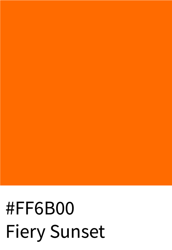
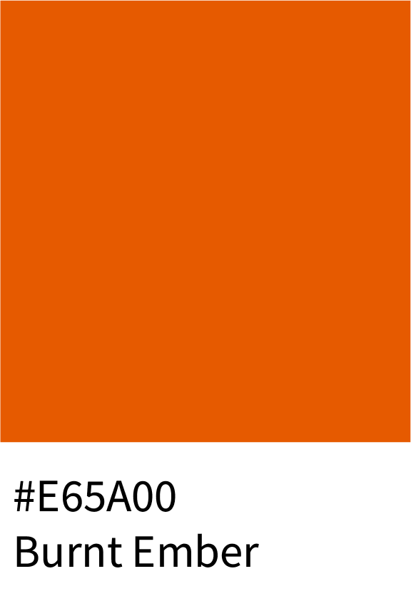
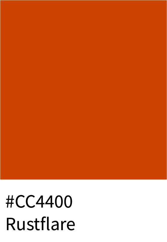
1 – Harvest Heat: Shades of Orange
This fiery palette captures the warmth and passion of true oranges — glowing from Fiery Sunset (#FF6B00) to Burnt Ember (#E65A00), deepening into Molten Copper (#D94E00) and Rustflare (#CC4400). These classic tones express boldness, creativity, and energy.
Best for:
Food & beverage brands
Autumn campaigns
Dynamic website call-to-actions

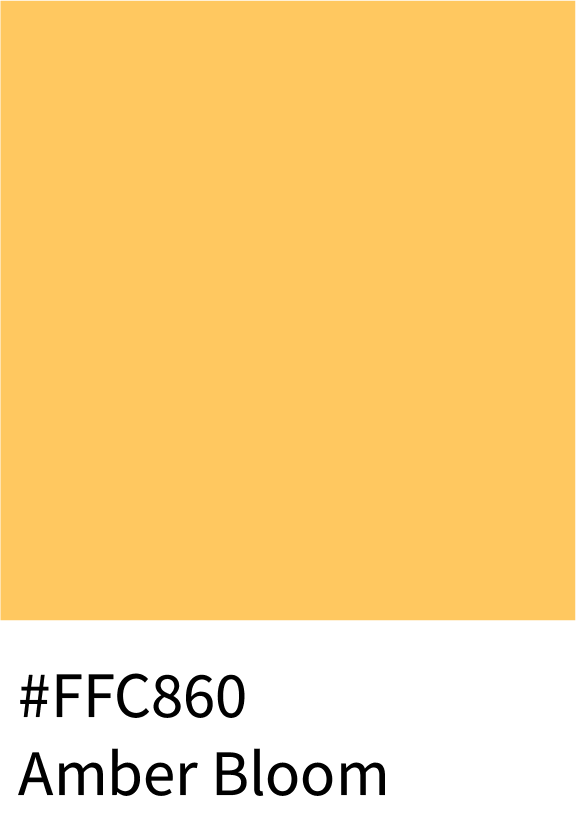
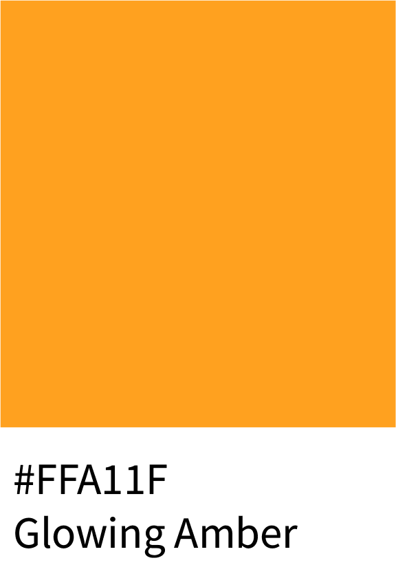
2 – Amber & Honey Color Hex Codes
Radiating natural glow and sophistication, this set starts with Soft Honey (#FFDD8C) and deepens through Amber Bloom (#FFC860), Glowing Amber (#FFA11F), and Burnt Honey (#E38014). These are perfect for conveying warmth, luxury, and richness.
Best for:
Premium packaging
Lifestyle and jewelry branding
Natural wellness aesthetics


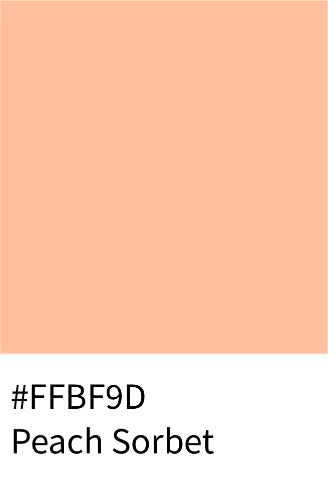
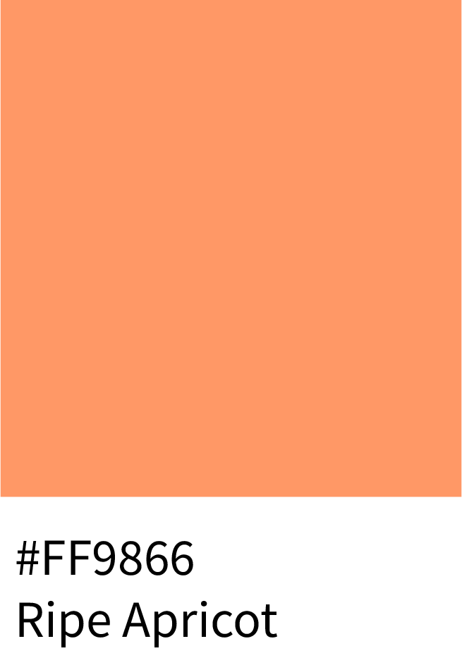
3 – Peach Fuzz & Apricot Color Hex Codes
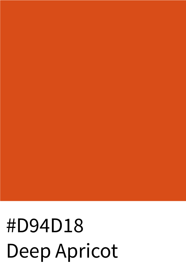
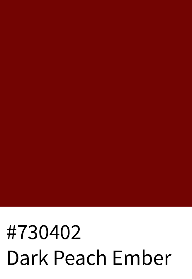
Playful yet refined, these shades blend comfort with vibrance — from Peach Sorbet (#FFBF9D) and Ripe Apricot (#FF9866) to Deep Apricot (#D94D18) and Dark Peach Ember (#730402). Their soft warmth makes them ideal for friendly, approachable visuals.
Best for:
Skincare and beauty design
Lifestyle blogs
Soft product packaging
4 – Peach & Coral Color Hex Codes
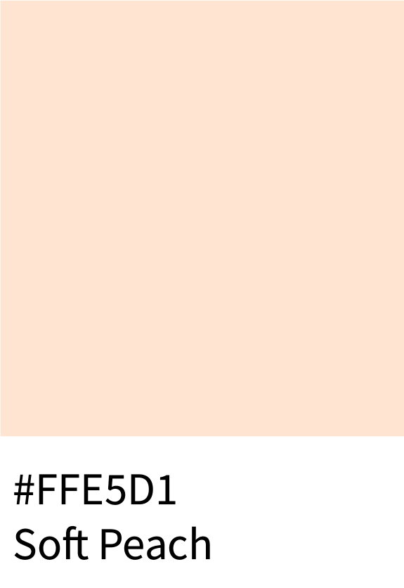
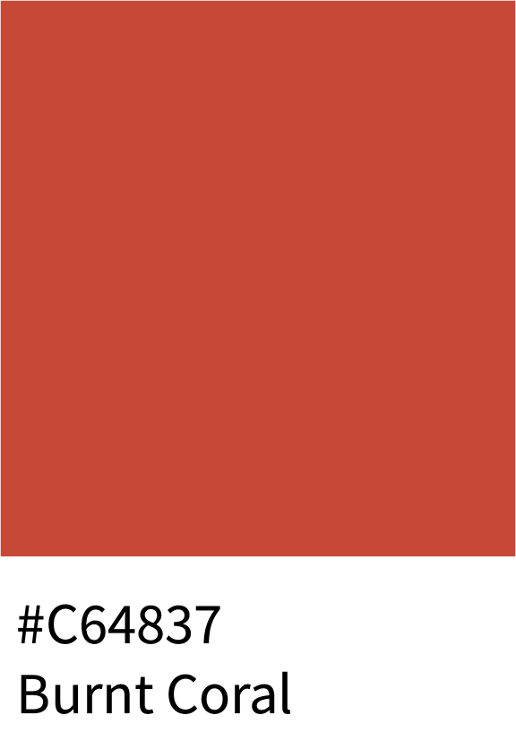
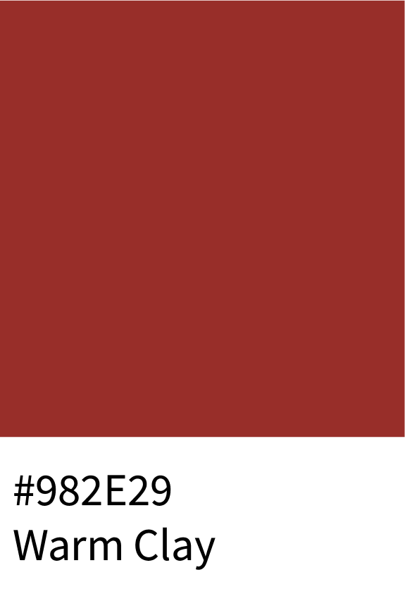
This fresh palette transitions from Soft Peach (#FFE5D1) to Coral Blush (#FF8269), Burnt Coral (#C64837), and Warm Clay (#982E29) — evoking natural vitality and creative energy. These tones shine in human-centered or artistic design.
Best for:
Fashion and editorial visuals
Wellness and lifestyle websites
Artistic product branding

5 – Copper & Rust Color Hex Codes
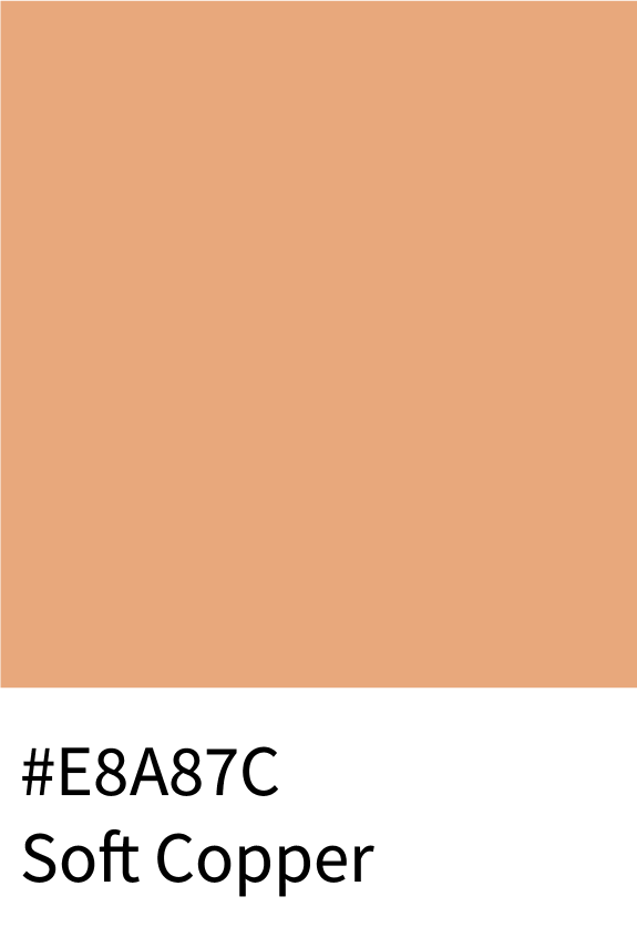
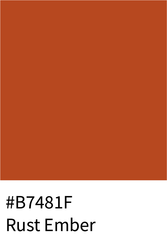
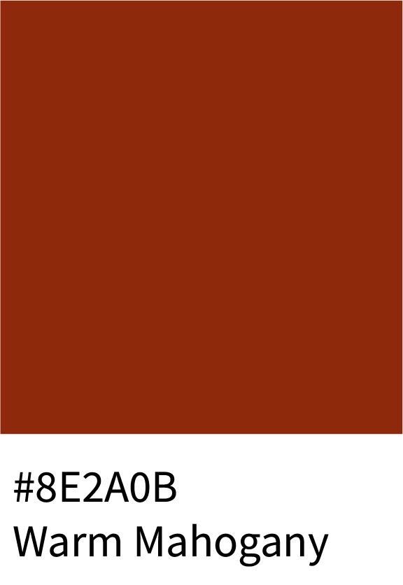
Earthy and grounded, these tones range from Soft Copper (#E8A87C) to Rust Ember (#B7481F), Warm Mahogany (#8E2A0B), and Auburn Bronze (#571002). They blend metallic warmth with rustic depth — timeless and elegant.
Best for:
Interior design brands
Vintage and heritage projects
High-end packaging

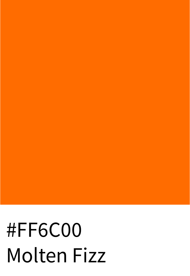
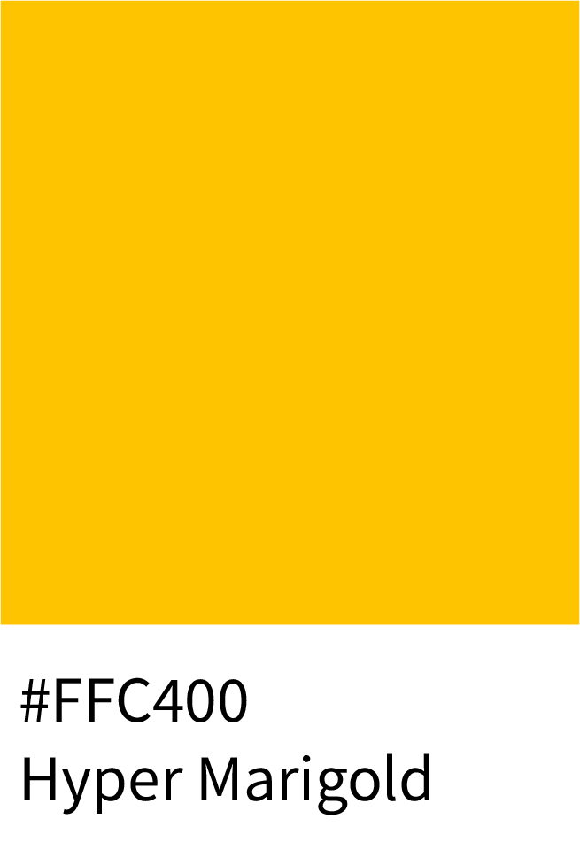
6 – Bright Neon & Electric Orange Color Hex Codes
Pure energy in color form — starting with Blazing Peel (#FF9510), glowing through Molten Fizz (#FF6C00) and Hyper Marigold (#FFC400) before ending with Bright Yolk Ember (#FFA100). These are bold, eye-catching tones for modern visuals.
Best for:
Sports and gaming brands
Event promotions
Tech and digital campaigns
(Total: 32 colors)


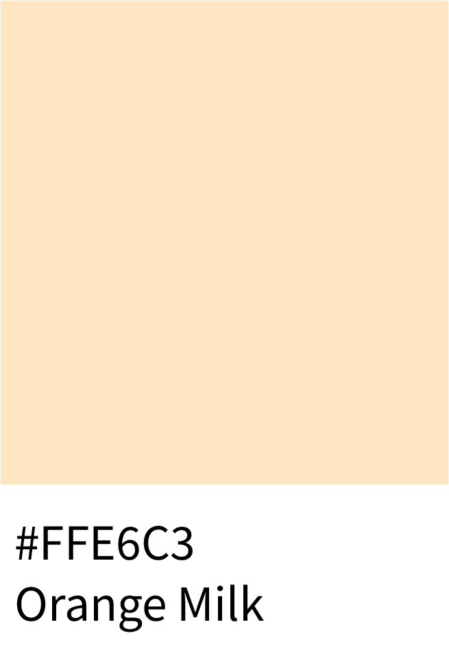
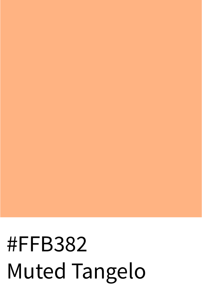
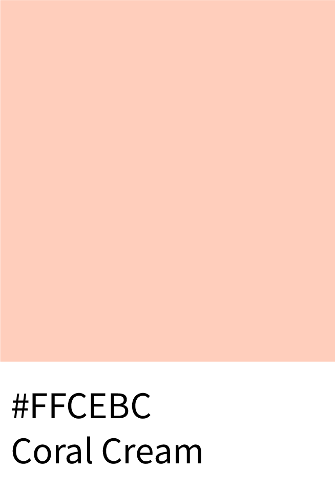
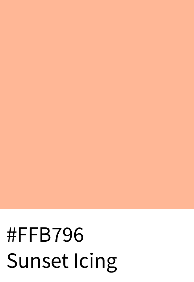
7 – Pastel Orange Color Hex Codes
Soft, cheerful, and subtle, this palette brings calm optimism with Orange Milk (#FFE6C3), Muted Tangelo (#FFB382), Coral Cream (#FFCEBC), and Sunset Icing (#FFB796). Perfect for light, approachable, and minimal design.
Best for:
Wellness and baby brands
Lifestyle blogs
Soft editorial design
(Total: 32 colors)
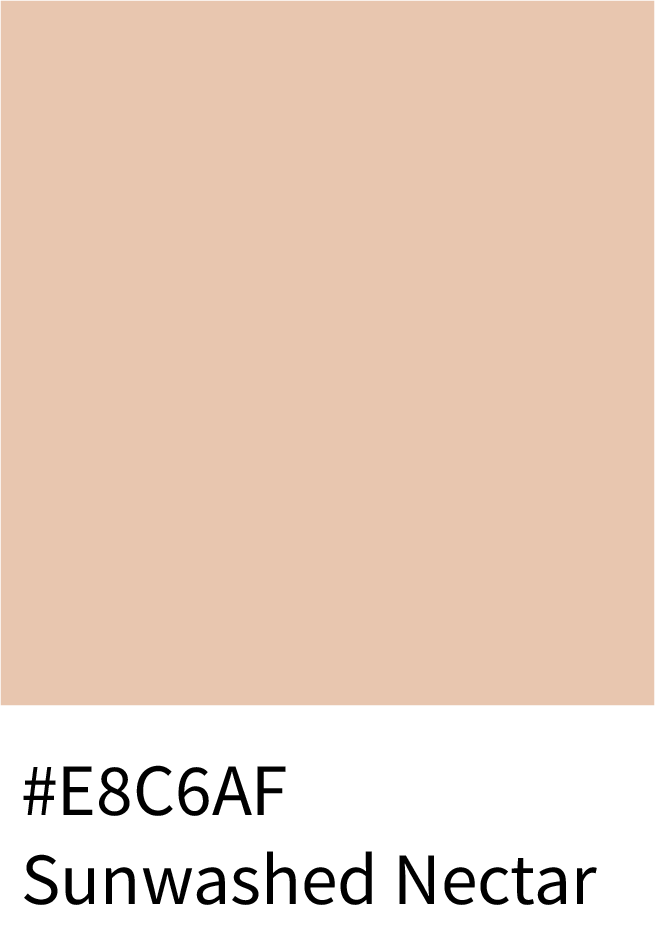
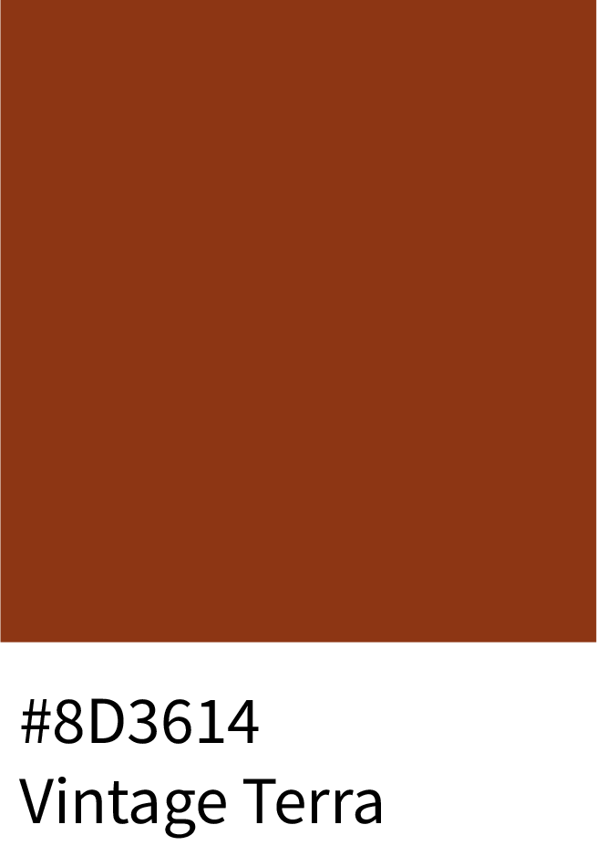
8 – Muted, Dusty & Vintage Orange Color Hex Codes
Richly nostalgic and timeless, this palette flows from Sunwashed Nectar (#E8C6AF) to Antique Orange (#BA724E), Vintage Terra (#8D3614), and Smoked Paprika (#631D09). These tones bring depth and warmth to elegant, retro branding.
Best for:
Vintage aesthetics
Artisan packaging
Home & décor design


Psychology of Orange Color Shades
Orange blends warmth with movement, making it highly engaging in design:
Orange feels energetic and enthusiastic without the aggression of red.
It encourages interaction, which is why it’s often used in buttons, highlights, and promotional elements.
Orange adds personality and friendliness, helping brands feel more approachable.
When balanced with neutral tones, orange brings life to a design without overwhelming it.
Orange is ideal when a design needs momentum, optimism, and a sense of action.
Continue the series with Shades of Yellow with Hex Codes and Names
Practical Ways to Apply Orange Color Schemes in Design
Orange has a reputation for being bold, but when chosen thoughtfully, it becomes one of the most adaptable colors in a designer’s toolkit. Instead of defaulting to “safe” neutrals like grey or blue, orange can make your visuals stand out while still feeling professional.
Here are some practical uses of orange palettes across industries:
1 – Food & Beverage Branding
Evoke appetite, energy, and friendliness with bright and appetizing tones.
Best Shades:
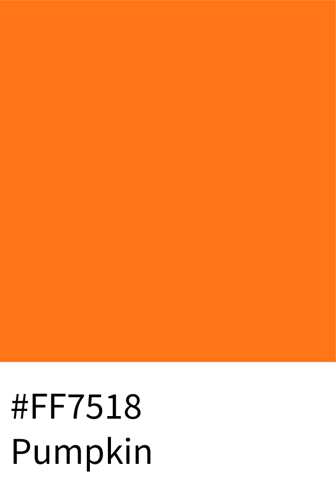
Pumpkin (#FF7518) – classic and bold, ideal for packaging.
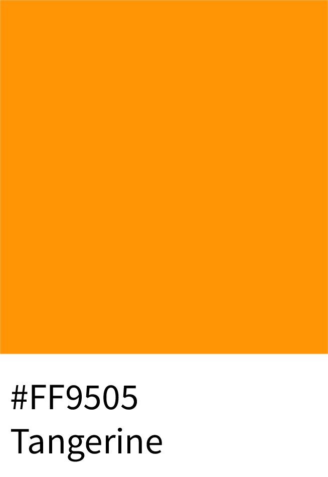
Tangerine (#FF9505) – vibrant and juicy for cafés or restaurants.
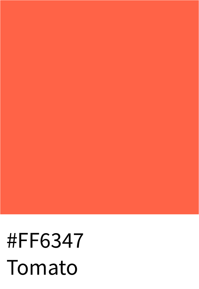
Tomato (#FF6347) – rich and lively, perfect for menus and ads.
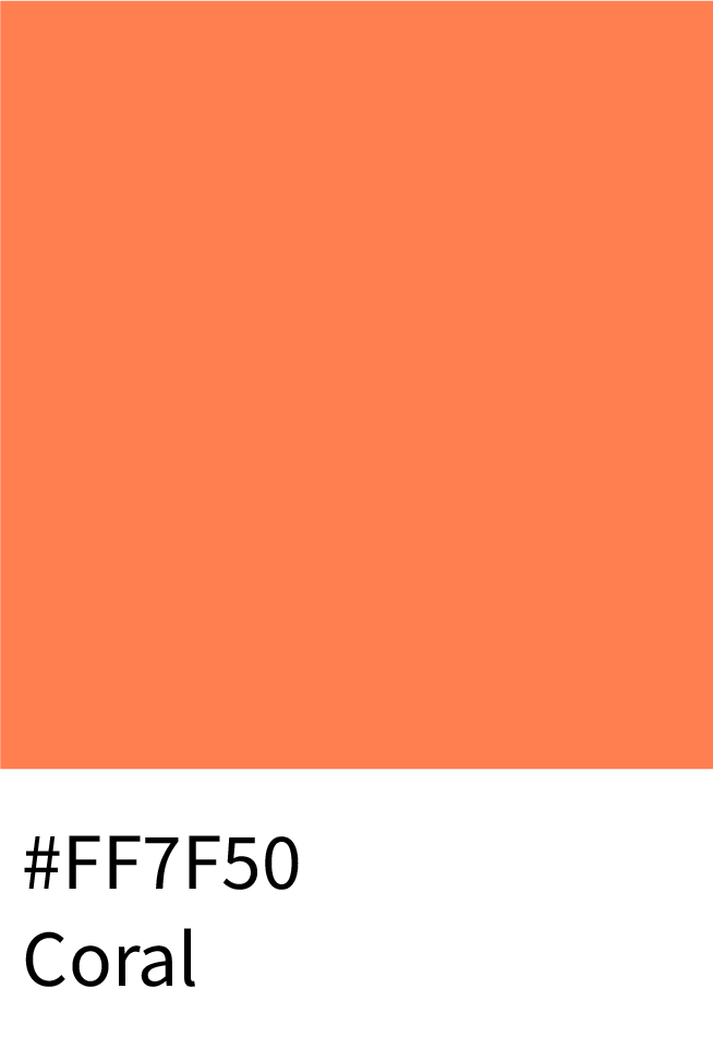
Coral (#FF7F50) – soft yet playful, great for beverage brands.
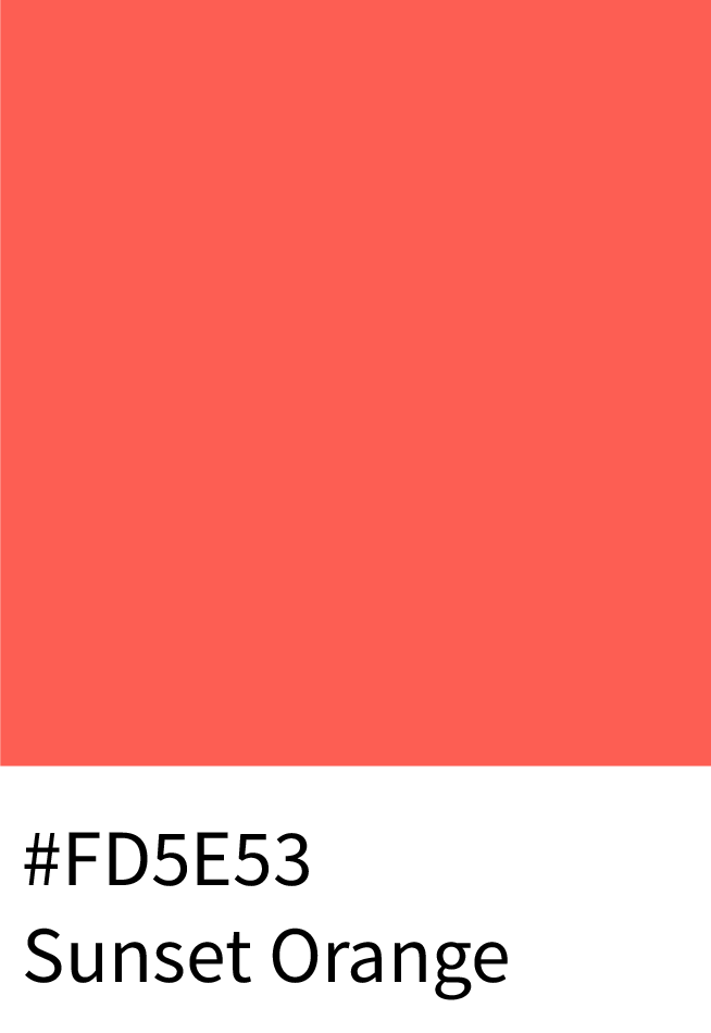
Sunset Orange (#FD5E53) – adds zest and warmth to visuals.
Why It Works:
Orange in this range stimulates hunger and attention, making it a go-to for F&B design.
2 – Luxury & Lifestyle
Showcase elegance, sophistication, and timeless appeal through deep metallic and earthy oranges.
Best Shades:
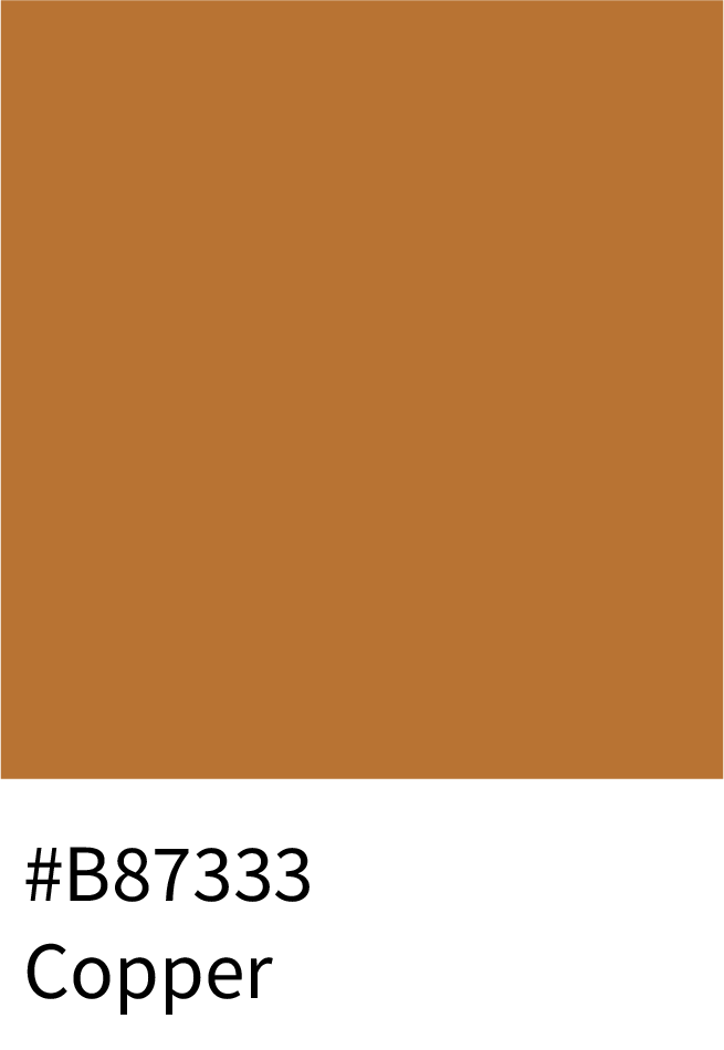
Copper (#B87333) – refined and traditional for premium branding.
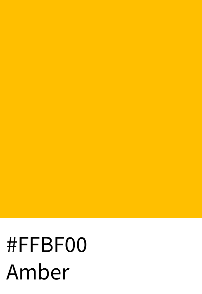
Amber (#FFBF00) – a golden-orange hue symbolizing prosperity.
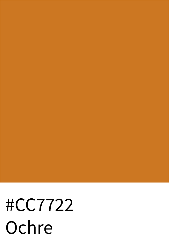
Ochre (#CC7722) – vintage and editorial, ideal for print design.
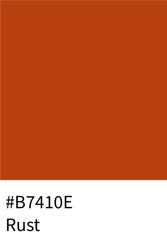
Rust (#B7410E) – strong, aged tone suited for luxury interiors.
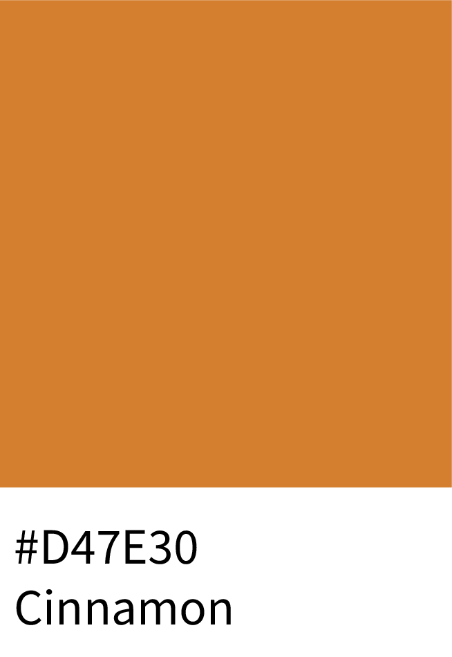
Cinnamon (#D47E30) – earthy, comforting, and perfect for lifestyle brands.
Why It Works:
These tones blend warmth with prestige, ideal for jewelry, interiors, and premium packaging.
3 – Wellness, Beauty & Home
Soothing, creamy oranges create a calm, nurturing vibe — ideal for wellness and lifestyle aesthetics.
Best Shades:
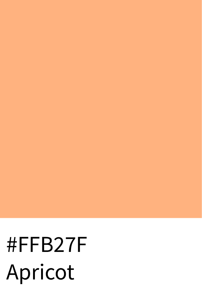
Apricot (#FFB27F) – soft and approachable for skincare or home brands.
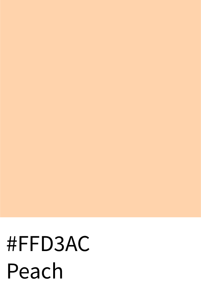
Peach (#FFD3AC) – delicate and comforting, evokes self-care and peace.
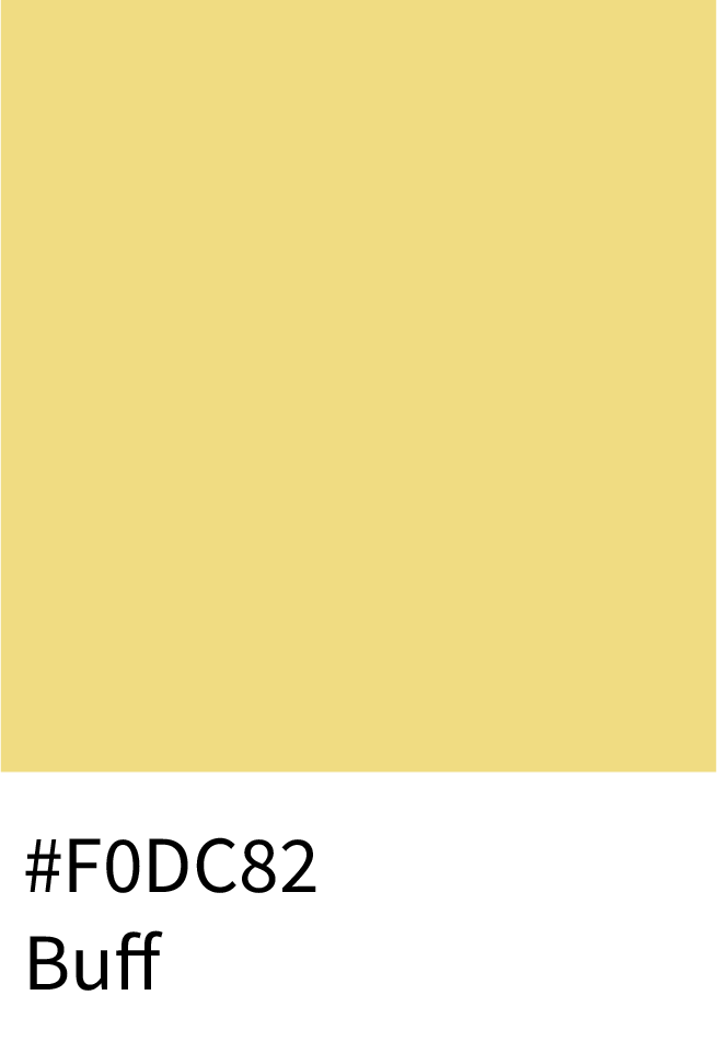
Buff (#F0DC82) – warm and muted, fits natural or organic product lines.
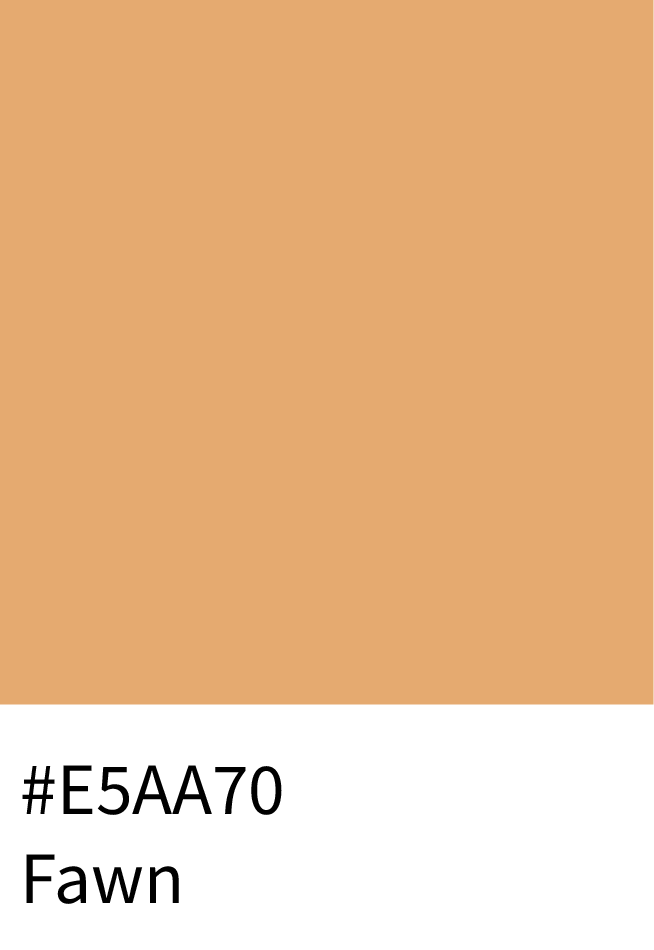
Fawn (#E5AA70) – sophisticated neutral-orange, perfect for editorial use.
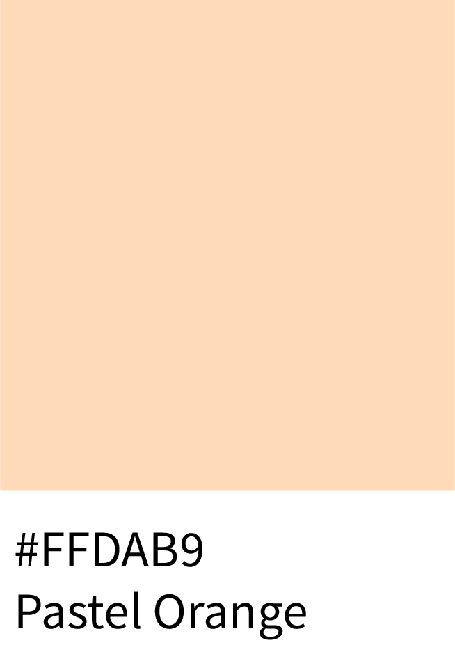
Pastel Orange – subtle and modern for minimalist branding.
Why It Works:
These pastels convey comfort, optimism, and an approachable aesthetic that appeals across wellness, lifestyle, and beauty industries.
4 – Sports, Technology & Innovation
Energetic, futuristic oranges create action and movement, ideal for brands built on speed and performance.
Best Shades:
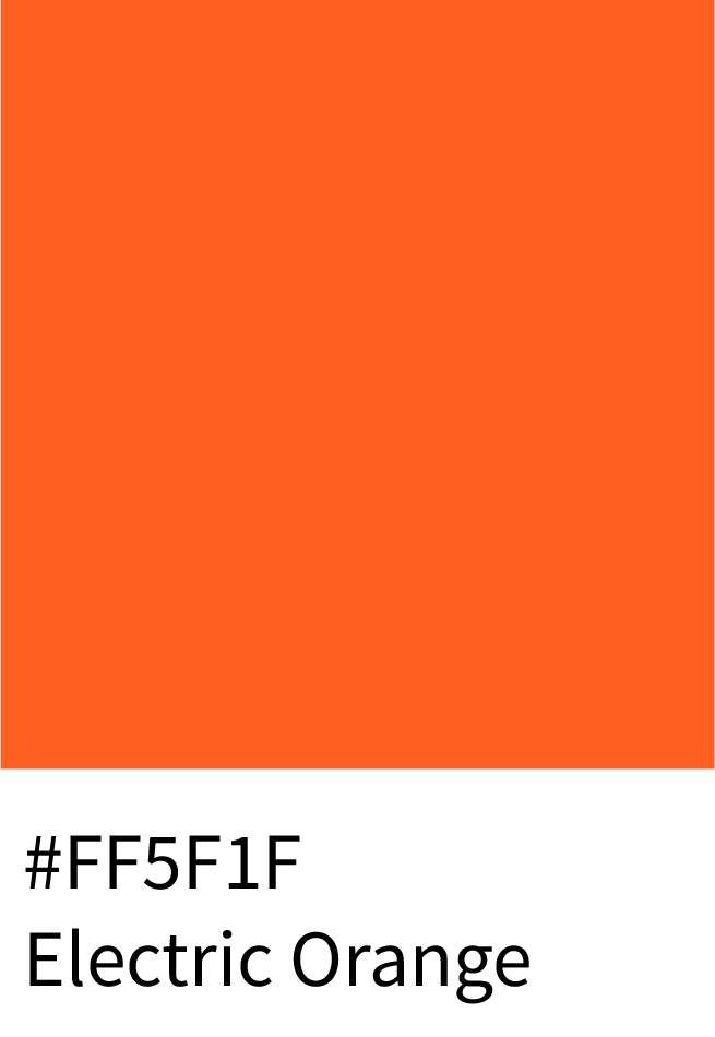
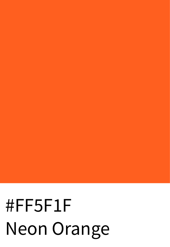
Electric Orange (#FF5F1F) – bold and bright, great for sportswear and energy brands.
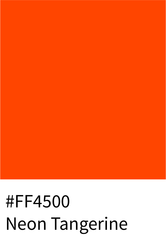
Neon Tangerine (#FF4500) – energetic, eye-catching, and futuristic.
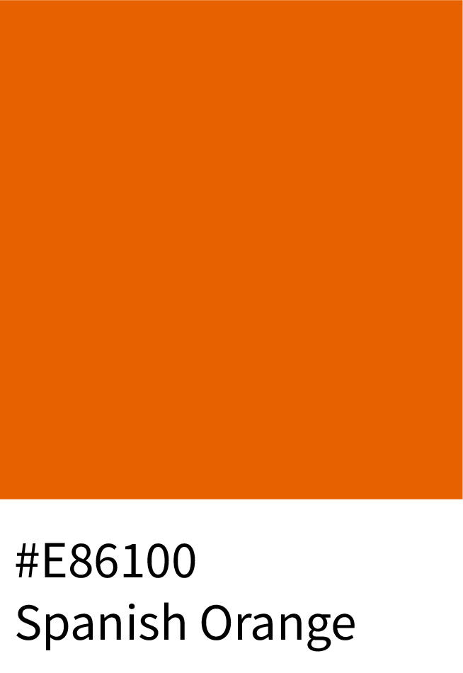
Spanish Orange (#E86100) – vivid and warm for tech or gaming.
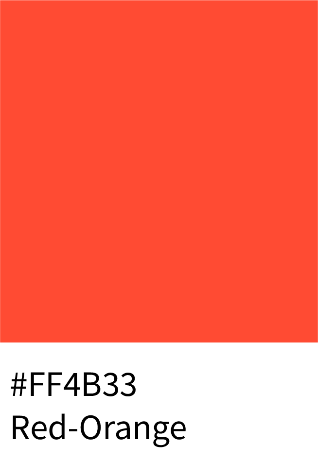
Red-Orange (#FF4B33) – fiery and dynamic accent color for modern UIs.
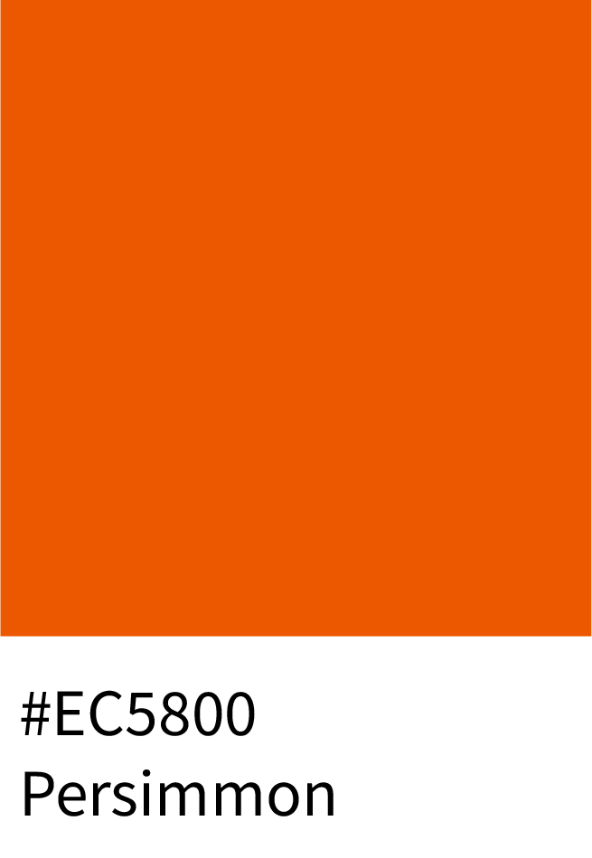
Persimmon (#EC5800) – sharp and digital-friendly, great for app design.
Why It Works:
Bright oranges enhance attention and emotional energy, perfect for brands that want to stand out in fast-paced markets.
5 – Artistic & Earthy Designs
Muted, organic oranges are ideal for creative, editorial, and rustic designs.
Best Shades:
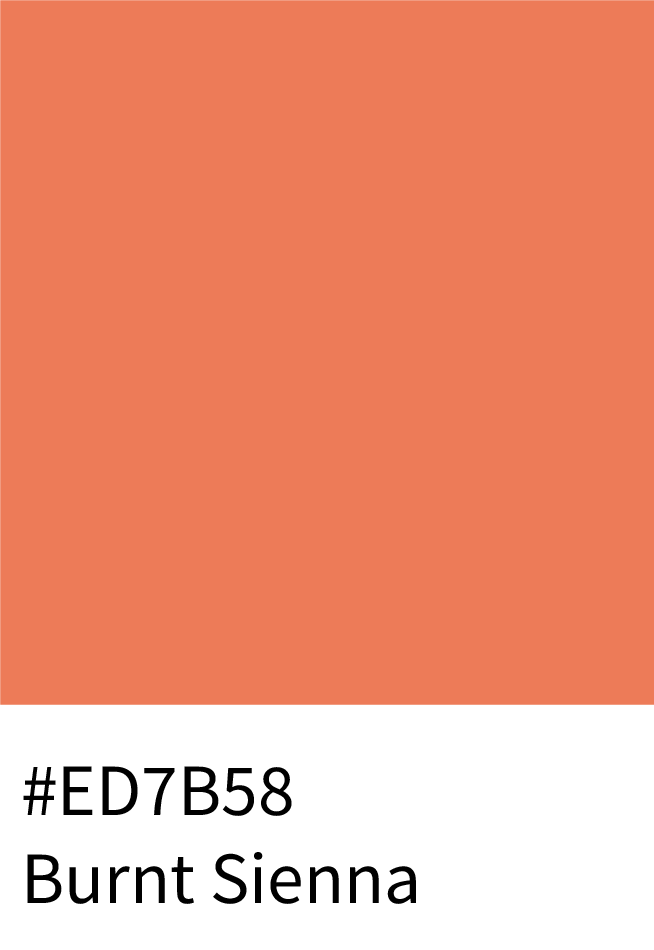
Burnt Sienna (#ED7B58) – vintage and versatile for digital art or illustration.
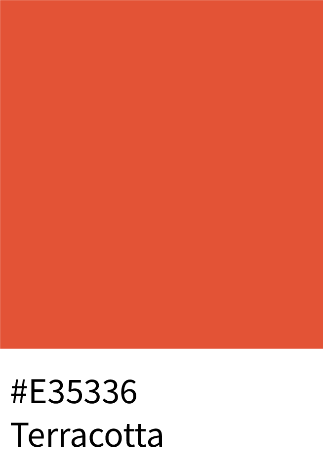
Terracotta (#E35336) – timeless earthy tone for architecture or decor.
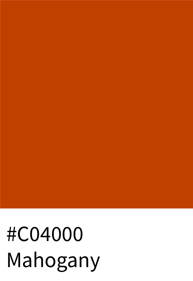
Mahogany (#C04000) – bold and rustic for handcrafted or vintage styles.
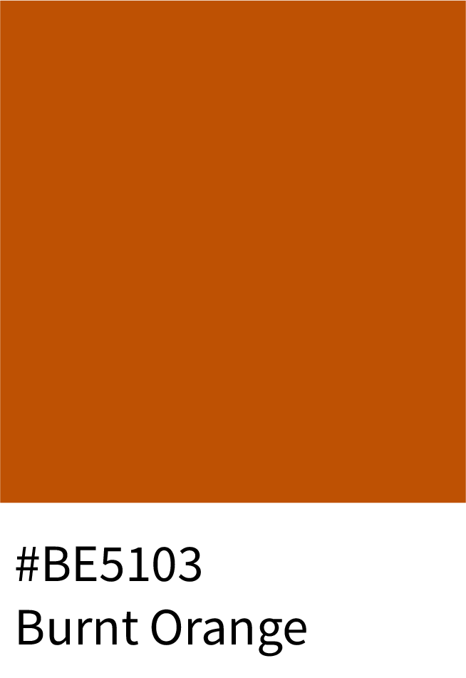
Burnt Orange (#BE5103) – rich autumn hue, excellent for warm branding.
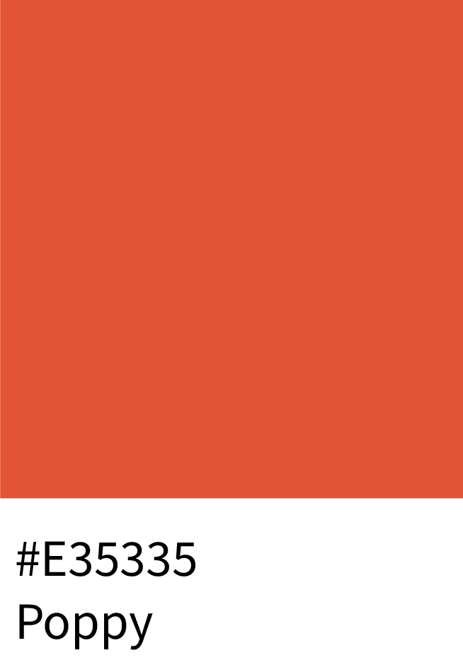
Poppy (#E35335) – a lively accent color with personality and depth.
Why It Works:
These tones ground visuals while maintaining creative vibrancy — ideal for art, fashion, and handmade branding.
6 – Other Notable Orange Shades (with HEX Codes & Names)
For designers seeking more variety, these additional orange shades work well as accents or theme bases:
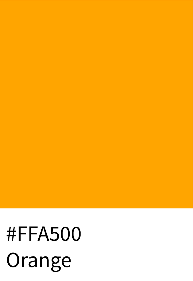
#FFA500 – Orange (classic balance of warmth and visibility)
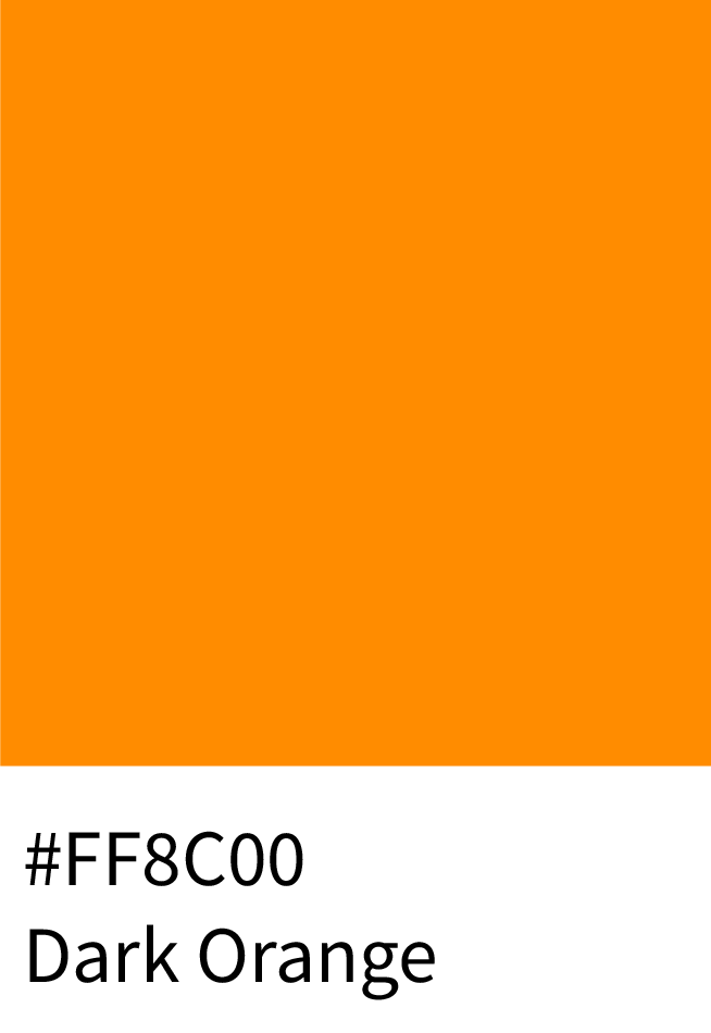
#FF8C00 – Dark Orange (bold and attention-grabbing for headers)
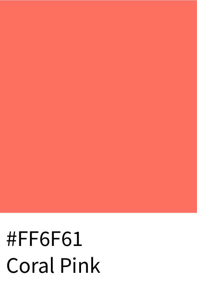
#F88379 – Coral Pink (soft and trendy; perfect for modern UI)
#F0DC82 – Buff (neutral with subtle orange warmth)
#E35335 – Poppy (energetic mid-orange for creative layouts)
#FD5E53 – Sunset Orange (lively gradient-friendly hue)
Trending Orange Shades
If you want your palette to feel current, consider:
Neon Orange (#FF5F1F) – dominating digital designs and sportswear.
Pastel Orange (#FFDAB9) – trending in wellness and fashion branding.
Burnt Orange (#BE5103) – a return to retro luxury.
Cinnamon (#D47E30) – widely used in organic and editorial palettes.
Frequently Asked Questions (FAQs)
Q1: What are the best orange palettes for websites?
Soft peach (#FFDAB9) and apricot (#FBCEB1) work beautifully for wellness and lifestyle sites. For bolder statements, try amber (#FFBF00) or coral orange (#FF7F50). Neon shades like #FF5F1F are perfect for gaming or event-based designs.
Soft Peach
Apricot
Amber
Coral Orange
Neon Orange
Q2: Which orange HEX codes are trending in 2025?
#FF6F00 (Vivid Orange): Popular in sports branding.
#FFC107 (Amber): A favorite for modern UI kits.
#FFD580 (Pastel Peach): Rising in lifestyle design.
#B7410E (Rust): Making a comeback in vintage aesthetics.
Vivid Orange
Amber
Pastel Peach
Rust
Q3: Can orange work in professional or corporate branding?
Absolutely. While it’s playful at first glance, muted oranges like #D2691E (Cinnamon) or copper tones like #A0522D can feel strong, mature, and trustworthy. Many modern fintech, fashion, and hospitality brands use orange to break away from predictable blue-grey palettes.
Cinnamon
Copper Tone
Q4: What’s the difference between peach, coral, and apricot?
Peach (#FFDAB9): Soft, gentle, nurturing.
Coral (#FF7F50): More vibrant with pink undertones, playful and modern.
Apricot (#FBCEB1): Balanced between yellow and pink, approachable and fresh.
Peach
Coral
Apricot
File Formats Included:
To make your workflow smooth, every palette comes in 7 different formats, ready for print and digital:
AI (Adobe Illustrator): Fully editable swatches.
EPS 10: Flexible vector files.
PDF: Printable color guide with HEX codes and names.
JPG & PNG: High-quality swatch previews.
TXT: Quick HEX + names reference.
ASE (Adobe Swatch Exchange): Import directly into Photoshop & Illustrator.
No matter your design tool, your palettes are instantly ready to use.
Wrapping It Up – The Power of Orange in Design
Orange is more than just a “warm color” — it’s a design powerhouse. With 212 curated orange shades, you’ll have every variation from peach fuzz to deep rust at your fingertips.
With this resource, you can:
Save hours searching for consistent orange HEX codes.
Keep brand visuals strong across all platforms.
Find inspiration for both modern and timeless projects.
This is your ultimate toolkit for orange — a palette that can carry creativity, energy, and elegance into every design.