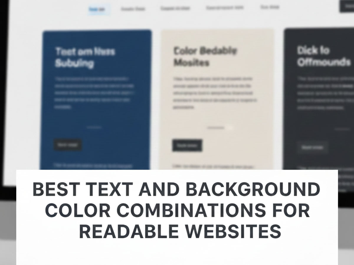
Best Text and Background Color Combinations for Readable Websites
Readable websites are not about trendy colors or bold aesthetics. They are about clarity, comfort, and trust. If users struggle to read your content—even for a few seconds—they leave.
In this guide, you will find proven text and background color combinations that work well across websites, devices, and screen conditions. Each pair is chosen for readability first, aesthetics second.
All examples are suitable for modern web design and can be tested against accessibility contrast rules if needed.
Why Text and Background Color Choices Matter
Text readability directly affects:
Time on page
Bounce rate
Content comprehension
Accessibility and inclusivity
A visually appealing site that strains the eyes will always underperform a simpler, readable one.
Good color combinations:
Reduce eye fatigue
Make scanning easier
Improve trust and professionalism
Tips for Choosing Readable Color Combinations
Avoid pure black (
#000000) for long textAvoid pure white (
#FFFFFF) on black backgroundsTest text in paragraphs, not just headings
Check readability on mobile screens
Maintain consistency across pages
If you are designing for accessibility, pair these combinations with proper contrast testing using our
Color Contrast Checker & Generator
How These Color Combinations Were Selected
Each combination below follows these principles:
Clear separation between text and background
Comfortable contrast (not harsh, not washed out)
Suitable for long-form reading
Works across blogs, landing pages, and content sites
If you want to validate any pair technically, you can test them with a color contrast checker. This article focuses on what works in practice.
Classic & Safe Text and Background Combinations
These combinations are timeless and work for almost any type of website.
Dark Gray Text on White Background
Text: Dark Gray
#1F2937Background: White
#FFFFFF
Why it works:
Softer than pure black
Comfortable for long reading sessions
Ideal for blogs, documentation, and articles
Dark Gray text on a white background offers a softer alternative to pure black. It remains highly readable while being comfortable for long reading sessions, making it ideal for blogs, documentation, and articles.
Black Text on Light Gray Background
Text: Near Black
#111111Background: Light Gray
#F3F4F6
Why it works:
Reduces glare compared to white
Feels modern and clean
Works well for content-heavy layouts
Near black text on a light gray background reduces glare compared to white. The result feels modern, clean, and works exceptionally well for content-heavy layouts.
Dark Slate Text on White
Text: Dark Slate
#1E293BBackground: White
#FFFFFF
Why it works:
Strong contrast without harsh black
Professional and neutral
Ideal for long-form blog content
Dark slate text on white provides strong contrast without the harshness of pure black. It feels professional, neutral, and is ideal for long-form blog content.
Charcoal Text on Very Light Gray
Text: Charcoal
#2D2D2DBackground: Very Light Gray
#FAFAFA
Why it works:
Reduces eye strain compared to pure white
Maintains excellent readability
Works well on content-heavy pages
Charcoal text on a very light gray background minimizes eye strain while maintaining excellent readability. This combination works particularly well on content-heavy pages.
Graphite Text on Cool Gray
Text: Graphite
#303030Background: Cool Gray
#F1F5F9
Why it works:
Modern, clean appearance
Comfortable for extended reading
Popular in editorial layouts
Graphite text on a cool gray background creates a modern, editorial look. It remains comfortable for extended reading and is commonly used in professional layouts.
Espresso Text on Cream
Text: Espresso
#2B2118Background: Cream
#FFF8ED
Why it works:
Warm contrast feels inviting
Still meets readability expectations
Great for lifestyle and creative blogs
Espresso text on a cream background delivers warm contrast that feels inviting. It still meets readability expectations and works well for lifestyle and creative blogs.
Neutral Black Text on Off-White
Text: Neutral Black
#181818Background: Off-White
#FCFCFC
Why it works:
Maximum clarity without pure white glare
Familiar and trustworthy look
Safe choice for any website
Neutral black text on an off-white background delivers maximum clarity without the glare of pure white. It feels familiar, trustworthy, and is a safe choice for any website.
Soft Contrast Combinations (Easy on the Eyes)
These are excellent for long-form content and reading-focused websites.
Slate Blue Text on Off-White Background
Text: Slate Blue
#334155Background: Off-White
#FAFAFA
Why it works:
Less harsh than black
Maintains clarity
Popular in modern editorial design
Slate Blue text on an off-white background is less harsh than black while maintaining strong clarity. It is a popular choice in modern editorial design for long-form reading.
Charcoal Text on Warm Beige Background
Text: Charcoal
#2B2B2BBackground: Warm Beige
#F5F1EC
Why it works:
Warm and inviting
Ideal for lifestyle and creative blogs
Reduces eye strain in low-light environments
Charcoal text on a warm beige background feels inviting and relaxed. This pairing reduces eye strain and works especially well for lifestyle and creative blogs.
Blue-Gray Text on Mist White
Text: Blue-Gray
#475569Background: Mist White
#F8FAFC
Why it works:
Gentle contrast for comfortable reading
Reduces visual fatigue
Excellent for long articles
Blue-gray text on mist white provides gentle contrast that minimizes visual fatigue. It is an excellent option for long articles and reading-focused layouts.
Olive Gray Text on Warm Gray
Text: Olive Gray
#4B4F46Background: Warm Gray
#F4F4F0
Why it works:
Natural, calming tone
Less clinical than blue-gray palettes
Suitable for wellness and personal brands
Olive gray text on warm gray creates a natural, calming reading experience. It feels less clinical than blue-gray palettes and suits wellness or personal brands.
Taupe Text on Light Sand
Text: Taupe
#5B5148Background: Light Sand
#F6F1EA
Why it works:
Soft contrast with warmth
Maintains clarity without sharp edges
Works well for creative portfolios
Taupe text on a light sand background offers soft contrast with warmth. It maintains clarity without sharp edges and works well for creative portfolios.
Muted Navy Text on Pale Gray
Text: Muted Navy
#334155Background: Pale Gray
#F3F4F6
Why it works:
Professional yet approachable
High legibility without aggressive contrast
Ideal for SaaS and corporate blogs
Muted navy text on pale gray feels professional yet approachable. It delivers high legibility without aggressive contrast, making it ideal for SaaS and corporate blogs.
Smoke Text on Pearl White
Text: Smoke
#6B7280Background: Pearl White
#FBFBFB
Why it works:
Easy on the eyes
Good for secondary paragraphs
Prevents visual overload
Smoke-colored text on pearl white is easy on the eyes and prevents visual overload. This pairing is well-suited for secondary paragraphs and supporting content.
Blue-Based Text Combinations (Trust & Professionalism)
Blue tones are widely used because they feel stable and trustworthy.
Deep Blue Text on White Background
Text: Deep Blue
#1E3A8ABackground: White
#FFFFFF
Why it works:
Strong readability
Professional tone
Common in corporate and SaaS websites
Deep blue text on a white background delivers strong readability with a clearly professional tone. This combination is widely used across corporate and SaaS websites.
Navy Text on Light Gray Background
Text: Navy
#0F172ABackground: Light Gray
#E5E7EB
Why it works:
Excellent contrast without harshness
Ideal for dashboards and content platforms
Navy text on a light gray background provides excellent contrast without appearing harsh. It is ideal for dashboards, content platforms, and data-heavy interfaces.
Indigo Text on White
Text: Indigo
#312E81Background: White
#FFFFFF
Why it works:
Strong contrast with personality
Conveys authority and reliability
Suitable for finance and tech sites
Indigo text on white combines strong contrast with subtle personality. It conveys authority and reliability, making it suitable for finance and technology websites.
Steel Blue Text on Light Gray
Text: Steel Blue
#1E40AFBackground: Light Gray
#F1F5F9
Why it works:
Clean and modern
Maintains WCAG-friendly contrast
Excellent for informational pages
Steel blue text on a light gray background feels clean and modern. It maintains WCAG-friendly contrast and works well for informational pages.
Midnight Blue Text on Ice Gray
Text: Midnight Blue
#020617Background: Ice Gray
#E5E7EB
Why it works:
Extremely readable
Serious and professional tone
Great for policy and documentation pages
Midnight blue text on an ice gray background is extremely readable and conveys a serious, professional tone. It is well suited for policy and documentation pages.
Denim Blue Text on Off-White
Text: Denim Blue
#1D4ED8Background: Off-White
#FAFAFA
Why it works:
Friendly and modern
Less formal than navy
Works well for marketing content
Denim blue text on an off-white background feels friendly and modern. It is less formal than navy and works especially well for marketing content.
Blue-Gray Text on Cloud White
Text: Blue-Gray
#4B5563Background: Cloud White
#F9FAFB
Why it works:
Neutral and balanced
Keeps focus on content
Common in modern UI systems
Blue-gray text on a cloud white background appears neutral and balanced. It keeps focus on the content and is commonly used in modern UI systems.
Dark Mode Text and Background Combinations
Dark mode requires more care. Pure white on pure black is often too harsh.
Light Gray Text on Dark Slate Background
Text: Light Gray
#E5E7EBBackground: Dark Slate
#0F172A
Why it works:
Comfortable dark mode pairing
Reduces eye fatigue
Common in developer tools and modern apps
Light gray text on a dark slate background creates a comfortable dark mode experience. It reduces eye fatigue and is commonly used in developer tools and modern applications.
Soft White Text on Charcoal Background
Text: Soft White
#F8FAFCBackground: Charcoal
#1C1C1C
Why it works:
High clarity
Less glare than pure white
Suitable for content sections in dark themes
Soft white text on a charcoal background delivers high clarity without the glare of pure white. This pairing works well for content sections in dark themes.
Soft Gray Text on Near-Black
Text: Soft Gray
#D1D5DBBackground: Near-Black
#020617
Why it works:
Reduces eye strain in dark mode
Avoids harsh white-on-black contrast
Suitable for reading-heavy layouts
Soft gray text on a near-black background minimizes eye strain in dark mode. It avoids harsh white-on-black contrast and suits reading-heavy layouts.
Light Slate Text on Deep Navy
Text: Light Slate
#CBD5E1Background: Deep Navy
#020617
Why it works:
Clear text separation
Feels modern and premium
Common in developer dashboards
Light slate text on deep navy provides clear separation and a modern, premium feel. This combination is common in developer dashboards.
Pale Blue Text on Dark Slate
Text: Pale Blue
#E0F2FEBackground: Dark Slate
#0F172A
Why it works:
Slight color tint improves comfort
Maintains strong contrast
Great for UI labels and content blocks
Pale blue text on a dark slate background introduces a subtle color tint that improves comfort while maintaining strong contrast. It is ideal for UI labels and content blocks.
Silver Text on Charcoal
Text: Silver
#E5E7EBBackground: Charcoal
#1F2937
Why it works:
Balanced dark theme contrast
Easy to scan
Works well across screen sizes
Silver text on a charcoal background offers balanced dark theme contrast. It is easy to scan and performs well across different screen sizes.
Muted White Text on Graphite
Text: Muted White
#F3F4F6Background: Graphite
#111827
Why it works:
Comfortable for long dark-mode reading
Less eye fatigue than pure white
Ideal for articles and documentation
Muted white text on a graphite background remains comfortable for long dark-mode reading. It causes less eye fatigue than pure white and is ideal for articles and documentation.
Headings and Body Text Pairings
Readable websites often use different colors for headings and body text.
Navy Headings with Dark Gray Body Text
Headings: Navy
#1E293BBody Text: Dark Gray
#374151Background: White
#FFFFFF
Why it works:
Clear content hierarchy
Improves scanning
Common in editorial and knowledge sites
Navy Headings Provide Structure
Dark gray body text paired with navy headings creates a clear content hierarchy. This combination improves scanning and is widely used in editorial and knowledge-based websites.
Indigo Headings + Slate Body
Headings: Indigo
#312E81Body: Slate
#475569Background: White
#FFFFFF
Why it works:
Clear visual hierarchy
Headings stand out without overpowering
Easy to scan
Indigo Headings Stand Out Naturally
Slate-colored body text keeps paragraphs calm while indigo headings provide visual emphasis. The result is a clean hierarchy that is easy to scan.
Navy Headings + Charcoal Body
Headings: Navy
#0F172ABody: Charcoal
#374151Background: Light Gray
#F9FAFB
Why it works:
Professional structure
Excellent readability
Common in long-form blogs
Strong Navy Headings for Long Reads
Charcoal body text on a light gray background enhances readability while navy headings create a professional structure ideal for long-form blogs.
Deep Blue Headings + Gray Body
Headings: Deep Blue
#1E40AFBody: Gray
#4B5563Background: White
#FFFFFF
Why it works:
Strong separation of content
Keeps paragraphs comfortable
Ideal for educational content
Deep Blue Headings Guide the Reader
Gray body text keeps paragraphs comfortable while deep blue headings create strong separation. This pairing is ideal for educational content.
Dark Green Headings + Neutral Body
Headings: Dark Green
#14532DBody: Neutral Gray
#374151Background: Off-White
#FAFAFA
Why it works:
Adds personality without harming readability
Suitable for sustainability or wellness topics
Feels natural and balanced
Dark Green Headings Add Personality
Neutral gray body text balances dark green headings, adding personality without harming readability. This pairing feels natural and grounded.
Burgundy Headings + Warm Gray Body
Headings: Burgundy
#7F1D1DBody: Warm Gray
#57534EBackground: Cream
#FFF7ED
Why it works:
Rich, editorial tone
Maintains clear hierarchy
Works well for storytelling content
Burgundy Headings Create an Editorial Feel
Warm gray body text complements burgundy headings, maintaining hierarchy while delivering a rich, storytelling-friendly tone.
Common Text & Background Combinations to Avoid
Even if they look “nice,” these often hurt readability.
Light Gray Text on White Background
Text:
#9CA3AFBackground:
#FFFFFF
Problem:
Low contrast
Difficult for many users to read
Light gray text on a pure white background may look clean, but the low contrast makes it difficult to read for many users, especially those with visual impairments.
Bright Colors as Body Text
Red
#EF4444Green
#22C55EBlue
#3B82F6
Problem:
Eye strain
Poor long-form readability
Use these as accents, not body text.
Bright red body text quickly causes eye strain and is difficult to read in long paragraphs. It should be reserved for alerts or accents only.
How to Fix Most Color Readability Issues Quickly
You do not need to redesign your website.
Start with:
Testing text/background contrast
Fixing body text first
Adjusting CTAs and links
Reducing unnecessary colors
A dedicated contrast tool can instantly identify problem areas and suggest better combinations.
FAQ Section (User-Facing Content)
1. What is the best text color for website readability?
Dark gray or dark slate text on a white or off-white background offers the best readability. These colors reduce eye strain while maintaining strong contrast compared to pure black.
2. Is black text on a white background always the best choice?
Not always. While it provides maximum contrast, pure black on pure white can feel harsh. Slightly softened colors often improve comfort without sacrificing clarity.
3. What are the best color combinations for dark mode websites?
Soft light gray text on dark navy or charcoal backgrounds works best. Avoid pure white text on black backgrounds to reduce eye fatigue.
4. How do I know if my color combination meets accessibility standards?
You should check the contrast ratio between text and background. WCAG recommends at least 4.5:1 for normal text and 3:1 for large text.
5. Can colorful text still be readable on websites?
Yes, if used carefully. Muted blues, deep greens, and dark reds can work well as text colors when paired with light neutral backgrounds and sufficient contrast.
6. Should headings and body text use different colors?
Yes. Using a slightly stronger color for headings helps create hierarchy, while softer colors for body text improve long-form readability.
7. Do background colors affect reading speed?
Absolutely. High glare or low-contrast backgrounds slow reading speed and increase cognitive load. Neutral and soft tones support faster comprehension.
8. Are these color combinations safe for Google AdSense approval?
Yes. Clean layouts, readable text, and accessibility-friendly color choices align with Google’s content quality and user experience guidelines.
Final Thoughts
Readable websites are built on simple, intentional color choices. You do not need dozens of colors or complex palettes. A few well-chosen text and background combinations can dramatically improve user experience.
Start with clarity. Add personality later.
These combinations give you a solid foundation you can trust.