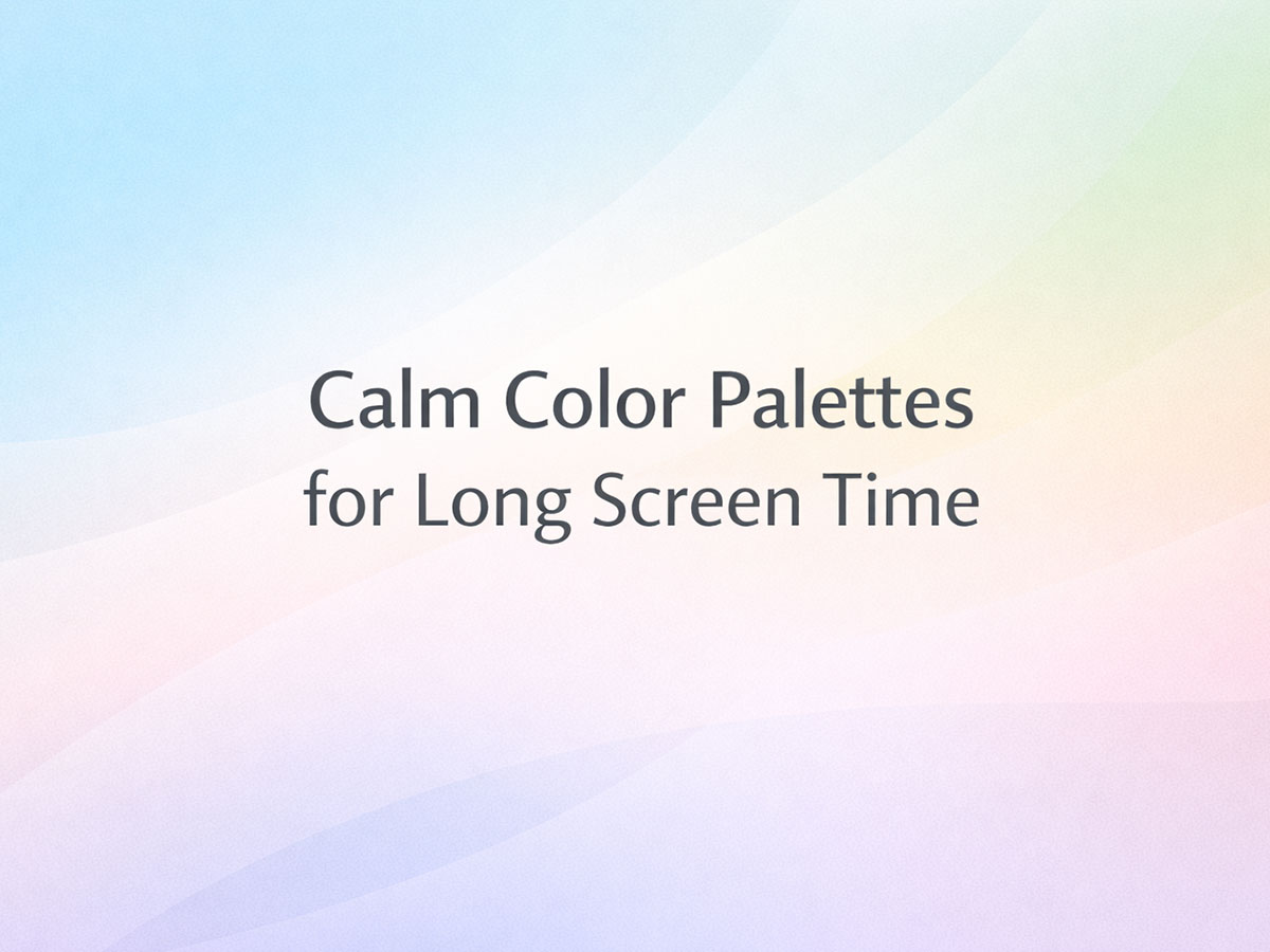
Calm Color Palettes for Long Screen Time
Spending hours on screens is no longer optional.
Work, study, reading, planning, and even creativity now happen in front of glowing displays.
When screen time increases, color comfort matters more than aesthetics.
This guide explores calm color palettes designed for long screen sessions—palettes that reduce fatigue, maintain clarity, and feel comfortable over time without sacrificing usability or personality.
What “Calm” Means in Color Design (For Long Use)
Calm does not mean dull or colorless.
For long screen time, calm palettes typically:
Avoid extreme brightness (
#FFFFFF)Limit harsh contrast spikes
Use muted or softened hues
Maintain predictable hierarchy
These palettes help the eyes and brain settle into sustained focus rather than constantly re-adjust.
This builds directly on
→ Why Pure White Backgrounds Can Be Visually Harmful
Key Principles of Calm Color Schemes for Long Screen Time
1. Softer Backgrounds Over Pure White
Off-whites and light neutrals reduce glare while preserving clarity.
Examples:
#FAF9F6#F6F8FA#F2F2F2
These backgrounds appear clean but feel noticeably calmer over time.
#FAF9F6
#F6F8FA
#F2F2F2
2. Anchored Dark Tones (Instead of Pure Black)
Replacing pure black text with deep neutrals reduces edge sharpness.
Better alternatives:
Charcoal (#2E2E32)
Deep slate (#2C3440)
Ink blue (#2F3E4E)
This approach improves readability during long reading sessions.
#2E2E32
#2C3440
#2F3E4E
3. Limited, Purposeful Color Variation
Too many colors increase cognitive load.
Calm palettes typically use:
1 light base
1 deep anchor
1 muted supporting hue (optional)
This aligns with
→ What Makes a Color Palette Cognitively Accessible?
Calm Color Palettes (Preview-Ready Examples)
These palettes are general-use and suitable for websites, apps, documents, reading interfaces, dashboards, and digital tools.
1. Soft Ivory, Ink Blue & Slate
Soft Ivory —
#FAF9F6Ink Blue —
#2F3E4ESlate —
#6B7280
Why it’s calm:
Low glare, strong hierarchy, no harsh contrast.
#FAF9F6
#2F3E4E
#6B7280
2. Cool Off-White, Charcoal & Mist Blue
Cool Off-White —
#F6F8FACharcoal —
#2E2E32Mist Blue —
#8FA9C4
Why it’s calm:
Cool tones reduce eye strain during extended focus.
#F6F8FA
#2E2E32
#8FA9C4
3. Light Stone, Forest Grey & Soft Sage
Light Stone —
#F1EEE9Forest Grey —
#3A4A42Soft Sage —
#9FB6A8
Why it’s calm:
Natural tones help maintain mental stability over long sessions.
#F1EEE9
#3A4A42
#9FB6A8
4. Pale Grey, Deep Navy & Muted Steel
Pale Grey —
#F2F2F2Deep Navy —
#1F2A35Muted Steel —
#7D8A91
Why it’s calm:
Balanced contrast without visual aggression.
#F2F2F2
#1F2A35
#7D8A91
5. Warm Paper, Cocoa Brown & Dusty Blue
Warm Paper —
#F7F3EDCocoa Brown —
#4A3B34Dusty Blue —
#6B86A5
Why it’s calm:
Warm base prevents fatigue, cool accent adds clarity.
#F7F3ED
#4A3B34
#6B86A5
6. Soft Linen, Graphite & Cloud Blue
Soft Linen —
#F4F1ECGraphite —
#30343ACloud Blue —
#A2B6C8
Why it’s calm:
Neutral warmth with a restrained cool accent keeps attention stable.
#F4F1EC
#30343A
#A2B6C8
7. Pale Pearl, Deep Slate & Cool Mist
Pale Pearl —
#F3F4F6Deep Slate —
#2C3440Cool Mist —
#9FAFBF
Why it’s calm:
Clean, structured, and easy on the eyes during long reading sessions.
#F3F4F6
#2C3440
#9FAFBF
8. Warm Paper, Olive Grey & Ink Green
Warm Paper —
#F6F2EAOlive Grey —
#6E7466Ink Green —
#2F3F37
Why it’s calm:
Earth-based tones feel grounding without becoming dull.
#F6F2EA
#6E7466
#2F3F37
9. Light Fog, Blue Charcoal & Soft Steel
Light Fog —
#F1F3F5Blue Charcoal —
#28333FSoft Steel —
#7E8A94
Why it’s calm:
Cool neutrals reduce eye strain in data-heavy environments.
#F1F3F5
#28333F
#7E8A94
10. Cream White, Cocoa & Muted Teal
Cream White —
#FAF6EFCocoa —
#4B3A32Muted Teal —
#5F8C8A
Why it’s calm:
Warm base with a soft accent prevents visual monotony.
#FAF6EF
#4B3A32
#5F8C8A
11. Off-White, Forest Slate & Sage Grey
Off-White —
#F7F8F4Forest Slate —
#2F3D38Sage Grey —
#9BAFA6
Why it’s calm:
Natural hues support long focus without distraction.
#F7F8F4
#2F3D38
#9BAFA6
12. Soft Chalk, Ink Navy & Powder Blue
Soft Chalk —
#F5F7FAInk Navy —
#1F2A3APowder Blue —
#9FBAD1
Why it’s calm:
Clear hierarchy without harsh brightness.
#F5F7FA
#1F2A3A
#9FBAD1
13. Pale Sand, Ash Brown & Dusty Sky
Pale Sand —
#F4EFE6Ash Brown —
#6A5A4FDusty Sky —
#7F99B2
Why it’s calm:
Warm neutrals balance cool accents for extended use.
#F4EFE6
#6A5A4F
#7F99B2
14. Light Stone, Charcoal Green & Mint Grey
Light Stone —
#EFECE6Charcoal Green —
#2E403AMint Grey —
#A8C1B8
Why it’s calm:
Soft contrast reduces visual pressure.
#EFECE6
#2E403A
#A8C1B8
15. Cool Ivory, Night Blue & Steel Grey
Cool Ivory —
#FAFBFCNight Blue —
#253241Steel Grey —
#8A94A1
Why it’s calm:
Excellent for text-heavy layouts and dashboards.
#FAFBFC
#253241
#8A94A1
16. Warm Linen, Deep Plum & Fog Grey
Warm Linen —
#F7F1E9Deep Plum —
#3E2C3AFog Grey —
#9C9AA1
Why it’s calm:
Adds subtle personality without visual noise.
#F7F1E9
#3E2C3A
#9C9AA1
17. Soft Grey, Ocean Ink & Muted Aqua
Soft Grey —
#F2F4F6Ocean Ink —
#263C4AMuted Aqua —
#8FB3B1
Why it’s calm:
Cool balance for long analytical work.
#F2F4F6
#263C4A
#8FB3B1
18. Paper White, Bark Brown & Cool Sage
Paper White —
#FBF8F3Bark Brown —
#4F3F34Cool Sage —
#9EB4A6
Why it’s calm:
Natural contrast without glare.
#FBF8F3
#4F3F34
#9EB4A6
19. Pale Cloud, Slate Navy & Silver Blue
Pale Cloud —
#EEF1F5Slate Navy —
#2A3645Silver Blue —
#9AAEC2
Why it’s calm:
Soft, modern, and fatigue-resistant.
#EEF1F5
#2A3645
#9AAEC2
20. Soft Ecru, Graphite Blue & Drift Grey
Soft Ecru —
#F5F2ECGraphite Blue —
#2F3A45Drift Grey —
#8E949B
Why it’s calm:
Stable contrast for extended screen exposure.
#F5F2EC
#2F3A45
#8E949B
Light Mode vs Calm Mode (Important Distinction)
Many people assume:
Light mode = white background
That is not true.
A calm light mode:
Uses softened whites
Controls contrast
Reduces glare
This naturally leads into:
→ Dark Mode vs Light Mode: Accessibility and Sensory Comfort
Who Benefits Most From Calm Screen Palettes?
Knowledge workers
Students
Readers and writers
Developers and designers
Neurodivergent users
Anyone spending 6+ hours on screens
This connects with:
→ Autism-Friendly Color Palettes
→ ADHD-Friendly Color Schemes for Better Focus
When Calm Palettes Are Not Ideal
Calm palettes are not always the right choice for:
High-energy marketing pages
Short-term attention capture
Loud brand expressions
Design is contextual. Comfort should match purpose.
How to Choose the Right Calm Palette
Ask:
How long will users look at this?
Is focus more important than impact?
Will content density be high?
If the answer is “yes,” calm palettes outperform pure white designs.
Final Note
Calm color palettes are not about aesthetics alone.
They are about respecting time, attention, and human perception.
That makes them essential—not optional—for long screen use.
FAQs
1. What makes a color palette suitable for long screen time?
Palettes designed for long screen use minimize visual stress by avoiding extreme contrast, harsh saturation, and pure white backgrounds. They typically use softened neutrals, controlled chroma, and predictable color relationships that allow the eyes to rest rather than constantly refocus.
2. Are these palettes only for websites and apps?
No. While they work exceptionally well for UI and web interfaces, these palettes are equally effective for documents, dashboards, design systems, presentations, e-readers, and any environment involving prolonged visual attention.
3. Is dark mode always better for long screen time?
Not necessarily. Dark mode can reduce glare in low-light conditions, but poorly tuned dark palettes can cause halation, eye strain, and focus loss. Well-balanced light or mid-tone palettes are often more comfortable for extended daytime use.
4. Why are overly bright or saturated colors tiring?
Highly saturated colors demand more cognitive and visual processing. Over time, this leads to faster fatigue, reduced comprehension, and difficulty maintaining focus—especially when used for large background areas or primary reading surfaces.
5. How do calm palettes differ from accessibility contrast guidelines?
Accessibility contrast ensures readability. Calm palettes go a step further by optimizing comfort over time, not just legibility. A palette can technically pass contrast ratios and still feel exhausting during long sessions.
6. Can calm palettes improve productivity?
Yes. Reducing visual noise lowers cognitive load. Users tend to read longer, make fewer errors, and maintain focus better when the visual environment is stable and non-aggressive.
7. What should I avoid when designing for long screen use?
Avoid:
Pure white (#FFFFFF) backgrounds
Pure black text on white
Neon or fully saturated colors
Excessive color variety
High-contrast color clashes
Comfort comes from restraint, not visual intensity.