Color Contrast Ratio Explained: What It Is and Why It Matters
When people talk about website accessibility, design clarity, or readability, color contrast ratio is always part of the discussion. Yet many designers apply it blindly—checking a score without truly understanding what it means.
This guide explains what color contrast ratio actually is, how it works, why it matters for real users (not just compliance), and how to apply it correctly in web design.
What Is Color Contrast Ratio?
Color contrast ratio measures the difference in brightness between two colors—most commonly text and its background.
It is written as a ratio, for example:
4.5:1
7:1
21:1 (maximum contrast: black on white)
The higher the ratio, the easier it is for the human eye to distinguish the foreground from the background.
Contrast ratio is not subjective. It is calculated using relative luminance, which considers how bright a color appears to the human eye—not just its HEX or RGB values.
How Color Contrast Ratio Is Calculated (Simply Explained)
Color contrast ratio is calculated by comparing how bright two colors appear on a screen—not just their HEX values.
Every color has a relative luminance value:
0 represents pure black
1 represents pure white
The calculation always compares:
the lighter color
against the darker color
The standard formula looks like this:
(Lighter Color + 0.05) ÷ (Darker Color + 0.05)
You do not need to memorize or manually use this formula. It exists to ensure consistency across screens and devices.
Simple Examples
White
#FFFFFFon Black#000000
Contrast Ratio: 21:1 (maximum possible contrast)Blue
#2563EBon White#FFFFFF
Contrast Ratio: ≈ 4.6:1 (acceptable for normal text)
Higher numbers mean better readability. Lower numbers mean text may be difficult to read, especially for users with low vision.
Do You Need to Calculate This Yourself?
No.
Manual calculation is impractical and unnecessary. Instead, use a contrast testing tool that:
Calculates the ratio instantly
Shows whether text is readable
Flags accessibility issues clearly
You can test any text and background combination using your Color Contrast Checker & Generator, which automatically calculates contrast ratios and helps you choose safer color pairs.
Why Color Contrast Ratio Matters (Beyond Accessibility)
Contrast ratio is often discussed only in the context of WCAG compliance, but its impact goes much further.
1. Readability and Eye Strain
Low contrast forces users to strain their eyes, especially on:
Long articles
Mobile screens
Bright environments
Even users without visual impairments benefit from proper contrast.
2. Bounce Rate and Content Engagement
If text is hard to read, users leave quickly. Poor contrast:
Increases bounce rate
Reduces time on page
Hurts content performance
Good contrast keeps users reading.
3. Buttons, Links, and Conversion Clarity
CTAs with weak contrast blend into the background.
Example:
Poor contrast CTA: Light blue button on white
Strong contrast CTA: Blue
#2563EBbutton on white with white text
Contrast directly affects click-through rates.
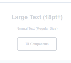
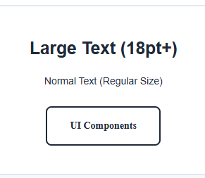
Common Contrast Ratio Levels You Should Know
1:1 – 2:1 (Very Low Contrast)
Decorative use only
Never suitable for text
3:1 (Large Text Minimum)
Acceptable for:
Large headings
Bold UI labels
4.5:1 (Standard Text Threshold)
Safe for:
Body text
Paragraphs
Navigation menus
7:1 (High Readability)
Ideal for:
Long-form content
Accessibility-focused websites
Educational platforms
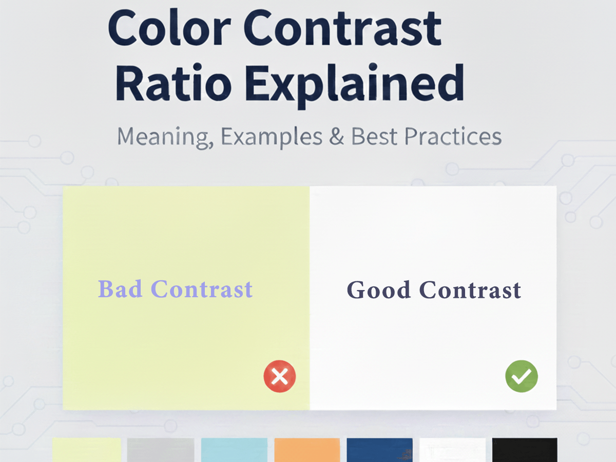
Real Examples of Good vs Poor Contrast
Poor Contrast Example
Text: Light grey
#D1D5DBBackground: White
#FFFFFFResult: Hard to read, fails usability expectations
Good Contrast Example
Text: Dark slate
#1F2937Background: White
#FFFFFFResult: Clear, professional, readable
Contrast Ratio and Color Codes (HEX, RGB, HSL)
Contrast is independent of the color format you use:
HEX
RGB / RGBA
HSL / HSLA
What matters is the final displayed color on screen.
If you are converting colors between formats, ensure the contrast remains sufficient after conversion.You can convert and compare colors using your All Color Code Converter tool if you are working across different color systems.
Contrast Ratio vs Accessibility Guidelines (How They Connect)
This article focuses on what contrast ratio is and why it matters.
If you want to understand:
WCAG contrast thresholds
Accessibility compliance
Inclusive design standards
You can read the dedicated guide:
How to Choose Accessible Colors for Websites (WCAG Explained Simply)
Where Designers Commonly Get Contrast Wrong
Using brand colors without testing contrast
Relying on color alone to convey meaning
Designing in perfect lighting conditions only
Forgetting hover and disabled states
Contrast must be tested in real use scenarios, not just design previews.
Best Practice Checklist for Contrast Ratio
Always test text against its background
Check CTAs separately from body text
Test hover and focus states
Recheck contrast after color conversion
Prioritize clarity over decoration
Frequently Asked Questions (FAQ)
What is color contrast ratio?
Color contrast ratio measures the visual difference between two colors, usually text and its background. It shows how easily content can be read on a screen.
Why is color contrast ratio important?
Good contrast improves readability, reduces eye strain, helps users with low vision, and makes websites easier to use for everyone—not just for accessibility compliance.
What is a good contrast ratio for text?
For normal body text, a contrast ratio of 4.5:1 or higher is recommended. Larger text can be readable at 3:1, while 7:1 offers excellent clarity.
Does color contrast affect SEO?
Indirectly, yes. Poor contrast can increase bounce rates and reduce engagement, while good readability improves user experience—signals Google values.
Is contrast ratio only for accessibility?
No. While it is part of accessibility standards, contrast ratio also affects design quality, conversion rates, and overall usability.
How can I check color contrast on my website?
You can use a color contrast checker tool to instantly test text and background colors and see whether they meet readability and accessibility standards.
Does contrast ratio depend on HEX, RGB, or HSL?
No. Contrast ratio depends on how colors appear on screen, not on the color format used. HEX, RGB, and HSL all calculate contrast the same way visually.
Final Thoughts
Color contrast ratio is not about limiting creativity. It is about clarity, usability, and trust.
When contrast is right:
Content feels effortless to read
Interfaces feel intentional
Users stay longer and engage more
Understanding contrast ratio gives you control—not restrictions—over your color decisions.