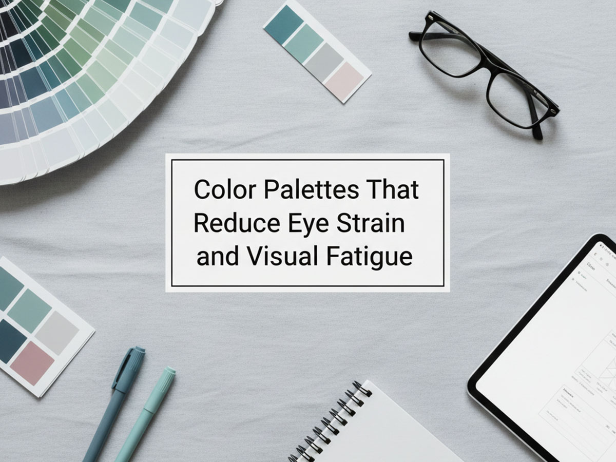
Color Palettes That Reduce Eye Strain and Visual Fatigue
Spending long hours on screens is now normal for designers, students, and office workers. While screen brightness and font size matter, color palette choices have a direct impact on how tiring an interface feels over time.
This guide focuses on specific color palettes that reduce eye strain, explains why they work, and shows how to use them effectively in digital design.
Why Some Color Palettes Cause Eye Strain
Eye strain in digital interfaces is often caused by:
Excessive brightness (especially pure white backgrounds)
Extreme contrast across large areas
Overuse of saturated colors
Too many competing hues on a single screen
These issues increase visual tension and cognitive effort, especially during long sessions.
The underlying principles are explained in What Makes a Color Palette Cognitively Accessible? — this article focuses on practical palette examples.
Characteristics of Eye-Strain-Reducing Color Palettes
Palettes that are comfortable for long use typically:
Use soft or off-white backgrounds
Maintain moderate contrast, not maximum contrast everywhere
Limit saturation
Use consistent, predictable color roles
Now let’s look at actual palettes you can preview and reuse.
1. Soft Neutral Workspace Palette
Best for: dashboards, blogs, productivity tools, long reading
Hex codes:
Background:
#F4F5F7Primary text:
#2E3440Secondary text:
#6B7280Accent:
#4C6FFF
Why this reduces eye strain
Off-white background reduces glare
Dark gray text is softer than pure black
Accent color is muted, not overpowering
#F4F5F7
#2E3440
#6B7280
#4C6FFF
2. Warm Light Reading Palette
Best for: articles, documentation, learning platforms
Hex codes:
Background:
#FAF7F2Primary text:
#3A3A3ASecondary text:
#7A7A7AAccent:
#C08457
Why this reduces eye strain
Warm background mimics paper tones
Reduces harsh light compared to cool whites
Earthy accent avoids visual shock
This palette works especially well for reading-heavy layouts.
#FAF7F2
#3A3A3A
#7A7A7A
#C08457
3. Calm Olive Interface Palette
Best for: Productivity apps, writing tools, knowledge bases
Hex codes:
Background:
#FAFAF7Primary text:
#1F2933Secondary text:
#6B7C5DAccent:
#6B7C5D
Why this reduces eye strain
Earth-toned accent avoids visual spikes
Unified secondary + accent role keeps focus steady
Natural hues feel less artificial on long sessions
This palette aligns well with the principles discussed in Neurodiversity and Color Accessibility: A Practical Guide for Designers.
#FAFAF7
#1F2933
#6B7C5D
#6B7C5D
4. Low-Contrast Dark Comfort Palette
Best for: night mode, low-light environments
Hex codes:
Background:
#1E1E1ESurface:
#252526Primary text:
#D1D5DBAccent:
#60A5FA
Why this reduces eye strain
Avoids pure black, which can feel harsh
Text contrast is sufficient but not extreme
Accent color is soft and limited in use
This is an example of comfort-first dark mode, not high-contrast dark mode.
More context on this appears in Dark Mode vs Light Mode: Accessibility and Sensory Comfort.
#1E1E1E
#252526
#D1D5DB
#60A5FA
5. Minimal Pastel Balance Palette
Best for: creative tools, lifestyle apps, calm branding
Hex codes:
Background:
#F8FAFCPrimary text:
#334155Secondary text:
#64748BAccent:
#A5B4FC
Why this reduces eye strain
Pastels are desaturated and soft
Very low visual noise
Ideal for prolonged casual browsing
This palette pairs well with the ideas in Calm Color Palettes for Long Screen Time.
#F8FAFC
#334155
#64748B
#A5B4FC
6. Soft Beige Reading Palette
Best for: blogs, ebooks, long-form articles
Hex codes:
Background:
#F6F1EBPrimary text:
#3B3B3BSecondary text:
#7A6F66Accent:
#B08968
Why this reduces eye strain
Beige background reduces brightness without feeling gray
Warm tones are easier for prolonged reading
Accent color is subtle and non-distracting
#F6F1EB
#3B3B3B
#7A6F66
#B08968
7. Gentle Green Calm Palette
Best for: wellness apps, dashboards, focus tools
Hex codes:
Background:
#F2F7F4Primary text:
#1F2933Secondary text:
#5F6F68Accent:
#6FAF98
Why this reduces eye strain
Green hues are naturally calming
Low saturation prevents overstimulation
Works well for anxiety-free interfaces
#F2F7F4
#1F2933
#5F6F68
#6FAF98
8. Soft Blue Document Palette
Best for: documentation, knowledge bases, admin panels
Hex codes:
Background:
#F1F5F9Primary text:
#1E293BSecondary text:
#64748BAccent:
#38BDF8
Why this reduces eye strain
Blue-tinted neutrals reduce harsh contrast
Familiar, predictable hierarchy
Accent is bright but used sparingly
#F1F5F9
#1E293B
#64748B
#38BDF8
9. Muted Lavender Comfort Palette
Best for: creative platforms, note-taking apps
Hex codes:
Background:
#F5F3F7Primary text:
#2E2A32Secondary text:
#6B6673Accent:
#9F8FEF
Why this reduces eye strain
Lavender tones are calming without being cold
Avoids aggressive contrast
Visually soft but still modern
#F5F3F7
#2E2A32
#6B6673
#9F8FEF
10. Warm Gray Office Palette
Best for: enterprise software, internal tools
Hex codes:
Background:
#F3F4F6Primary text:
#262626Secondary text:
#6B7280Accent:
#6366F1
Why this reduces eye strain
Neutral and predictable
No color fights for attention
Ideal for 8+ hour daily use
#F3F4F6
#262626
#6B7280
#6366F1
11. Low-Stimulus Earth Palette
Best for: productivity apps, task managers
Hex codes:
Background:
#F4F3EFPrimary text:
#3A3A32Secondary text:
#7B7B6AAccent:
#A3B18A
Why this reduces eye strain
Earth tones reduce sensory tension
Feels grounded and stable
Accent blends naturally with neutrals
#F4F3EF
#3A3A32
#7B7B6A
#A3B18A
12. Soft Teal Focus Palette
Best for: analytics dashboards, study tools
Hex codes:
Background:
#F0F7F6Primary text:
#0F2A2ASecondary text:
#4F7A7AAccent:
#4DB6AC
Why this reduces eye strain
Teal is calming without being dull
Strong clarity without harsh contrast
Maintains focus over long sessions
#F0F7F6
#0F2A2A
#4F7A7A
#4DB6AC
13. Gentle Peach Light Palette
Best for: lifestyle blogs, content-heavy sites
Hex codes:
Background:
#FFF4EEPrimary text:
#3A2F2ASecondary text:
#8A6F63Accent:
#F4A261
Why this reduces eye strain
Warm, soft background reduces glare
Pleasant for reading without distraction
Accent color is friendly, not loud
#FFF4EE
#3A2F2A
#8A6F63
#F4A261
14. Muted Olive Neutral Palette
Best for: forms, settings pages, utilities
Hex codes:
Background:
#F2F3EDPrimary text:
#2F332ESecondary text:
#6B7268Accent:
#8DAA91
Why this reduces eye strain
Olive tones are naturally subdued
Excellent for repetitive interactions
Reduces visual fatigue over time
#F2F3ED
#2F332E
#6B7268
#8DAA91
15. Soft Slate UI Palette
Best for: SaaS products, professional tools
Hex codes:
Background:
#F8FAFCPrimary text:
#0F172ASecondary text:
#64748BAccent:
#64748B
Why this reduces eye strain
Extremely low visual noise
Consistent color roles
Ideal for information-dense layouts
#F8FAFC
#0F172A
#64748B
#64748B
16. Calm Sky Pastel Palette
Best for: education platforms, onboarding flows
Hex codes:
Background:
#F3F8FFPrimary text:
#1E293BSecondary text:
#5B6B88Accent:
#93C5FD
Why this reduces eye strain
Pastel blue feels light, not glaring
Encourages calm focus
Safe for long reading sessions
#F3F8FF
#1E293B
#5B6B88
#93C5FD
17. Soft Brown Paper Palette
Best for: writing apps, reading modes
Hex codes:
Background:
#FBF7F2Primary text:
#3E2F2ASecondary text:
#7C6A63Accent:
#C89B7B
Why this reduces eye strain
Mimics paper-like warmth
Reduces brightness fatigue
Comfortable for extended writing
#FBF7F2
#3E2F2A
#7C6A63
#C89B7B
18. Low-Contrast Dark Gray Palette
Best for: dark mode productivity apps
Hex codes:
Background:
#202124Surface:
#2A2B2EPrimary text:
#E5E7EBAccent:
#8AB4F8
Why this reduces eye strain
Avoids pure black
Text contrast is controlled, not harsh
Easier on eyes than high-contrast dark modes
#202124
#2A2B2E
#E5E7EB
#8AB4F8
19. Muted Rose Neutral Palette
Best for: creative dashboards, personal tools
Hex codes:
Background:
#F7F2F4Primary text:
#2F2A2DSecondary text:
#6F5E66Accent:
#C08497
Why this reduces eye strain
Soft warmth without saturation
Emotionally calm, visually gentle
Works well for prolonged casual use
#F7F2F4
#2F2A2D
#6F5E66
#C08497
20. Ultra-Minimal Off-White Palette
Best for: reading modes, distraction-free layouts
Hex codes:
Background:
#FAFAFAPrimary text:
#1F1F1FSecondary text:
#737373Accent:
#A3A3A3
Why this reduces eye strain
Minimal contrast variation
Extremely predictable
Designed for long, uninterrupted sessions
#FAFAFA
#1F1F1F
#737373
#A3A3A3
How to Use These Palettes Without Causing Fatigue
Even good palettes can cause strain if misused. Follow these rules:
Do not overuse accent colors
Avoid large blocks of saturated color
Maintain consistent color roles
Test palettes in real layouts, not just swatches
If a palette feels “loud” after five minutes, it will feel exhausting after one hour.
Quick Eye-Strain Checklist for Designers
Before publishing a design, ask:
Is the background softer than pure white or black?
Are accent colors used sparingly?
Does the interface still work in grayscale?
Does the palette feel calm after prolonged viewing?
If yes, you are on the right track.
What to Read Next
Continue with:
Each article explores one dimension of comfort-focused color design.
Final Thoughts
Reducing eye strain is not about removing color — it is about choosing colors that respect long-term use.
By using soft backgrounds, controlled contrast, and restrained accents, designers can create palettes that remain comfortable hours after the first impression.
These palettes are not just accessible — they are sustainable.
FAQs
Can color palettes really reduce eye strain?
Yes, well-balanced color palettes with low contrast extremes, muted tones, and softer backgrounds can reduce visual fatigue during prolonged screen use.
Are dark color palettes better for eye strain?
Not always. Poorly designed dark palettes can increase eye strain. Neutral dark backgrounds paired with soft, low-saturation text colors tend to work best.
What colors are easiest on the eyes?
Soft neutrals, muted blues, sage greens, warm grays, and off-whites are generally considered easier on the eyes than pure white or highly saturated colors.
Are these palettes suitable for neurodiverse users?
Many of these palettes are designed to reduce sensory overload, making them more comfortable for users with ADHD, autism, or visual sensitivity.
Can I use these palettes for websites and apps?
Yes. These palettes are suitable for UI design, dashboards, reading interfaces, productivity tools, and educational platforms.
Do these palettes meet WCAG contrast standards?
Some do, some may require adjustment. Always test text contrast using a contrast checker before final implementation.