Common Website Color Mistakes That Hurt Readability (And How to Fix Them)

Common Website Color Mistakes

Common Website Color Mistakes That Hurt Readability (And How to Fix Them)

Many websites look visually appealing at first glance but fail at something far more important: readability.
Users do not leave because a website lacks style—they leave because content is uncomfortable to read or interact with.

Most readability issues are not caused by poor typography or layout. They are caused by color mistakes that are easy to overlook and even easier to fix.

This guide breaks down the most common website color mistakes that hurt readability and explains how to correct them without redesigning your entire site.

Why Readability Matters More Than Aesthetics

Readability determines:

  • How long users stay on your website

  • Whether content feels effortless or exhausting

  • How clearly actions and information are understood

Good color choices reduce cognitive load. Bad ones force users to work harder just to read.

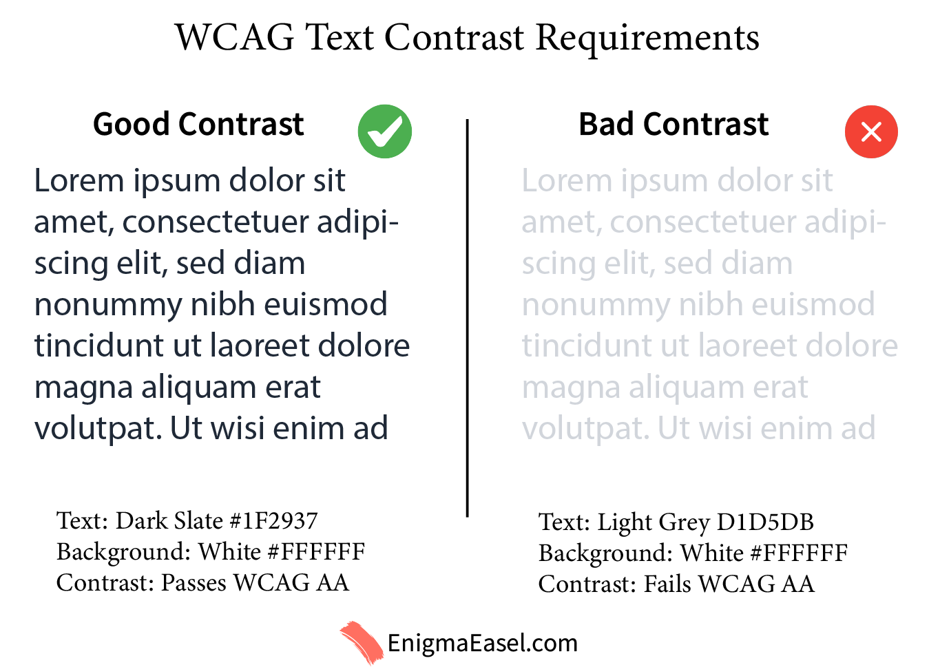
Mistake #1: Low-Contrast Text on Light Backgrounds

This is the most common and most damaging mistake.

The problem

Designers often use light grey text on white backgrounds because it looks “modern” and minimal.

Example:

  • Text: #D1D5DB

  • Background: #FFFFFF

This combination looks clean but lacks enough contrast, especially for long-form content.

Why it hurts readability

  • Text blends into the background

  • Causes eye strain

  • Becomes unreadable in bright environments

How to fix it

Use darker text colors that maintain visual softness without sacrificing contrast.

Better example:

  • Text: #1F2937

  • Background: #FFFFFF

Low Vs High Contrast Text

If you want to understand why contrast matters technically, see
Color Contrast Ratio Explained: What It Is and Why It Matters.

Mistake #2: Using Color Alone to Communicate Meaning

The problem

Many websites rely only on color to indicate:

  • Errors (red)

  • Success (green)

  • Warnings (yellow)

This fails for users with color vision deficiencies.

Why it hurts readability

Color alone does not communicate context clearly for everyone.

How to fix it

Always pair color with:

  • Text labels

  • Icons

  • Structural cues

Example:

  • Error text: Red #DC2626 + “Error:” label

  • Success message: Green #16A34A + checkmark icon

This improves clarity without changing your design language.

Mistake #3: Bright Colors on Bright Backgrounds

The problem

Highly saturated colors used on light backgrounds often lack contrast.

Example:

  • Yellow: #FACC15

  • Background: #FFFFFF

Why it hurts readability

Brightness does not equal contrast. Some bright colors have low luminance difference from white.

How to fix it

Use bright colors for:

  • Buttons

  • Accents

  • Highlights

Not for body text.

If a bright color must be used for text, darken it:

  • Dark amber: #B45309 instead of #FACC15

Mistake #4: Too Many Accent Colors Competing for Attention

The problem

Using multiple accent colors without hierarchy creates visual noise.

Example:

  • Blue links

  • Green buttons

  • Orange highlights

  • Red warnings

Why it hurts readability

Users cannot distinguish what is important.

How to fix it

Limit accent colors:

  • One primary accent

  • One secondary accent

  • One status color (error/success)

Example structure:

  • Primary CTA: Blue #2563EB

  • Secondary action: Slate #475569

  • Alerts: Red #DC2626

Consistency improves both readability and usability.

Mistake #5: Ignoring Button and Link Contrast

The problem

Buttons and links often fail contrast requirements even when text is readable.

Example:

  • Light blue button on white

  • Grey links without underlines

Why it hurts readability

Users miss important actions or struggle to identify interactive elements.

How to fix it

Ensure buttons and links:

  • Stand out from the background

  • Have readable text

  • Are visually distinct even without color

Example:

  • Button background: #2563EB

  • Button text: #FFFFFF

If you are unsure, testing button contrast is quick and reliable using a color contrast checker.

Mistake #6: Forgetting Hover, Focus, and Disabled States

The problem

Designs often look fine in their default state but fail in interaction states.

Why it hurts readability

Users navigating with keyboards or assistive technologies rely on visible focus indicators.

How to fix it

Test all states:

  • Hover

  • Focus

  • Active

  • Disabled

Example:

  • Focus outline: #93C5FD

  • Disabled text: #9CA3AF on #E5E7EB

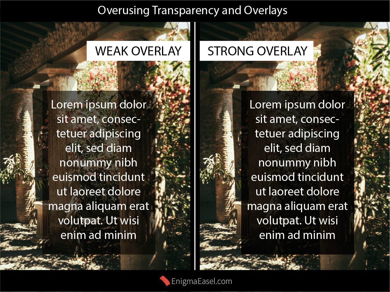
Mistake #7: Overusing Transparency and Overlays

The problem

Text placed over images or gradients with opacity overlays often loses contrast.

Example:

  • White text with 60% black overlay

  • Background image varies in brightness

Why it hurts readability

Contrast changes depending on the image behind the text.

How to fix it

  • Increase overlay opacity

  • Use solid background sections for text

  • Avoid placing long text over images

WCAG Image Transparency Overlay

How to Fix Most Color Readability Issues Quickly

You do not need to redesign your website.

Start with:

  • Testing text/background contrast

  • Fixing body text first

  • Adjusting CTAs and links

  • Reducing unnecessary colors

A dedicated contrast tool can instantly identify problem areas and suggest better combinations.

Frequently Asked Questions (FAQ)

What is the most common website color mistake?

The most common mistake is using low-contrast text, such as light grey text on a white background. It looks modern but significantly reduces readability, especially for long content.


How do colors affect website readability?

Colors affect readability by influencing contrast, eye strain, and visual hierarchy. Poor color choices make text harder to scan and increase cognitive load for users.


What text color is best for readability on white backgrounds?

Dark neutral colors like deep gray or near-black work best. Pure black can feel harsh, while very light grey lacks sufficient contrast.


Do bright colors reduce readability?

Bright colors can reduce readability when used for body text or placed on light backgrounds. They work better as accents, buttons, or highlights rather than main text.


How many colors should a readable website use?

Most readable websites use:

  • One primary color

  • One secondary accent

  • Neutral background and text colors
    Too many competing colors reduce clarity and focus.


Does color contrast affect SEO?

Indirectly, yes. Poor readability increases bounce rates and reduces time on page, which can negatively impact user engagement signals important for SEO.


Are accessibility color standards really necessary?

Yes. Accessibility standards such as WCAG contrast ratios ensure content is readable for all users, including those with visual impairments or color blindness.

Final Thoughts

Readable websites feel effortless. Users should not notice colors—they should notice clarity.

Most color-related readability problems come from:

  • Assumptions

  • Trends

  • Untested design choices

Fixing them does not reduce creativity. It improves usability, trust, and engagement.

If you understand contrast and apply color intentionally, your website will feel better instantly—without looking “less designed.”

Leave a Reply

Shopping cart

0
image/svg+xml

No products in the cart.

Continue Shopping
TOC