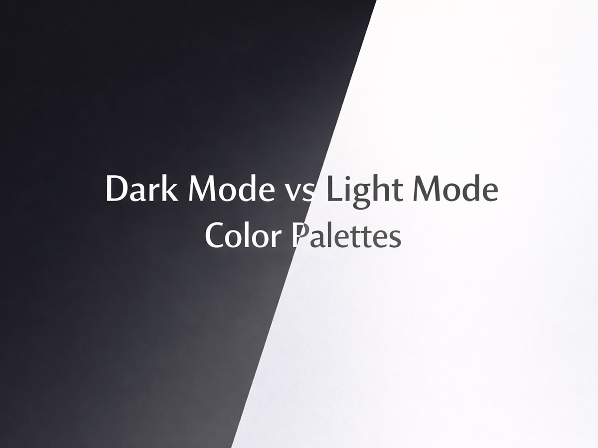
Dark Mode vs Light Mode Color Palettes: Accessibility and Sensory Comfort
Dark mode and light mode are often treated like a binary choice: one is “modern,” the other is “traditional.”
In reality, neither mode is universally better for accessibility or comfort.
Sensory comfort depends on context, task type, environment, and individual perception. For some users, dark mode reduces glare. For others, it increases visual strain. Light mode can feel clean and readable—or harsh and fatiguing if poorly designed.
This article explains when each mode works, when it fails, and how to design both responsibly, especially for users sensitive to visual stimulation.
Why This Debate Exists in the First Place
Dark mode became popular for three main reasons:
Reduced screen brightness in low-light environments
Battery savings on OLED screens
Aesthetic preference
Light mode, however, remains dominant because:
Text is often more readable on light backgrounds
Most print-based reading habits favor light surfaces
High-contrast dark text on light backgrounds supports clarity
The conflict arises because accessibility is not about preference, but about how the visual system processes contrast, luminance, and color relationships.
Accessibility Is Not About Dark vs Light — It’s About Contrast Control
A common misconception is that dark mode is “more accessible.”
In practice, accessibility depends on how contrast is managed, not which mode is chosen.
Poor examples in both modes:
Pure white backgrounds (#FFFFFF) with pure black text (#000000)
Extremely dark backgrounds with overly bright text
Neon accents that dominate visual hierarchy
Better accessibility comes from controlled contrast, as explained in:
→ What Makes a Color Palette Cognitively Accessible?
When Light Mode Works Better
Light mode tends to perform well when:
Reading long-form content
Working in bright or daylight environments
Scanning dense information (tables, dashboards, articles)
Common Light Mode Mistakes
Using pure white instead of soft off-whites
Excessive contrast between text and background
Cool whites that feel sterile or glaring
This is why:
→ Why Pure White Backgrounds Can Be Visually Harmful
is an essential companion article.
Light Mode Done Right
Accessible light mode usually uses:
Off-white or light neutral backgrounds
Dark gray text instead of pure black
Muted accent colors
This approach aligns with:
→ Calm Color Palettes for Long Screen Time
When Dark Mode Works Better
Dark mode can be beneficial when:
Used in low-light environments
Viewing content briefly rather than reading for hours
Reducing perceived brightness late at night
However, dark mode is not automatically easier on the eyes.
Common Dark Mode Pitfalls
Text that is too bright or too thin
Pure black backgrounds causing halation
High-saturation accent colors that “vibrate” against dark surfaces
For users sensitive to sensory overload, this can increase fatigue instead of reducing it.
Light Mode vs Dark Mode: Practical Color Palette Examples
These palettes show how sensory comfort changes based on execution, not mode choice.
Light Mode Palettes (Comfort-Focused)
1. Soft Paper Neutral
Best for: Reading, articles, documentation
Background:
#FAF9F6Text:
#1F2933Muted accent:
#6B7280Soft highlight:
#E5E7EB
Why it works
No pure white
Calm contrast
Familiar “paper-like” feel
2. Warm Minimal Light
Best for: Long work sessions, dashboards
Background:
#F4F1ECText:
#2B2B2BSecondary tone:
#8A857CAccent:
#C4B7A6
Why it works
Warmth reduces glare
Predictable hierarchy
Low visual tension
3. Cool Professional Light
Best for: SaaS, productivity tools
Background:
#F6F8FAText:
#0F172ASecondary text:
#475569Accent:
#CBD5E1
Why it works
Controlled cool tones
High clarity without harshness
Scales well for dense information
4. Soft Linen Light
Best for: Long reading, content-heavy pages
Background:
#F7F5F2Text:
#2A2A2ASecondary tone:
#6F6F6FAccent:
#D1C7B8
Why it works
Linen-like warmth
No glare
Familiar reading feel
5. Neutral Stone Light
Best for: Professional tools, documentation
Background:
#F2F3F5Text:
#1F2937Secondary tone:
#4B5563Accent:
#CBD5E1
Why it works
Clean but not sterile
Stable hierarchy
Excellent text clarity
6. Soft Sage Light
Best for: Calm interfaces, wellness tools
Background:
#F4F7F5Text:
#24332ASecondary tone:
#6B7C72Accent:
#C7D4CC
Why it works
Gentle green bias reduces tension
Natural, grounded feel
Low sensory load
7. Warm Paper Beige
Best for: Articles, educational platforms
Background:
#F6F1EAText:
#2B2621Secondary tone:
#7A7268Accent:
#D8CFC4
Why it works
Mimics book paper
Comfortable for hours
Reduces contrast shock
8. Cool Mist Light
Best for: Data-heavy layouts, dashboards
Background:
#F5F8FBText:
#0F172ASecondary tone:
#475569Accent:
#E2E8F0
Why it works
Calm coolness
Strong structure
Minimal distraction
Dark Mode Palettes (Sensory-Safe)
1. Soft Charcoal Dark
Best for: Evening use, low-light environments
Background:
#121417Text:
#E5E7EBSecondary text:
#9CA3AFAccent:
#64748B
Why it works
Avoids pure black
Text is bright, not glowing
Reduced halation
2. Muted Slate Dark
Best for: Focus tools, terminals, creative apps
Background:
#0F172AText:
#E2E8F0Secondary tone:
#94A3B8Accent:
#475569
Why it works
Stable contrast
No aggressive highlights
Predictable visual rhythm
3. Warm Dark Neutral
Best for: Reading at night, calm interfaces
Background:
#181816Text:
#E6E4DFSecondary tone:
#A8A29EAccent:
#78716C
Why it works
Warm darks feel less “empty”
Reduces visual isolation
Comfortable for long sessions
4. Deep Slate Dark
Best for: Developer tools, focus environments
Background:
#0B1220Text:
#E5E7EBSecondary tone:
#94A3B8Accent:
#334155
Why it works
No pure black
Stable contrast
Predictable rhythm
5. Warm Graphite Dark
Best for: Evening reading, writing tools
Background:
#181A1BText:
#E6E6E6Secondary tone:
#A1A1A1Accent:
#6B6B6B
Why it works
Warm dark base
Soft text glow
Reduces halation
6. Muted Navy Dark
Best for: SaaS dashboards, analytics
Background:
#0A2540Text:
#E2E8F0Secondary tone:
#94A3B8Accent:
#1E3A8A
Why it works
Blue bias improves clarity
Professional tone
Calm, not aggressive
7. Olive Charcoal Dark
Best for: Long sessions, creative work
Background:
#151A17Text:
#E3E6E3Secondary tone:
#9AA39CAccent:
#5B6B61
Why it works
Organic dark tone
Reduces visual emptiness
Grounded and stable
8. Soft Ink Dark
Best for: Writing apps, night modes
Background:
#101418Text:
#E8EAEDSecondary tone:
#9AA0A6Accent:
#5F6368
Why it works
Familiar system feel
Balanced contrast
Minimal sensory noise
Dark Mode and Neurodiversity
Different neurodivergent users respond differently to dark mode.
Autism & Sensory Predictability
Some autistic users prefer dark mode because it:
Reduces background brightness
Feels calmer in controlled environments
Others find dark mode destabilizing due to:
Light text “floating” on dark surfaces
Reduced spatial clarity
This variability is discussed further in:
→ Autism-Friendly Color Palettes: Calm, Predictable, and Balanced
ADHD & Focus
For ADHD users:
Dark mode can reduce background noise
But excessive contrast can increase distraction
Balanced, low-saturation palettes tend to perform better, regardless of mode:
→ ADHD-Friendly Color Schemes for Better Focus
Sensory Comfort Depends on Task, Not Mode
Instead of asking “Dark or light?”, designers should ask:
Is the task reading, scanning, or creating?
Is this used briefly or for hours?
Is the environment bright or dim?
Examples:
Long reading → soft light mode or balanced dark mode
Creative tools → neutral, low-stimulation palettes
Monitoring dashboards → controlled contrast, not extremes
This task-based approach mirrors the logic in:
→ Color Palettes That Reduce Eye Strain and Visual Fatigue
The Best Approach: Let Users Choose
From an accessibility standpoint, the most inclusive option is:
Offer both dark and light modes
Ensure both are thoughtfully designed
Avoid treating dark mode as a simple color inversion
Good implementations:
Slightly tinted backgrounds instead of pure white or black
Muted accents that work in both modes
Consistent hierarchy across modes
Accessibility improves when users control their environment, not when designers enforce a single aesthetic.
Dark Mode vs Light Mode: A Balanced Summary
Light mode excels in clarity and long reading
Dark mode works best in low-light and short sessions
Neither mode is inherently more accessible
Contrast, saturation, and predictability matter more than brightness
Accessibility is not a switch—it’s a system.
FAQs
Is dark mode more accessible than light mode?
Not always. Accessibility depends on contrast balance, text clarity, and color saturation. Poorly designed dark mode can cause as much discomfort as harsh light mode.
Why do some people feel uncomfortable using dark mode?
Bright text on dark backgrounds can create visual glow, reduce letter clarity, or feel disorienting for some users, especially during long reading sessions.
Is light mode bad for sensory-sensitive users?
Light mode itself is not harmful. Issues usually come from pure white backgrounds, excessive contrast, or cold color tones rather than the mode itself.
Should websites offer both dark and light modes?
Yes. Providing both modes allows users to choose what feels most comfortable based on their environment, task, and sensory preferences.
What matters more than dark or light mode for accessibility?
Controlled contrast, muted colors, predictable hierarchy, and avoiding extreme brightness or saturation matter more than the mode choice itself.