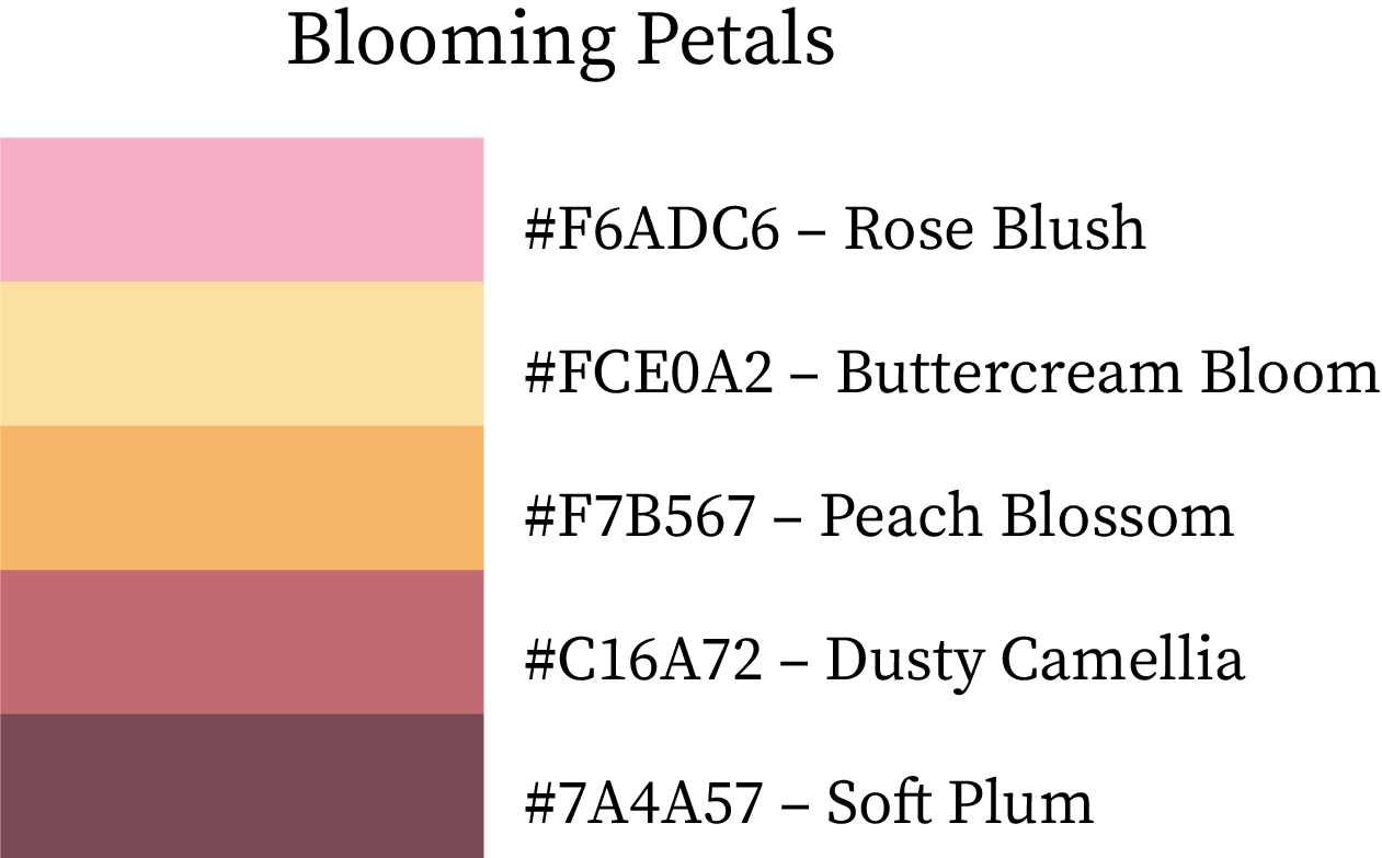
Spring Colour Palettes & Swatches – Warm, Cool & True Shades with Hex Codes and Names

Spring Colour Palettes Swatches and Combinations

Spring Colour Palettes, Swatches & Combinations with HEX Codes & Names

Spring is the season of rebirth — a time when colors soften, warm up, and bloom back into life. The spring palette is known for fresh pastels, soft warm tones, botanical greens, airy blues, and petal pinks. Whether you’re crafting branding, seasonal design, product packaging, fashion themes, or digital art, spring colors bring a feeling of renewal, lightness, joy, and natural vibrancy.

Below you’ll find complete spring colour palettes, swatches with HEX codes, warm and cool hues, true spring tones, and beautifully balanced color combinations — all designed to inspire refreshing, uplifting visuals.

Why Spring Color Palettes Feel Light and Renewing

Spring palettes reflect growth, freshness, and optimism:

  • Soft & Gentle – Pastel shades feel light, calm, and approachable for lifestyle and wellness brands.

  • Fresh & Renewing – Greens, pinks, and yellows evoke rebirth and rejuvenation.

  • Balanced & Harmonious – Spring palettes are well-rounded and easy on the eyes, ideal for layouts and branding.

  • Positive & Inviting – The light and airy tones make designs feel welcoming and uplifting.

Spring palettes infuse design with freshness, optimism, and balance.

1. Warm Color Swatches of Spring

These colors capture the gentle warmth of early spring—soft peaches, blooming florals, and sun-kissed neutrals. They add a welcoming, uplifting feel to any design without becoming overpowering.

HEX CodeColor NameDescription
#FFDAB9Peach BlossomA gentle peach tone that reflects soft new blooms.
#FFA07ACoral BudLight coral with a warm, lively glow.
#FF7F50Spring SunsetA cheerful coral-orange perfect for spring warmth.
#FF6347Tulip FlameA lively red-orange inspired by spring tulips.
#FFD1DCSpring DawnA delicate pink representing morning spring light.
#FFB6C1Soft PetalA classic soft pastel pink.
#F06292Pink PansyA fresh and energetic pink bloom tone.
#E91E63Azalea GlowA bold spring flower pink.
#FAEBD7Warm BreezeA warm, creamy neutral with spring softness.
#FFE4B5Golden PrimroseGentle yellow inspired by primrose petals.
#FFCC80Amber GlowA soft amber-orange perfect for spring warmth.
#FFB74DSunrise PeachA bright peachy tone reminiscent of spring mornings.
#CDB79EWarm EarthA muted warm neutral rooted in nature.
#D2B48CMuted MarigoldA soft tan with floral warmth.
#AD8B65Sunlit BarkA natural earthy shade with golden undertones.
#9E7B4ESoft TerraA subtle terracotta influenced by warm soils.

Best for: floral branding, feminine designs, beauty packaging, lifestyle websites, spring campaign visuals.

Peach Blossom Color Hex Code #FFDAB9
Coral Bud Color Hex Code #FFA07A
Spring Sunset Color Hex Code #FF7F50
Tulip Flame Color Hex Code #FF6347
Spring Dawn Color Hex Code #FFD1DC
Soft Petal Color Hex Code #FFB6C1
Pink Pansy Color Hex Code #F06292
Azalea Glow Color Hex Code #E91E63
Warm Breeze Color Hex Code #FAEBD7
Golden Primrose Color Hex Code #FFE4B5
Amber Glow Color Hex Code #FFCC80
Sunrise Peach Color Hex Code #FFB74D
Warm Earth Color Hex Code #CDB79E
Muted Marigold Color Hex Code #D2B48C
Sunlit Bark Color Hex Code #AD8B65
Soft Terra Color Hex Code #9E7B4E

2. Cool Color Swatches of Spring

Cool spring tones reflect fresh greenery, clear skies, and early morning breezes. These colors bring calmness and balance, especially when paired with warm or neutral shades.

HEX CodeColor NameDescription
#B5E7D0Mint WhisperA fresh mint tone that feels airy and clean.
#66CDAASpring MintA cool, refreshing botanical green.
#98FB98Dewy LeafPale green inspired by dew-kissed leaves.
#00FA9AEmerald BudA vivid spring green with lively clarity.
#3CB371Soft MeadowA friendly and natural green.
#2E8B57Sage GlowA deeper green with herbal notes.
#B3C99CNew BloomA muted, soft botanical green.
#6B8E23Olive SproutA spring olive shade rooted in nature.
#87CEEBSpring SkyA cheerful, bright sky blue.
#4682B4April BreezeSoft, breezy blue with cool depth.
#5F9EA0Morning TideA blue-green inspired by cool morning air.
#40E0D0Teal BlossomA lively teal perfect for spring freshness.
#AFEEEEMisty SpringVery light, almost frost-like aqua.
#20B2AAAqua BreezeA clean, modern aqua with spring clarity.
#D8BFD8Spring LilacA soft lavender shade.
#BA55D3Lavender WhisperA deeper, elegant purple bloom.

Best for: nature branding, wellness products, eco-designs, refreshing UI themes.

Mint Whisper Color Hex Code #B5E7D0
Spring Mint Color Hex Code #66CDAA
Dewy Leaf Color Hex Code #98FB98
Emerald Bud Color Hex Code #00FA9A
Soft Meadow Color Hex Code #3CB371
Sage Glow Color Hex Code #2E8B57
New Bloom Color Hex Code #B3C99C
Olive Sprout Color Hex Code #6B8E23
Spring Sky Color Hex Code #87CEEB
April Breeze Color Hex Code #4682B4
Morning Tide Color Hex Code #5F9EA0
Teal Blossom Color Hex Code #40E0D0
Misty Spring Color Hex Code #AFEEEE
Aqua Breeze Color Hex Code #20B2AA
Spring Lilac Color Hex Code #D8BFD8
Lavender Whisper Color Hex Code #BA55D3

3. True Color Swatches of Spring

True spring shades sit naturally between warm and cool—bright, clear, and full of life. They’re versatile, energetic, and perfect for creating vivid, cheerful palettes.

HEX CodeColor NameDescription
#FFF6C2Soft ButterlightA creamy, delicate pastel yellow.
#FFE3B0Sunlit ApricotA warm, sweet apricot tone.
#FFCD8FGolden PeachA fruity soft-orange pastel.
#FFD966Daffodil GlowA cheerful spring yellow.
#E6F27CLemon SproutA zesty yellow-green symbolizing new growth.
#C2ED6ESpring MeadowA botanical green full of life.
#A8E772Fresh PistachioA soft green with a fresh, edible quality.
#8FDFA2Mint BlossomA harmonious minty green.
#9DEBE9Tropical IceA cool aqua with a spring softness.
#B7F1FFSky DrizzleA light, airy spring sky blue.
#84C7E5Morning BlueCalm, clean blue reminiscent of early spring skies.
#67ADE4Clear LagoonA clear, refreshing aqua-blue.
#A5C5FAPastel AzureA dreamy blue-pastel perfect for spring.
#C7B1F3Lilac CloudA light purple with airy softness.
#E2B3F2Sweet OrchidA gentle orchid pink-purple.
#FAB6DCBlooming RoseA romantic spring rose tone.
#FFA6C2Coral BlushA soft coral with fresh sweetness.
#FF94A5Petal PinkA classic light blossom pink.
#FF807AMelon PunchA fun warm pink-orange.
#FF9D6EPapaya PopA fruity, lively peach-orange.

Best for: spring-inspired branding, soft packaging, lifestyle blogs, wedding palettes.

Soft Butterlight Color Hex Code #FFF6C2
Sunlit Apricot Color Hex Code #FFE3B0
Golden Peach Color Hex Code #FFCD8F
Daffodil Glow Color Hex Code #FFD966
Lemon Sprout Color Hex Code #E6F27C
Spring Meadow Color Hex Code #C2ED6E
Fresh Pistachio Color Hex Code #A8E772
Mint Blossom Color Hex Code #8FDFA2
Tropical Ice Color Hex Code #9DEBE9
Sky Drizzle Color Hex Code #B7F1FF
Morning Blue Color Hex Code #84C7E5
Clear Lagoon Color Hex Code #67ADE4
Pastel Azure Color Hex Code #A5C5FA
Lilac Cloud Color Hex Code #C7B1F3
Sweet Orchid Color Hex Code #E2B3F2
Blooming Rose Color Hex Code #FAB6DC
Coral Blush Color Hex Code #FFA6C2
Petal Pink Color Hex Code #FF94A5
Melon Punch Color Hex Code #FF807A
Papaya Pop Color Hex Code #FF9D6E

4. Cool & Warm Colour Combinations of Spring (5-Color Combo Palettes)

Blooming Petals

A romantic floral palette with warm pinks and soft berry undertones.
Rose Blush (#F6ADC6) sets the mood with airy sweetness, while Buttercream Bloom (#FCE0A2) adds a warm glow. Peach Blossom (#F7B567) introduces fruity brightness, Dusty Camellia (#C16A72) adds charm, and Soft Plum (#7A4A57) grounds the palette with elegance.
Best for: beauty brands, feminine packaging, floral artwork, wedding visuals.
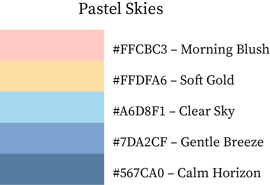
Spring Color Palette

Pastel Skies

This palette captures the gentle colors of a soft spring sunrise.
Morning Blush (#FFCBC3) and Soft Gold (#FFDFA6) warm the composition, balanced by Clear Sky (#A6D8F1) and Gentle Breeze (#7DA2CF). Calm Horizon (#567CA0) finishes the palette with subtle depth.
Best for: pastel branding, calming UI themes, lifestyle products.
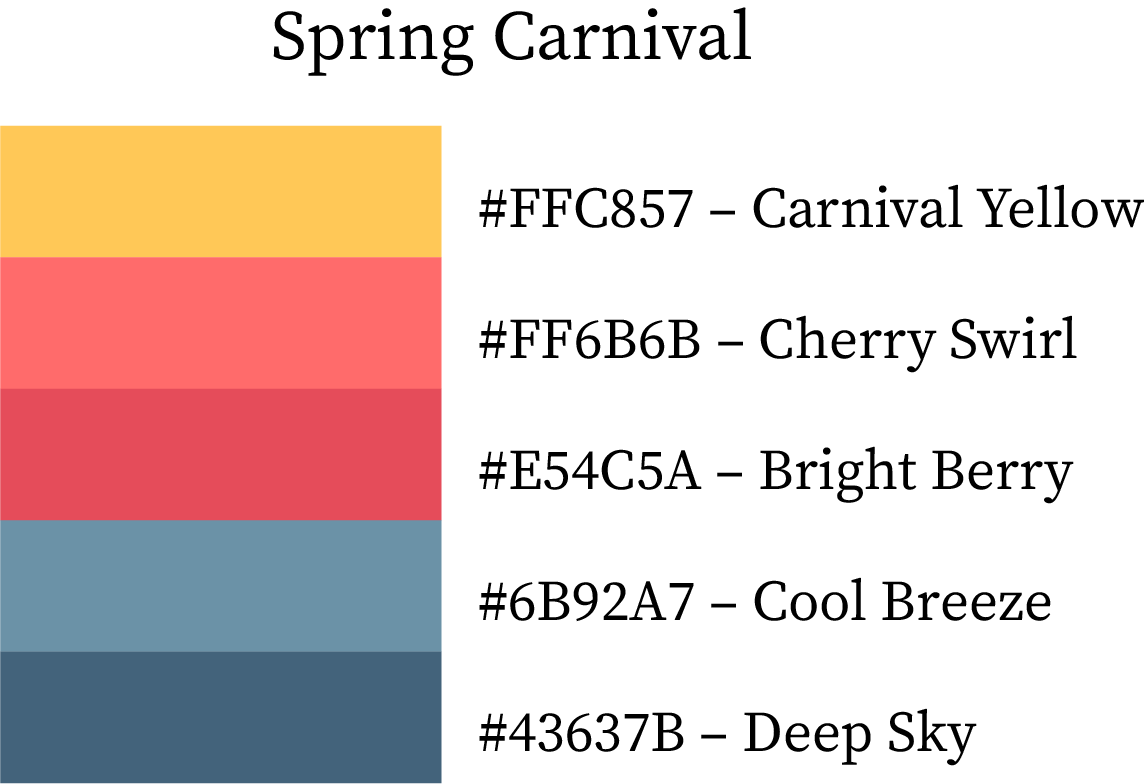
Spring Colour Palette

Spring Carnival

Bright, cheerful, and energetic — perfect for playful spring visuals.
Carnival Yellow (#FFC857) pairs beautifully with Cherry Swirl (#FF6B6B) and Bright Berry (#E54C5A) for joyful warmth. Cool Breeze (#6B92A7) and Deep Sky (#43637B) add refreshing contrast.
Best for: children’s brands, event posters, spring festival marketing.

Spring Color Combination

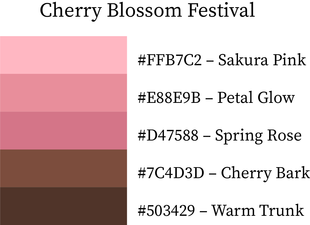
Cherry Blossom Festival

Inspired by blooming sakura trees and warm natural woods.
Sakura Pink (#FFB7C2) blends with Petal Glow (#E88E9B) and Spring Rose (#D47588) for floral beauty. Cherry Bark (#7C4D3D) and Warm Trunk (#503429) ground the palette with a natural touch.
Best for: cultural themes, stationery, soft fashion palettes.
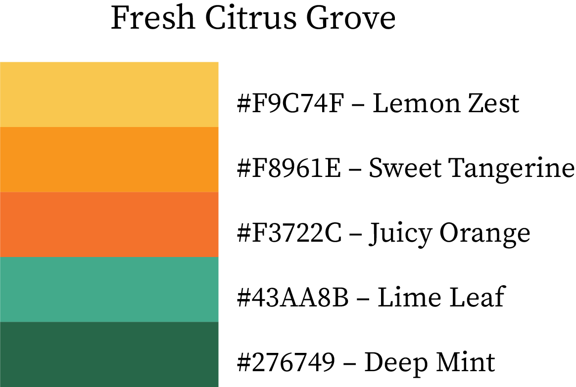
Spring Colour Combination

Fresh Citrus Grove

A vibrant, zesty palette symbolizing freshness and growth.
Lemon Zest (#F9C74F), Sweet Tangerine (#F8961E), and Juicy Orange (#F3722C) brighten the palette, while Lime Leaf (#43AA8B) and Deep Mint (#276749) add botanical depth.
Best for: organic brands, food packaging, energizing spring campaigns.
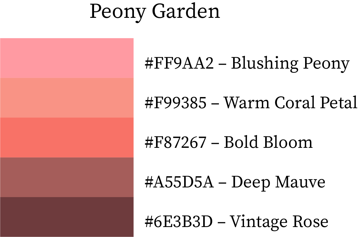
Spring Color Scheme

Peony Garden

Deep mauves and petal tones blend beautifully for a floral spring palette.
Blushing Peony (#FF9AA2) and Warm Coral Petal (#F99385) create soft sweetness. Bold Bloom (#F87267) offers contrast, while Deep Mauve (#A55D5A) and Vintage Rose (#6E3B3D) bring rich botanical warmth.
Best for: fashion branding, floristry, romantic visuals.
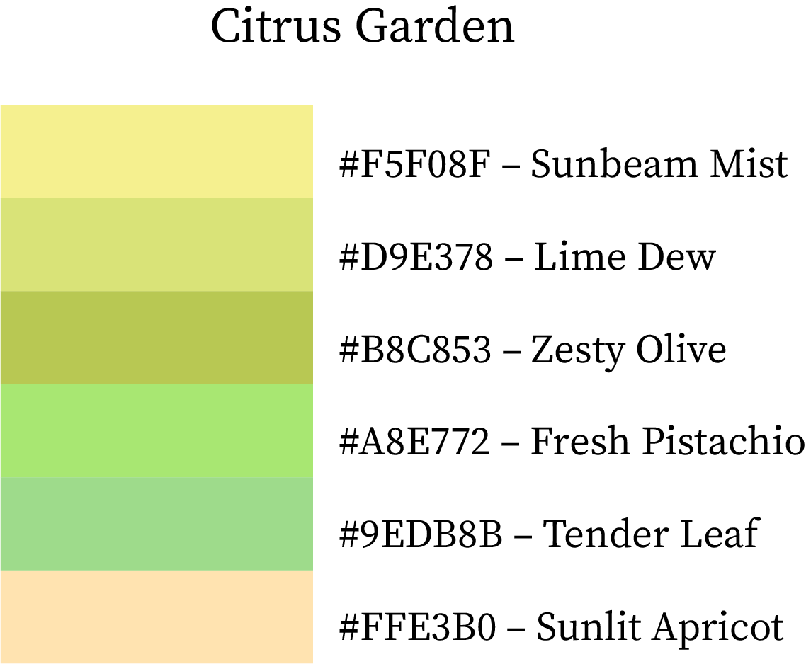
Spring Colour Scheme

5. True Color Combinations of Spring (6-Color Palettes)

Citrus Garden

A refreshing palette full of zesty greens and soft apricot warmth.
Sunbeam Mist (#F5F08F), Lime Dew (#D9E378), and Zesty Olive (#B8C853) create botanical energy. Fresh Pistachio (#A8E772) and Tender Leaf (#9EDB8B) soften the mix, while Sunlit Apricot (#FFE3B0) adds a warming finish.
Best for: organic brands, eco-packaging, spring-inspired UI design.
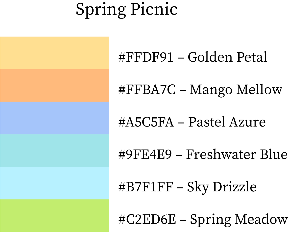
True Spring Color Palette

Spring Picnic

Bright, airy, and comforting — just like a sunny spring afternoon outdoors.
Golden Petal (#FFDF91) and Mango Mellow (#FFBA7C) provide sweetness. Pastel Azure (#A5C5FA) and Freshwater Blue (#9FE4E9) add breezy freshness. Sky Drizzle (#B7F1FF) and Spring Meadow (#C2ED6E) complete the cheerful harmony.
Best for: wellness branding, travel themes, home décor visuals.
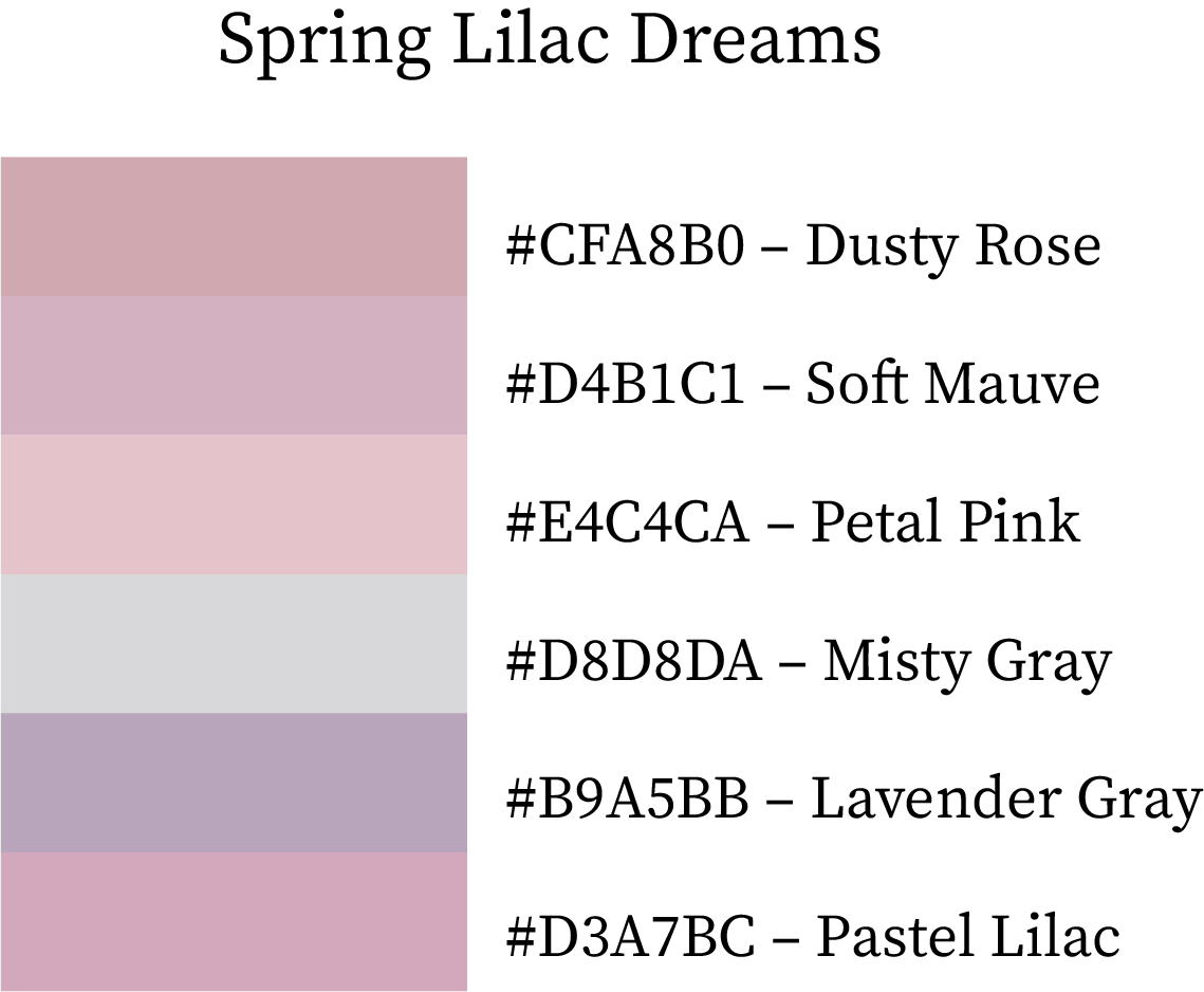
True Spring Colour Palette Combination

Spring Lilac Dreams

A soft, dreamy palette mixing lilacs, grays, and floral tints.
Dusty Rose (#CFA8B0), Soft Mauve (#D4B1C1), and Petal Pink (#E4C4CA) build a delicate base. Misty Gray (#D8D8DA) adds neutrality, while Lavender Gray (#B9A5BB) and Pastel Lilac (#D3A7BC) deepen the floral theme.
Best for: beauty brands, feminine stationery, luxury pastels.
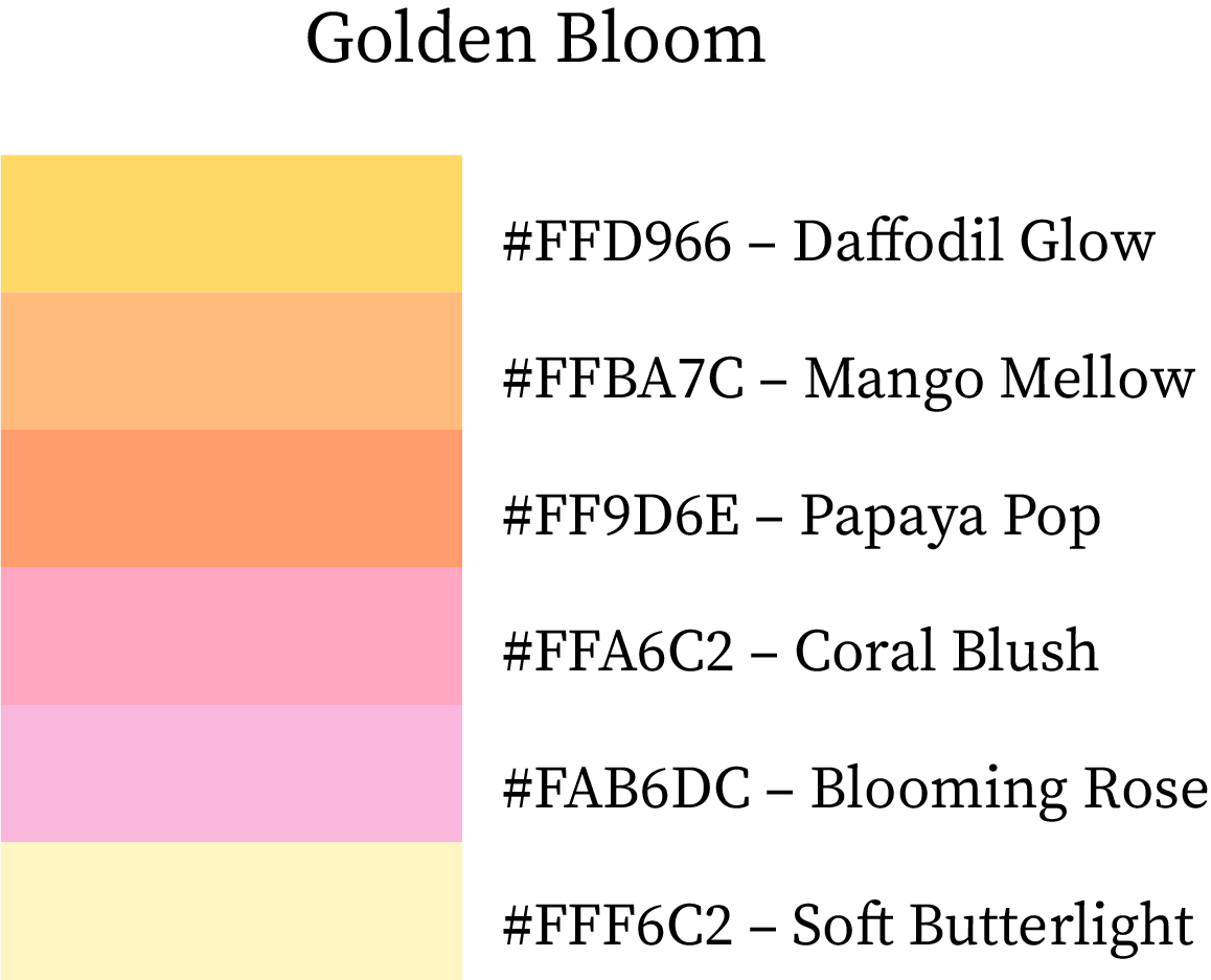
Spring Color Combos

Golden Bloom

Warm, glowing, and cheerful — a perfect palette for lively spring designs.
Daffodil Glow (#FFD966), Mango Mellow (#FFBA7C), and Papaya Pop (#FF9D6E) introduce fruit-inspired brightness. Coral Blush (#FFA6C2) and Blooming Rose (#FAB6DC) bring floral sweetness, while Soft Butterlight (#FFF6C2) ties everything together softly.
Best for: seasonal packaging, spring campaigns, joyful lifestyle branding.

Spring Colour Combos

Creative Ways to Use Spring Color Palettes

Spring palettes are soft, fresh, and uplifting—ideal for designs that feel renewed and approachable:

  • Interiors & Spaces – Pastel greens, pinks, and yellows brighten rooms and create airy moods.

  • Branding & Marketing – Soft spring shades convey growth, renewal, and friendliness.

  • Fashion & Accessories – Gentle pastels add sophistication while maintaining playfulness.

  • Web & UI Design – Light tones improve readability and create a clean, welcoming interface.

  • Mix & Match – Combine soft and mid-tone spring colors for balance and visual harmony.

Frequently Asked Questions (FAQs)

Q: What makes spring color palettes different from summer or winter palettes?

Spring palettes lean toward soft, fresh, and luminous hues, often inspired by new blossoms, tender leaves, and gentle sunshine. They sit between the cool crispness of winter and the bold vibrancy of summer. Spring colors usually have warm undertones, lighter saturation, and a naturally uplifting feel, making them ideal for branding, fashion, interiors, and seasonal graphics.

Q: Which spring colors work best for modern brand design?

Designers often gravitate toward shades like Mint Whisper (#B5E7D0), Peach Blossom (#FFDAB9), Daffodil Glow (#FFD966), and Sky Drizzle (#B7F1FF) because they balance freshness with professionalism. These colors look clean, friendly, and optimistic—perfect for wellness brands, beauty labels, cafés, kids’ products, and eco-focused businesses.

Q: How do I mix warm and cool spring colors in one palette?

A reliable approach is to pair three warm tones (peach, blush, apricot) with two refreshing cool tones (mint, sky blue, teal). This technique keeps the palette visually balanced while preserving the distinctive spring energy. Sets like Blooming Petals, Pastel Skies, and Spring Carnival are great examples of warm–cool harmony.

Q: What are popular pastel colors for spring in 2025?

Some of the most used pastels this year include Soft Butterlight (#FFF6C2), Pastel Azure (#A5C5FA), Spring Lilac (#D8BFD8), Misty Spring (#AFEEEE), and Soft Petal (#FFB6C1). These work well in minimalist designs, packaging, web themes, stationery, and feminine branding.

Q: Are spring color palettes good for home decor?

Absolutely. Spring colors brighten interiors without overwhelming the space. Shades like Warm Breeze (#FAEBD7), Mint Whisper (#B5E7D0), Dewy Leaf (#98FB98), Golden Primrose (#FFE4B5), and Lavender Whisper (#BA55D3) can revitalize bedrooms, kitchens, nurseries, offices, and reading corners.

Q: Which hex codes are trending for spring marketing graphics?

Some high-engagement colors across digital designs this year include Coral Bud (#FFA07A), Emerald Bud (#00FA9A), Morning Blue (#84C7E5), Blooming Rose (#FAB6DC), and Papaya Pop (#FF9D6E). These tones perform well because they are eye-catching without being too intense.

Conclusion: Embrace the Spring Palette Magic

Spring brings a sense of fresh beginnings — and the colors of this season reflect that beautifully. With warm blossoms, cool botanical tones, true spring pastels, and curated color combinations, these palettes allow you to create uplifting, bright, and naturally elegant designs. Whether you’re building brand identity, digital art, product packaging, or seasonal marketing, spring palettes offer endless possibilities for cheerful and refreshing visuals.

Tip: Always test contrast (especially with text), and combine fresh, luminous hues with light neutrals for a bright, uplifting spring feel.

Leave a Reply

Shopping cart

0
image/svg+xml

No products in the cart.

Continue Shopping
TOC