WCAG Color Contrast Requirements for Text, Buttons & UI Elements

WCAG Color Contrast Requirements

WCAG Color Contrast Requirements for Text, Buttons, and UI Elements

Accessibility is not just about being compliant — it is about making sure real people can comfortably read, understand, and interact with your website.

One of the most common accessibility failures on modern websites is improper color contrast. Designers often choose colors that look visually appealing but fail to meet WCAG color contrast requirements, especially for text, buttons, and interactive UI elements.

This guide breaks down exactly what contrast WCAG requires, where it applies, and how to implement it correctly — without drowning you in legal or technical jargon.

What WCAG Actually Means by “Color Contrast”

WCAG (Web Content Accessibility Guidelines) defines color contrast as the difference in luminance between foreground and background colors.

In simple terms:

  • Text must be readable against its background

  • Interactive elements must be clearly visible

  • Important UI components must not rely on color alone

WCAG expresses this difference using contrast ratios, such as:

  • 4.5:1

  • 3:1

  • 7:1

(If you want to understand how these ratios work, that is already covered in your dedicated Color Contrast Ratio Explained article.)

WCAG Levels You Need to Know (Quick Context)

You will see contrast requirements referenced by WCAG level:

  • WCAG AA → Standard requirement (what most websites should meet)

  • WCAG AAA → Enhanced accessibility (recommended, not mandatory)

For most commercial, content, and SaaS websites, WCAG AA is the practical target.

1. Text Contrast Requirements (Most Important)

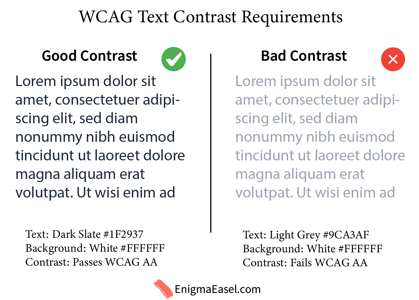
Text is where contrast matters the most — and where most websites fail.

Normal Body Text

WCAG AA requires:

  • Minimum contrast: 4.5:1

  • Applies to:

    • Paragraph text

    • Navigation links

    • Labels

    • Form instructions

    • Footer text

This requirement exists because low-contrast text causes:

  • Eye strain

  • Poor readability on mobile

  • Serious issues for users with low vision

Example (Good Contrast):

  • Text: Dark Slate #1F2937

  • Background: White #FFFFFF

  • Contrast: Passes WCAG AA

Example (Bad Contrast):

  • Text: Light Grey #9CA3AF

  • Background: White #FFFFFF

  • Contrast: Fails WCAG AA

Low Vs High Contrast Text

Large Text (Headings)

Large text gets slightly relaxed rules.

WCAG AA requires:

  • Minimum contrast: 3:1

  • Applies to:

    • Headings

    • Large UI numbers

    • Bold text ≥ 18px (or 14px bold)

This allows designers to use softer colors for headlines while keeping body text strict.

Good heading example:

  • Heading: Indigo #4338CA

  • Background: White #FFFFFF

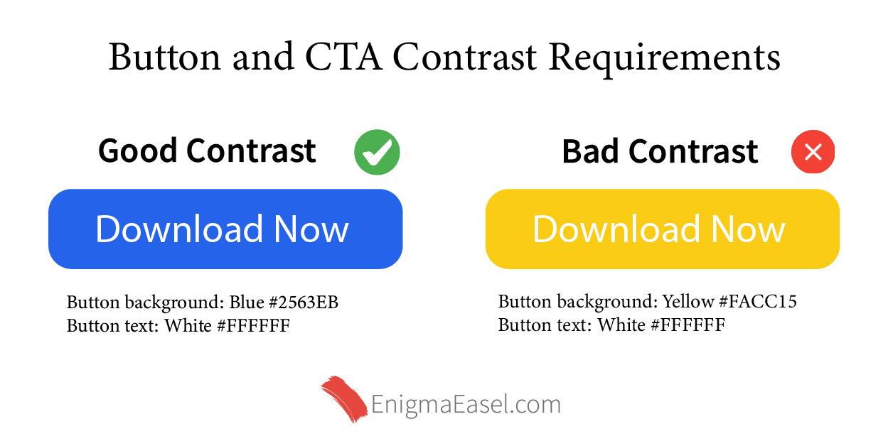
2. Button and CTA Contrast Requirements

Buttons are interactive elements, not just decorative blocks.

Button Text vs Button Background

WCAG treats button labels as text, so:

  • Button text must meet 4.5:1 contrast against the button color

Good CTA example:

  • Button background: Blue #2563EB

  • Button text: White #FFFFFF

Bad CTA example:

  • Button background: Yellow #FACC15

  • Button text: White #FFFFFF (fails contrast)

(Color preview suggestion: Three CTA buttons — pass, borderline, fail)

Button and Cta Contrast

Button vs Page Background

The button itself must also be visually distinguishable from its surroundings.

WCAG requires:

  • Minimum 3:1 contrast between the button and adjacent background

This ensures users can actually see the button.

Example:

  • Page background: Light Grey #F3F4F6

  • Button background: Blue #2563EB → clearly visible

3. Links Inside Text (Often Ignored)

Inline links deserve special attention.

WCAG requires one of the following:

  1. Link text contrast of 4.5:1 against background
    OR

  2. A visual indicator other than color (underline, border, icon)

This is why:

  • Blue links without underlines often fail accessibility

  • Color-blind users cannot rely on color alone

Accessible link example:

  • Text: Blue #1D4ED8

  • Underlined

  • On white background

Link Inside Text Contrast Wcag

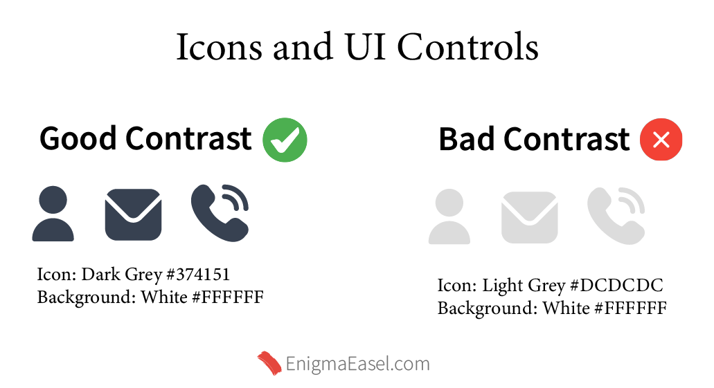
4. Icons and UI Controls

Icons are considered non-text UI elements.

WCAG AA requires:

  • Minimum contrast: 3:1 against background

This applies to:

  • Menu icons

  • Search icons

  • Close buttons

  • Form icons

  • Toggle indicators

Example:

  • Icon: Dark Grey #374151

  • Background: White #FFFFFF

Icons and UI Contrast Wcag

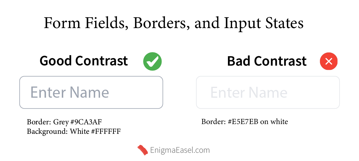
5. Form Fields, Borders, and Input States

This is where many modern UI designs break accessibility.

Input Borders

WCAG requires:

  • 3:1 contrast for visible boundaries

If your input borders are too light, users may not see them at all.

Good input border:

  • Border: Grey #9CA3AF

  • Background: White #FFFFFF

Bad input border:

  • Border: #E5E7EB on white

Focus States (Critical for Keyboard Users)

Focus outlines must:

  • Be clearly visible

  • Meet 3:1 contrast

Removing focus outlines without replacing them is a WCAG failure.

Good focus style:

  • Outline: Blue #2563EB

  • Thickness: 2px+

Form Fields Contrast Wcag

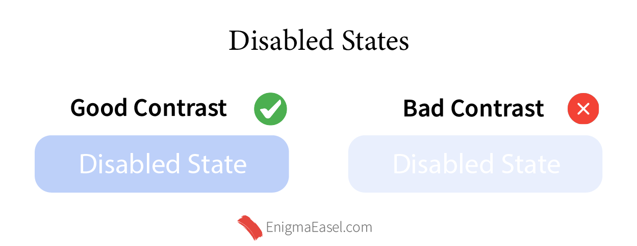
6. Disabled States (Special Case)

Disabled elements do not need to meet contrast requirements, but:

  • They must still be identifiable

  • They should not be confused with normal content

Best practice:

  • Lower opacity

  • Keep shape and context clear

  • Do not rely only on low contrast

Disabled States Contrast Wcag

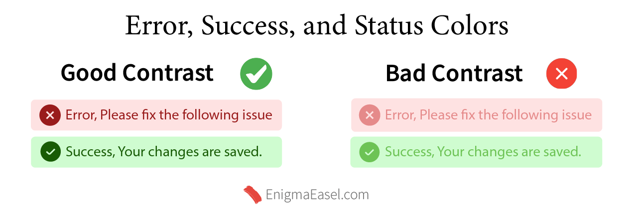
7. Error, Success, and Status Colors

WCAG does not allow color-only communication.

If you use:

  • Red for errors

  • Green for success

You must also include:

  • Icons

  • Text labels

  • ARIA alerts (where applicable)

Contrast requirements:

  • Text inside alerts → 4.5:1

  • Icons → 3:1

Good Accessible Error Example:

  • Background: Light Red #FEE2E2

  • Text: Dark Red #991B1B

Bad Accessible Error Example:

  • Background: Light Red #FEE2E2

  • Text: Dark Red #991B1B

Good Accessible Success Example:

  • Background: Light Red #FEE2E2

  • Text: Dark Red #991B1B

Bad Accessible Success Example:

  • Background: Light Red #FEE2E2

  • Text: Dark Red #991B1B

Error Success Status Contrast Wcag

Testing Your UI the Right Way

You do not need to calculate contrast manually.

For practical testing:

  • Check text/background pairs

  • Validate buttons and CTAs

  • Audit forms and alerts

Your Color Contrast Checker & Generator is directly relevant here, as it:

  • Calculates WCAG contrast ratios automatically

  • Flags AA and AAA failures

  • Helps test real UI combinations instead of theory

This is especially useful during:

  • UI audits

  • Redesigns

  • Accessibility reviews

Common Mistake to Avoid

Many designers assume:

    “If it looks readable to me, it’s accessible.”

That assumption fails for:

  • Older users

  • Users with low vision

  • Mobile users in sunlight

  • Color-blind users

WCAG contrast rules exist because human perception varies dramatically.

Final Takeaway

WCAG color contrast is not about limiting creativity — it is about clarity, usability, and inclusivity.

If you remember only three rules:

  1. Body text → 4.5:1

  2. Buttons and UI controls → 3:1 minimum visibility

  3. Never rely on color alone

You will already be ahead of most websites on the internet.

Frequently Asked Questions (FAQ)

What is the minimum WCAG color contrast for text?

For normal body text, WCAG AA requires a minimum contrast ratio of 4.5:1 between text and background. Large text can use 3:1.


Do buttons have different contrast requirements than text?

Yes. Button text must meet 4.5:1, while the button itself must have at least 3:1 contrast against the surrounding background so it is clearly visible.


Are icons and UI controls required to meet WCAG contrast rules?

Yes. Icons, toggles, and UI controls must have at least 3:1 contrast against their background to remain visible and usable.


Do disabled buttons need to meet contrast requirements?

No. WCAG allows lower contrast for disabled elements, but they must still be recognizable and not confused with active content.


Can I rely only on color to show errors or success messages?

No. WCAG requires that important information is not conveyed by color alone. Error and success states must include text labels, icons, or other visual indicators.


How can I test WCAG contrast without manual calculation?

You can use a color contrast testing tool that automatically calculates contrast ratios and flags WCAG AA and AAA issues, especially useful for buttons, text, and UI elements.

Leave a Reply

Shopping cart

0
image/svg+xml

No products in the cart.

Continue Shopping
TOC