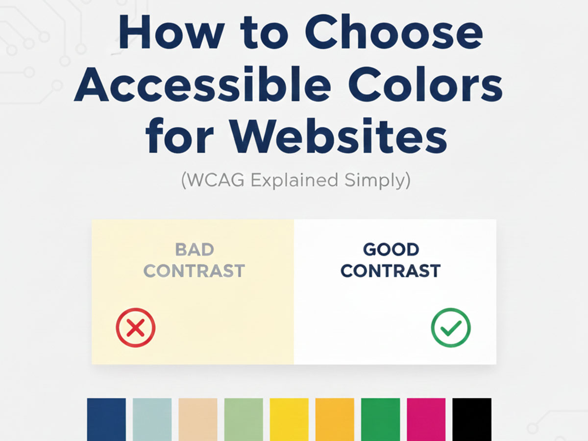
How to Choose Accessible Colors for Websites
Choosing colors for a website is not just a design decision. It directly affects readability, usability, and whether users can comfortably interact with your content. Accessible color choices ensure that people with visual impairments, color vision deficiencies, or low-contrast sensitivity can still use your website effectively.
This guide explains website color accessibility in simple terms, based on WCAG (Web Content Accessibility Guidelines), without technical jargon.
What Is Color Accessibility in Web Design?
Color accessibility means selecting text, background, and UI colors that are easy to distinguish for all users, including those with:
Low vision
Color blindness
Age-related vision decline
Screen glare or low-quality displays
Accessibility is not about making websites “boring.” It is about making information readable and usable.
Poor color choices can make even well-written content unusable.
What Is WCAG and Why It Matters
WCAG stands for Web Content Accessibility Guidelines. These guidelines are published by the W3C and are used worldwide as the standard for accessible web design.
From a color perspective, WCAG focuses mainly on contrast, not aesthetics.
Following WCAG:
Improves user experience
Reduces bounce rates
Helps meet legal and platform requirements
Signals quality and responsibility to search engines
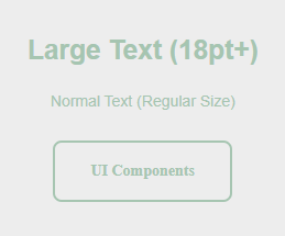
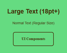
Understanding Color Contrast (The Core Rule)
Color contrast is the difference in brightness between text and its background.
WCAG defines minimum contrast ratios:
Normal text: at least 4.5:1
Large text (18px+ or bold 14px+): at least 3:1
UI elements and icons: at least 3:1
If contrast is too low, text blends into the background and becomes difficult to read.
Why Color Format Does Not Affect Accessibility
Whether you use HEX, RGB, or HSL does not change accessibility.
What matters is the final rendered color contrast.
For example, these are the same color in different formats:
HEX:
#2563EBRGB:
rgb(37, 99, 235)HSL:
hsl(221, 83%, 53%)
If you are unfamiliar with how these formats differ, you can read:
RGB vs HEX vs HSL: When to Use Which
Accessibility depends on contrast ratios, not color notation.
Common Accessibility Mistakes in Website Colors
1. Light Grey Text on White Backgrounds
Example:
Text:
#9CA3AFBackground:
#FFFFFF
This looks modern but often fails WCAG contrast requirements.
2. Bright Colors on Bright Backgrounds
Example:
Yellow
#FACC15on whiteLight green
#86EFACon white
These combinations are difficult to read for many users.
3. Relying Only on Color to Convey Meaning
Using red and green alone for errors and success messages can be problematic for color-blind users.
Always pair color with:
Icons
Text labels
Shape or position cues
How to Check Color Contrast Correctly
Manually guessing contrast is unreliable. The correct approach is to test color pairs.
This is where a contrast tool is genuinely useful.
You can use our Color Contrast Checker & Generator to:
Test text vs background colors
Check WCAG AA and AAA compliance
Generate accessible alternatives automatically
This step alone significantly improves accessibility with minimal effort.
Choosing Accessible Colors Step by Step
Step 1: Pick a Neutral Base
Start with accessible base colors:
White:
#FFFFFFNear-black text:
#111827Soft background grey:
#F3F4F6
Neutral bases make contrast management easier.
Step 2: Add Primary and Accent Colors Carefully
Example accessible palette:
Primary blue:
#2563EBDark text:
#1F2937Background:
#FFFFFFAccent green:
#16A34A
Test every combination, not just the main one.

Step 3: Check Buttons, Links, and States
Accessibility applies to:
Buttons
Links
Hover states
Disabled states
Example:
Button background:
#2563EBButton text:
#FFFFFF
This passes WCAG contrast and remains readable.
What About Transparency and Overlays?
Transparent colors can reduce contrast unexpectedly.
For example:
Black with opacity:
rgba(0,0,0,0.5)Over an image or gradient background
Always test overlays on top of real backgrounds, not solid colors.
If you want to understand how transparency works in color codes, see:
What Is HEX Color Code? How It Works in Web Design
Accessibility Benefits Beyond Compliance
Accessible colors improve:
Readability on mobile devices
Usability in bright environments
User trust and comfort
Overall design clarity
Accessibility is not a limitation. It is a design upgrade.
Do Accessible Websites Look Boring?
No.
Many modern, high-quality websites use accessible palettes by default. The key is intentional contrast, not muted colors.
Strong design systems prioritize:
Clear hierarchy
Consistent contrast
Predictable interactions
Accessibility and aesthetics are not opposites.
Frequently Asked Questions (FAQ)
1. What does accessible color mean in web design?
Accessible color in web design means choosing text, background, and interface colors that are easy to read and distinguish for all users, including people with low vision or color blindness. The focus is on sufficient contrast and clarity rather than visual style alone.
2. What is WCAG and how does it relate to website colors?
WCAG (Web Content Accessibility Guidelines) is a global standard for web accessibility. For colors, WCAG defines minimum contrast ratios between text and background to ensure readability across different vision conditions and devices.
3. What is the minimum contrast ratio for readable text?
According to WCAG:
Normal text requires a contrast ratio of at least 4.5:1
Large text requires at least 3:1
UI elements and icons also require at least 3:1
These ratios help ensure content remains readable in all conditions.
4. Does it matter if I use HEX, RGB, or HSL colors?
No. Accessibility is not affected by the color format. HEX, RGB, and HSL all produce the same visual color. What matters is the final contrast between the foreground and background colors.
5. Can bright colors still be accessible?
Yes. Bright colors can be accessible if they have enough contrast with their background. For example, a strong blue like #2563EB on a white background #FFFFFF can be both vibrant and readable when contrast requirements are met.
6. Why do light grey texts often fail accessibility?
Light grey text on white or very light backgrounds usually lacks enough contrast. Even if it looks modern, it can be difficult to read for many users and often fails WCAG contrast standards.
7. How can I check if my website colors are accessible?
The most reliable way is to test color pairs using a color contrast checker. These tools measure contrast ratios and indicate whether combinations meet WCAG requirements for text and UI elements.
8. Do accessible color choices improve SEO or user experience?
Yes. Accessible colors improve readability, reduce eye strain, and lower bounce rates. Search engines favor websites that provide good user experiences, and accessibility is a key part of that.
Final Thoughts
Choosing accessible colors is one of the highest-impact improvements you can make to a website.
You do not need advanced tools or complex theory. You need:
Awareness of contrast
Consistent testing
Thoughtful color roles
When accessibility is built into your color choices, everyone benefits.