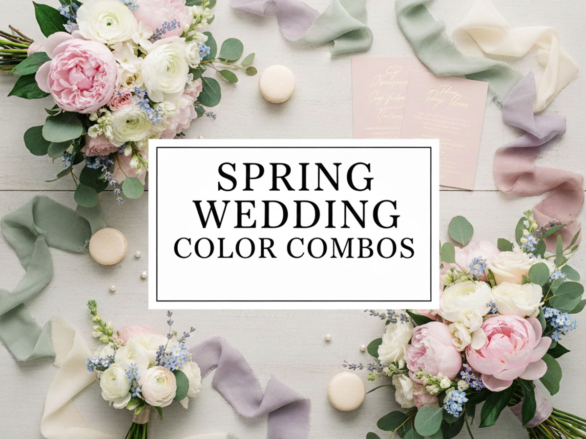
Spring Wedding Color Combos: Fresh, Romantic Palettes for the Season of Bloom
Spring weddings symbolize new beginnings, fresh growth, and softness. Unlike summer weddings, spring celebrations are shaped by mild light, blooming florals, and gentle color transitions. The best spring wedding color schemes feel airy, romantic, and naturally harmonious with the season.
This guide explores spring wedding color palettes and combinations designed to work beautifully across décor, florals, attire, and stationery—without overpowering the delicate spring atmosphere.
What Makes Spring Wedding Colors Unique?
Spring colors are defined by transition rather than intensity. Winter’s heaviness fades, summer’s brightness hasn’t arrived yet, and nature sits in a soft, balanced state.
Spring palettes typically:
Use lighter tints and softened pastels
Blend warm and cool tones gently
Complement natural florals instead of competing with them
This allows more flexibility than summer while still requiring restraint.
How to Choose the Right Spring Wedding Color Scheme
Start with venue surroundings
Match floral availability, not Pinterest trends
Test colors in natural daylight
Keep one neutral anchor color
For accessibility and contrast clarity, you can test these palettes using your Color Contrast Checker and Palette Generator
Soft & Airy Color Schemes for Early Spring Weddings
Early spring weddings often feature cooler air, subtle greenery, and pale florals. Palettes here should feel fresh but restrained.
Best palette size:
2-color and 3-color combinations
2-Color Spring Wedding Combos (Minimal & Elegant)
Soft Ivory and Pale Sage
Soft Ivory:
#FAF9F6Pale Sage:
#B7C4B1
Why it works:
Clean and understated
Pairs beautifully with early greenery
Ideal for garden or courthouse weddings
Mist Grey and Powder Blue
Mist Grey:
#E3E6EAPowder Blue:
#AFCBEB
Why it works:
Cool but not cold
Elegant for early spring venues
Works well with light florals
3-Color Spring Wedding Combos (Balanced Freshness)
White, Blush Pink, and Soft Green
White:
#FFFFFFBlush Pink:
#F2C6D2Soft Green:
#AFC8B8
Why it works:
Romantic without being overly sweet
Blends naturally with spring florals
Timeless for both indoor and outdoor venues
Spring Garden Wedding Color Schemes
Spring gardens introduce fresh greens, blossoms, and natural textures. Color palettes should enhance the surroundings, not overpower them.
Best palette size:
3-color and 4-color combinations
Garden-Friendly 3-Color Palettes
Cream, Lavender, and Sage
Cream:
#F7F3EBLavender:
#C7B8E2Sage:
#9CAF88
Why it works:
Lavender echoes spring blooms
Sage blends with foliage
Cream keeps the palette grounded
Soft Peach, Eucalyptus, and Warm White
Soft Peach:
#F6C1A3Eucalyptus:
#7F9C8CWarm White:
#FBFBF8
Why it works:
Peach adds warmth
Green provides balance
White keeps everything light
4-Color Spring Garden Palette
Ivory, Dusty Rose, Light Blue, and Leaf Green
Ivory:
#F9F7F3Dusty Rose:
#D8A7B1Light Blue:
#BFD7EALeaf Green:
#6B8E6E
Why it works:
Floral-inspired
Excellent for layered décor
Soft contrast that photographs well
Floral-Inspired Spring Wedding Color Palettes
Spring florals offer the widest range of inspiration. These palettes are designed to mirror natural blooms rather than impose artificial color themes.
Best palette size:
3-color and 4-color combinations
Floral-Based 3-Color Palettes
White, Butter Yellow, and Soft Green
White:
#FFFFFFButter Yellow:
#F4E3A3Soft Green:
#B6D7A8
Why it works:
Matches daffodils and tulips
Cheerful but not overpowering
Perfect for daytime ceremonies
Blush, Lilac, and Pale Grey
Blush:
#F2B8C6Lilac:
#D8CFE6Pale Grey:
#E5E7EB
Why it works:
Romantic and refined
Ideal for bouquets and table florals
Maintains softness throughout
4-Color Floral Palette
Cream, Apricot, Lavender, and Soft Green
Cream:
#F7F3EBApricot:
#F2A07BLavender:
#C7B8E2Soft Green:
#AFC8B8
Why it works:
Reflects mixed spring florals
Balanced warm and cool tones
Elegant without visual clutter
Spring Wedding Color Schemes by Fabric & Texture
Color behaves differently on fabric
Spring fabrics are typically light and breathable. Your palette should complement how color reflects on material, not just how it looks digitally.
Works Best With:
Chiffon
Tulle
Organza
Linen
2-Color Combos
Ivory
#FFF6E5+ Blush#F5C6CF
#FFF6E5
#F5C6CF
Soft Grey
#E6E8EB+ Lavender#C6B7E2
#E6E8EB
#C6B7E2
3-Color Combos
Sage
#9CAF88+ Cream#FAF3E0+ Dusty Blue#AFC4D6
#9CAF88
#FAF3E0
#AFC4D6
Peach
#FFB7A5+ White#FFFFFF+ Gold#D4AF37
#FFB7A5
#FFFFFF
#D4AF37
4-Color Combos
Mint
#AEE6CF+ Lilac#D6C9F0+ Grey#D9D9D9+ White#FFFFFF
#AEE6CF
#D6C9F0
#D9D9D9
#FFFFFF
Minimal & Modern Spring Wedding Color Combos
Clean, elegant, and intentional
For couples who want a spring feel without florals dominating the design, minimalist palettes offer clarity and sophistication.
Best Practices
Fewer colors, higher contrast control
Strong neutral foundations
Subtle seasonal hints
2-Color Combos
Warm White
#F9F9F6+ Soft Grey#D9D9D9Ivory
#FFF6E5+ Sage#9CAF88
3-Color Combos
White
#FFFFFF+ Blush#F4C2C2+ Grey#D9D9D9Cream
#FAF3E0+ Dusty Blue#AFC4D6+ Silver#C9CCD6
Daytime vs Evening Spring Wedding Color Combinations
Spring weddings often extend from daylight into evening. Color palettes should adapt naturally as lighting shifts.
Daytime Spring Wedding Palettes
Best palette size:
2-color or 3-color
White, Mint, and Sky Blue
White:
#FFFFFFMint:
#A8E6CFSky Blue:
#9BC7EB
Why it works:
Fresh and energizing
Reflects natural daylight
Ideal for outdoor ceremonies
#FFFFFF
#A8E6CF
#9BC7EB
Evening Spring Wedding Palettes
Best palette size:
4-color or 5-color (controlled lighting)
Dusty Blue, Mauve, Soft Gold, and Ivory
Dusty Blue:
#7DA3C7Mauve:
#C08DA5Soft Gold:
#D6B56CIvory:
#F9F7F3
Why it works:
Mauve adds warmth as light fades
Gold enhances evening ambiance
Blue keeps the palette grounded
#7DA3C7
#C08DA5
#D6B56C
#F9F7F3
Elegant 5-Color Spring Wedding Palette (Layered Styling)
5-color palettes work best for large spring weddings with multiple design elements.
Soft White:
#FAFAF8Blush Pink:
#F2C6D2Sage Green:
#9CAF88Lavender Blue:
#B9C6E3Champagne Gold:
#D6B56C
Why it works:
Each color has a defined role
Perfect for layered décor and stationery
Remains light and cohesive
#FAFAF8
#F2C6D2
#9CAF88
#B9C6E3
#D6B56C
How This Spring Guide Fits Your Wedding Color Series
This spring guide focuses on:
Soft growth
Floral harmony
Transitional lighting
It complements but does not duplicate:
Summer Wedding Color Schemes (heat & sunlight)
Fall Wedding Color Schemes (warm depth)
Winter Wedding Color Schemes (contrast & richness)
FAQs – Spring Wedding Color Combinations
1. What colors work best for spring weddings?
Soft pastels, muted florals, light neutrals, and fresh greens work best for spring weddings. Colors like blush, sage, lavender, dusty blue, and ivory reflect the season’s natural brightness without feeling heavy.
2. How do I choose a spring wedding color scheme?
Start by considering your venue (indoor or outdoor), time of day, and floral availability. Spring palettes look best when they balance light tones with one grounding neutral to avoid looking washed out.
3. Are pastel colors mandatory for spring weddings?
No. While pastels are popular, spring weddings can also use earthy neutrals, muted jewel tones, or modern minimal palettes. The key is softness and harmony, not brightness.
4. Can spring wedding palettes include metallic accents?
Yes. Soft gold, champagne, and silver work especially well in spring. Metallics should be used as accents rather than dominant colors to maintain a fresh seasonal feel.
5. How many colors should a spring wedding palette have?
Most spring weddings work best with 3 to 5 colors. Fewer colors feel minimal and elegant, while larger palettes help coordinate décor, florals, attire, and stationery.
6. Do spring wedding colors photograph well?
Yes, when chosen carefully. Avoid extremely light-on-light combinations. Including one slightly deeper tone helps maintain contrast and clarity in photos, especially in daylight.