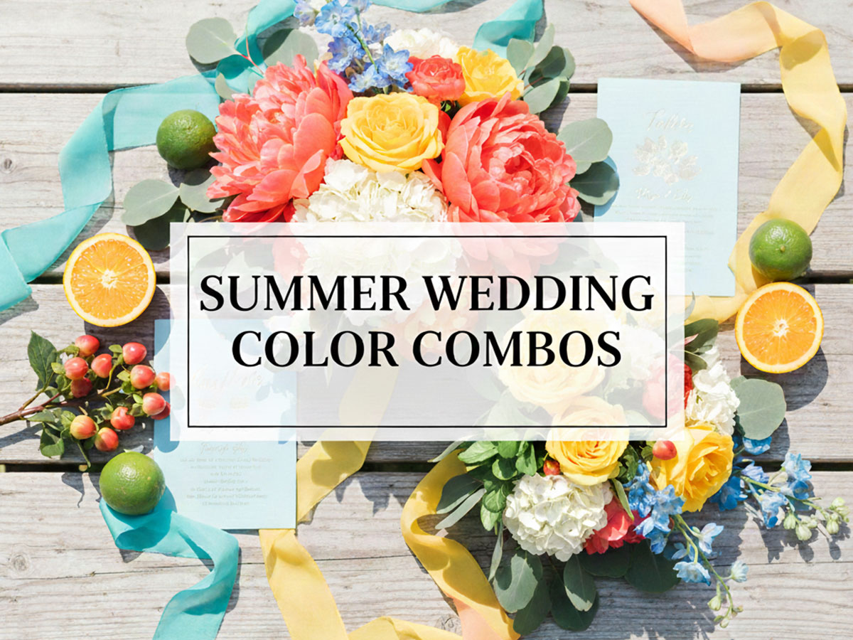
Summer Wedding Color Combos: Elegant Palettes That Work in Heat & Sunlight
Summer weddings bring bright light, warm temperatures, and vibrant surroundings. Choosing the right summer wedding color combos is less about trends and more about how colors behave in sunlight, outdoor venues, and heat.
In this guide, you’ll find summer wedding color combinations and palettes designed to stay elegant—not harsh—across décor, florals, attire, and stationery.
How Summer Conditions Affect Wedding Color Choices
Before choosing colors, it’s important to understand what summer changes visually:
Strong natural sunlight increases contrast
Heat makes dark colors feel heavier
Outdoor greenery competes with décor colors
Bright hues can look washed out or overly intense
The palettes below are selected to stay balanced under real summer conditions.
Light & Heat Considerations for Summer Wedding Colors
Summer heat and strong daylight dramatically affect how colors appear. Highly saturated or dark tones can feel heavy, while overly bright colors may look harsh or washed out under direct sunlight. The safest summer palettes are those that reflect light, reduce glare, and stay visually soft throughout the day.
Best palette size here:
2-color and 3-color combinations
2-Color Summer Wedding Combos (Heat-Safe)
Soft Ivory and Sage Green
Ivory:
#F9FAF7Sage Green:
#9CAF88
Why it works:
Reflects heat visually
Blends naturally with summer greenery
Feels calm and breathable
Sand Beige and Ocean Blue
Sand Beige:
#E8DCC8Ocean Blue:
#3A7CA5
Why it works:
Beach-friendly
Does not glare in sunlight
Works well for daytime ceremonies
Warm White and Olive Green
Warm White:
#FBFBF8Olive Green:
#8A9A5B
Why it works:
Olive stays earthy without overheating visually
White reflects light naturally
Ideal for outdoor ceremonies in open fields
Pale Taupe and Mist Blue
Pale Taupe:
#D6CEC3Mist Blue:
#9BB7D4
Why it works:
Neutral base keeps décor cool
Blue adds freshness without intensity
Works well under midday sun
3-Color Summer Wedding Combos (Balanced)
White, Dusty Blue, and Soft Peach
White:
#FFFFFFDusty Blue:
#7DA3C7Soft Peach:
#F6B7A5
Why it works:
Romantic without being overpowering
Peach softens blue under harsh light
Ideal for open-air venues
Soft Ivory, Seafoam, and Light Sand
Ivory:
#F9F7F3Seafoam:
#A8DADCLight Sand:
#EADFCF
Why it works:
Coastal feel without being themed
All tones stay gentle in strong light
Excellent for beach or garden venues
Outdoor vs Indoor Summer Wedding Color Combos
The venue environment determines how complex your palette can be. Outdoor spaces already contain visual noise—sky, greenery, florals—so simpler palettes perform better. Indoor venues allow more flexibility because lighting can be controlled and adjusted.
Outdoor Summer Wedding Palettes (Nature-Friendly)
Best palette size:
2-color and 3-color
Linen and Dusty Sage
Linen:
#F5F3EEDusty Sage:
#9BAE9E
Why it works:
Minimal and elegant
Works across tents, arches, and aisle décor
Low contrast = calm summer look
#F5F3EE
#9BAE9E
Eucalyptus Green, White, and Stone Grey
Eucalyptus:
#7F9C8CWhite:
#FFFFFFStone Grey:
#D1D5DB
Why it works:
Matches foliage
Clean contrast without glare
Photographs beautifully outdoors
White, Fern Green, and Soft Clay
White:
#FFFFFFFern Green:
#6F8F72Soft Clay:
#D9B8A0
Why it works:
Green blends with surroundings
Clay adds warmth without overpowering
White keeps everything readable
Indoor Summer Wedding Palettes (More Flexibility)
Best palette size:
3-color and 4-color
Champagne, Blush Pink, and Soft Gold
Champagne:
#F2E6D8Blush Pink:
#F2B8C6Soft Gold:
#D6B56C
Why it works:
Elegant under controlled lighting
Gold adds warmth without overpowering
Works well in banquet halls
Cream, Mauve, Soft Gold, Slate Blue
Cream:
#F6F1EBMauve:
#C08DA5Soft Gold:
#D6B56CSlate Blue:
#5B728A
Why it works:
Mauve adds romance
Blue anchors the palette
Gold elevates evening lighting
Fabrics That Work with Bright Summer Color Palettes
Fabric choice changes how color behaves. Light, breathable fabrics soften colors, while glossy materials intensify them. Summer palettes should work with fabric texture, not fight against it.
Certain fabrics amplify or soften colors:
Linen and chiffon soften bright tones
Satin reflects light (use with muted colors)
Organza adds dimension without heaviness
Fabric-Friendly 3-Color Palette
Linen White, Sky Blue, and Butter Yellow
Linen White:
#FAFAF7Sky Blue:
#8EC5E8Butter Yellow:
#F4E3A3
Why it works:
Light-reflective fabrics enhance softness
Yellow stays warm, not harsh
Perfect for flowing dresses and draping
Chiffon White, Powder Blue, and Soft Lilac
Chiffon White:
#FAFAF8Powder Blue:
#AFCBEBSoft Lilac:
#D8CFE6
Why it works:
Pastels diffuse light beautifully
Ideal for flowing dresses and drapes
Never looks harsh in photos
Linen Beige, Pistachio, and Pale Rose
Linen Beige:
#E6DDCFPistachio:
#B6D7A8Pale Rose:
#F2C6CC
Why it works:
Earthy yet romantic
Complements natural fabrics
Excellent for rustic summer weddings
Color Combinations That Don’t Look Harsh in Sunlight
Direct sunlight exaggerates contrast. These palettes are designed to remain legible and calm, even during peak daylight hours.
Avoid neon or fully saturated colors for large surfaces. Use softened tones instead.
4-Color Summer Wedding Palette (Sun-Safe)
Soft White, Lavender, Sage, and Cool Grey
Soft White:
#F8FAFCLavender:
#C7B8E2Sage:
#9CAF88Cool Grey:
#CBD5E1
Why it works:
Pastel tones stay gentle in sunlight
Grey anchors the palette
Ideal for signage and seating charts
Soft White, Sky Grey, Lavender Blue, and Sage
Soft White:
#F8FAFCSky Grey:
#DCE1E7Lavender Blue:
#B9C6E3Sage:
#9CAF88
Why it works:
All mid-to-light tones
No color dominates
Ideal for signage and stationery
Cream, Butter Yellow, Eucalyptus, and Stone
Cream:
#F7F3EBButter Yellow:
#F4E3A3Eucalyptus:
#7F9C8CStone:
#CFCFC4
Why it works:
Yellow stays soft, not neon
Green cools the palette
Stone neutralizes brightness
Floral Color Matching for Summer Weddings
Florals introduce natural color variation. The best summer palettes support floral tones instead of clashing with them.
Florals should complement, not compete with, the palette.
Floral-Focused 4-Color Palette
Ivory, Coral, Leaf Green, and Soft Taupe
Ivory:
#F9F7F3Coral:
#F28C8CLeaf Green:
#6B8E6ESoft Taupe:
#CFC2B2
Why it works:
Coral pops without overpowering
Green ties florals to décor
Taupe balances brightness
White, Apricot, and Leaf Green
White:
#FFFFFFApricot:
#F2A07BLeaf Green:
#6B8E6E
Why it works:
Matches roses, ranunculus, peonies
Warm but not overwhelming
Excellent for centerpieces
Blush, Soft Plum, and Dusty Green
Blush:
#F2B8C6Soft Plum:
#9B6B88Dusty Green:
#8FAF9A
Why it works:
Adds depth without heaviness
Works well with layered bouquets
Elegant for semi-formal weddings
Day vs Evening Summer Wedding Color Schemes
Summer lighting shifts dramatically from day to night. A palette that looks perfect at noon may feel flat or heavy after sunset. Choosing colors based on time of day avoids that problem entirely.
Daytime Summer Wedding Palettes
Best palette size:
2-color or 3-color
Pale Peach and Soft Grey
Pale Peach:
#F6C1A3Soft Grey:
#D1D5DB
Why it works:
Romantic without brightness overload
Works well in photos
Minimal but warm
#F6C1A3
#D1D5DB
White, Mint, and Sky Blue
White:
#FFFFFFMint:
#A8E6CFSky Blue:
#9BC7EB
Why it works:
Fresh and airy
Reflects daylight beautifully
Ideal for beach and garden venues
#FFFFFF
#A8E6CF
#9BC7EB
Evening Summer Wedding Palettes
Best palette size:
4-color and 5-color (controlled lighting)
Navy, Blush, Soft Gold, and Ivory
Navy:
#1E3A5FBlush:
#F2B8C6Soft Gold:
#D6B56CIvory:
#F9F7F3
Why it works:
Navy grounds the palette at night
Gold adds warmth under lights
Blush keeps it romantic
#1E3A5F
#F2B8C6
#D6B56C
#F9F7F3
Navy, Champagne, Blush, and Soft Gold
Navy:
#1E3A5FChampagne:
#F2E6D8Blush:
#F2B8C6Soft Gold:
#D6B56C
Why it works:
Navy grounds evening lighting
Metallics glow under warm lights
Blush softens contrast
#1E3A5F
#F2E6D8
#F2B8C6
#D6B56C
Elegant 5-Color Summer Wedding Palette (Evening Only)
Use 5-color palettes only when lighting is controlled.
Soft White:
#F9FAF7Dusty Blue:
#7DA3C7Blush Pink:
#F2B8C6Sage Green:
#9CAF88Soft Gold:
#D6B56C
Why it works:
Each color has a clear role
No single shade dominates
Suitable for large venues and layered décor
#F9FAF7
#7DA3C7
#F2B8C6
#9CAF88
#D6B56C
How This Fits with Your Other Wedding Color Guides
This summer guide focuses on heat, light, and venue behavior, not just color lists.
You can naturally link this post to:
Wedding Color Combos (Main Guide) – for general planning
Spring Wedding Color Schemes – softer transitions
Fall Wedding Color Schemes – warmer depth
Winter Wedding Color Schemes – richer contrast
FAQs – Summer Wedding Color Combinations
1. What colors work best for summer weddings?
Light, muted, and nature-inspired colors work best for summer weddings. Shades like sage green, dusty blue, ivory, blush, and soft peach stay elegant in strong sunlight and heat.
2. How many colors should a summer wedding palette have?
For daytime and outdoor summer weddings, 2 or 3 colors work best. Indoor or evening summer weddings can comfortably use 4 or 5 colors under controlled lighting.
3. Are bright colors a bad choice for summer weddings?
Bright colors are not always bad, but fully saturated or neon shades can look harsh in direct sunlight. Softer versions of bright colors usually photograph better and feel more comfortable visually.
4. What is the difference between daytime and evening summer wedding colors?
Daytime palettes should be light and airy to reflect sunlight, while evening palettes can include deeper tones like navy or plum because artificial lighting softens contrast.
5. Do summer wedding colors need to match the venue?
Yes. Outdoor venues benefit from natural, earthy palettes that blend with greenery, while indoor venues allow richer and more layered color combinations.
6. Can summer wedding color schemes be reused for other seasons?
Some neutral-based summer palettes can transition well into spring or early fall, but seasonal adjustments in tone and texture are usually needed for the best results.