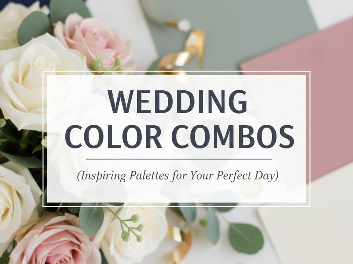
Wedding Color Combos: Elegant Wedding Color Scheme Ideas That Always Work
Choosing the right wedding color combos is one of the most important visual decisions you’ll make during wedding planning. Your color scheme influences everything — invitations, outfits, décor, florals, lighting, photography, and even how guests emotionally experience the event.
This guide focuses on timeless wedding color scheme ideas, not tied to any season. Whether you prefer minimalist elegance or bold, expressive palettes, these wedding color combos are designed to stay visually balanced, photogenic, and cohesive across all wedding elements.
Later, you can explore season-specific wedding color palettes in our dedicated Spring, Summer, Fall, and Winter wedding guides.
How to Choose the Right Wedding Color Combo (Before Looking at Colors)
Before selecting specific colors, clarify these fundamentals:
Venue style (ballroom, garden, beach, banquet hall)
Formality level (luxury, semi-formal, casual)
Cultural preferences
Lighting conditions (daylight vs evening)
Fabric and material textures
Once these are clear, choosing colors becomes significantly easier and more intentional.
How to Apply Wedding Color Combos Correctly
Use a color hierarchy instead of equal distribution:
Primary color → dominant décor & outfits
Secondary color → florals & fabric accents
Neutral base → readability and balance
Accent color → highlights and details
This prevents visual overload and keeps your wedding cohesive.
2-Color Wedding Combos (Simple & Elegant)
Two-color wedding schemes are clean, timeless, and easy to execute. They work especially well for minimalist, luxury, and modern weddings.
White and Gold
Textural elegance and luxury balance.
White:
#FFFFFFGold:
#C9A24D
Why it works:
Universally elegant
Reflects light beautifully
Ideal for formal décor, stationery, and table settings
Navy Blue and Blush Pink
A soft-meets-structured combination.
Navy Blue:
#1F2A44Blush Pink:
#F4C2C2
Why it works:
Masculine and feminine balance
Excellent for outfits and floral accents
Photographs exceptionally well
Black and Ivory
Understated luxury with contrast.
Black:
#0F0F0FIvory:
#F8F4EC
Why it works:
Sophisticated and timeless
Suitable for evening weddings
Strong contrast without harshness
Champagne and Sage Green
Champagne:
#F3E5C7Sage Green:
#A3B18A
Why it works:
Soft luxury without being flashy
Perfect balance of warmth and calm
Works beautifully with florals and linens
Dusty Rose and Charcoal
Dusty Rose:
#C48B9FCharcoal:
#2B2B2B
Why it works:
Romantic yet grounded
Strong contrast for signage and invites
Elegant for evening weddings
Teal and Gold
Teal:
#0F766EGold:
#C9A24D
Why it works:
Rich, vibrant, and upscale
Teal adds depth; gold adds luxury
Excellent for statement décor
Ivory and Soft Brown
Ivory:
#FBF5ECSoft Brown:
#8B5E3C
Why it works:
Warm and natural
Ideal for rustic and traditional weddings
Very fabric-friendly palette
Lavender and Grey
Lavender:
#C3B1E1Grey:
#8E8E8E
Why it works:
Calm and romantic
Neutral enough to avoid overpowering
Works well in photography
Navy Blue and Silver
Navy Blue:
#1F2A44Silver:
#CFCFCF
Why it works:
Clean and formal
Excellent contrast for décor
Timeless and classy
Peach and Mint Green
Peach:
#F4B6A1Mint Green:
#98D8C8
Why it works:
Fresh and joyful
Light, airy visual feel
Great for casual or daytime weddings
3-Color Wedding Combos (Balanced & Versatile)
Three-color schemes add depth while remaining cohesive.
Emerald Green, Gold, and White
Emerald Green:
#0B6B4FGold:
#C9A24DWhite:
#FFFFFF
Why it works:
Regal and elegant
Ideal for décor and floral arrangements
Allows layering without clutter
Dusty Blue, Grey, and Soft Peach
Dusty Blue:
#7A9EB1Grey:
#8E8E8ESoft Peach:
#F4B6A1
Why it works:
Calm and romantic
Great for table styling and signage
Neutral-friendly palette
Burgundy, Cream, and Sage
Burgundy:
#6B1E23Cream:
#FBF5ECSage Green:
#A3B18A
Why it works:
Rich yet grounded
Suitable for both traditional and modern weddings
Excellent floral harmony
Blush Pink, Grey, and Gold
Blush Pink:
#F4C2C2Grey:
#8E8E8EGold:
#C9A24D
Why it works:
Romantic with luxury accents
Grey stabilizes the palette
Gold adds polish
Navy Blue, Cream, and Dusty Blue
Navy Blue:
#1F2A44Cream:
#FBF5ECDusty Blue:
#7A9EB1
Why it works:
Sophisticated and cohesive
Excellent depth control
Ideal for formal venues
Forest Green, White, and Gold
Forest Green:
#1E5631White:
#FFFFFFGold:
#C9A24D
Why it works:
Luxurious yet organic
Works well with greenery décor
Strong contrast balance
Mauve, Plum, and Ivory
Mauve:
#C38EB4Plum:
#5A2A4DIvory:
#FBF5EC
Why it works:
Deep romantic tones
Ivory prevents heaviness
Ideal for elegant themes
Terracotta, Cream, and Olive
Terracotta:
#C26D3ACream:
#FBF5ECOlive Green:
#6B8E23
Why it works:
Earthy and grounded
Natural harmony
Perfect for outdoor décor
Sky Blue, White, and Silver
Sky Blue:
#A7C7E7White:
#FFFFFFSilver:
#CFCFCF
Why it works:
Light and airy
Excellent for daytime weddings
Clean visual hierarchy
Burgundy, Blush, and Gold
Burgundy:
#6B1E23Blush:
#F4C2C2Gold:
#C9A24D
Why it works:
Bold but romantic
Gold unifies contrasting tones
Works well in large venues
4-Color Wedding Combos (Layered & Expressive)
Four-color palettes work best when each color has a defined role.
Champagne, Navy, Blush, and Gold
Champagne:
#F3E5C7Navy:
#1F2A44Blush:
#F4C2C2Gold:
#C9A24D
Why it works:
Luxurious without being overwhelming
Clear hierarchy of tones
Excellent for large venues
Lavender, Grey, White, and Silver
Lavender:
#C3B1E1Grey:
#9A9A9AWhite:
#FFFFFFSilver:
#CFCFCF
Why it works:
Soft and romantic
Great for lighting and fabric textures
Maintains visual calm
Sage, Cream, Blush, and Gold
Sage Green:
#A3B18ACream:
#FBF5ECBlush Pink:
#F4C2C2Gold:
#C9A24D
Why it works:
Soft luxury with warmth
Balanced visual flow
Excellent floral coordination
Navy, Dusty Blue, White, and Silver
Navy:
#1F2A44Dusty Blue:
#7A9EB1White:
#FFFFFFSilver:
#CFCFCF
Why it works:
Layered blues create depth
White keeps it breathable
Silver adds polish
Emerald, Black, White, and Gold
Emerald:
#0B6B4FBlack:
#0F0F0FWhite:
#FFFFFFGold:
#C9A24D
Why it works:
High-end luxury palette
Strong contrast control
Perfect for formal weddings
Lavender, Mauve, Grey, and White
Lavender:
#C3B1E1Mauve:
#C38EB4Grey:
#8E8E8EWhite:
#FFFFFF
Why it works:
Soft tonal transitions
Calm and cohesive
Ideal for romantic styling
Terracotta, Sage, Cream, and Brown
Terracotta:
#C26D3ASage Green:
#A3B18ACream:
#FBF5ECBrown:
#8B5E3C
Why it works:
Warm, earthy consistency
Natural texture compatibility
Great for rustic décor
Teal, Navy, White, and Gold
Teal:
#0F766ENavy:
#1F2A44White:
#FFFFFFGold:
#C9A24D
Why it works:
Rich contrast without chaos
Strong visual hierarchy
Elegant and modern
Peach, Dusty Blue, Grey, and White
Peach:
#F4B6A1Dusty Blue:
#7A9EB1Grey:
#8E8E8EWhite:
#FFFFFF
Why it works:
Soft and inviting
Grey anchors light colors
Ideal for décor layering
Burgundy, Navy, Cream, and Gold
Burgundy:
#6B1E23Navy:
#1F2A44Cream:
#FBF5ECGold:
#C9A24D
Why it works:
Deep, dramatic elegance
Cream prevents heaviness
Gold ties tones together
5-Color Wedding Combos (Bold but Controlled)
Five-color schemes require structure. Use them only when each color has a specific application.
Terracotta, Olive, Cream, Gold, and Soft Brown
Terracotta:
#C26D3AOlive Green:
#6B8E23Cream:
#FBF5ECGold:
#C9A24DSoft Brown:
#8B5E3C
Why it works:
Earthy and warm
Ideal for rustic or cultural weddings
Colors complement natural materials
Plum, Mauve, Grey, White, and Gold
Plum:
#5A2A4DMauve:
#C38EB4Grey:
#8E8E8EWhite:
#FFFFFFGold:
#C9A24D
Why it works:
Romantic depth
Excellent for layered décor
Strong contrast control
Sage, Blush, Cream, Grey, and Gold
Sage Green:
#A3B18ABlush Pink:
#F4C2C2Cream:
#FBF5ECGrey:
#8E8E8EGold:
#C9A24D
Why it works:
Soft, layered elegance
Neutral control prevents clutter
Excellent for full-venue styling
Navy, Dusty Blue, White, Silver, and Grey
Navy:
#1F2A44Dusty Blue:
#7A9EB1White:
#FFFFFFSilver:
#CFCFCFGrey:
#8E8E8E
Why it works:
Structured tonal harmony
Great for modern weddings
Very scalable palette
Terracotta, Olive, Cream, Gold, and Ivory
Terracotta:
#C26D3AOlive:
#6B8E23Cream:
#FBF5ECGold:
#C9A24DIvory:
#F8F4EC
Why it works:
Warm and cohesive
Excellent material compatibility
Earthy yet elegant
Plum, Mauve, Blush, White, and Gold
Plum:
#5A2A4DMauve:
#C38EB4Blush:
#F4C2C2White:
#FFFFFFGold:
#C9A24D
Why it works:
Romantic depth
White balances dark tones
Gold adds refinement
Emerald, Sage, Cream, Brown, and Gold
Emerald:
#0B6B4FSage:
#A3B18ACream:
#FBF5ECBrown:
#8B5E3CGold:
#C9A24D
Why it works:
Natural luxury palette
Excellent floral synergy
Rich but grounded
Black, Ivory, Champagne, Grey, and Gold
Black:
#0F0F0FIvory:
#F8F4ECChampagne:
#F3E5C7Grey:
#8E8E8EGold:
#C9A24D
Why it works:
Ultra-luxury feel
Perfect contrast control
Ideal for formal weddings
Peach, Mint, White, Grey, and Gold
Peach:
#F4B6A1Mint:
#98D8C8White:
#FFFFFFGrey:
#8E8E8EGold:
#C9A24D
Why it works:
Fresh and cheerful
Grey stabilizes light tones
Gold elevates the palette
Burgundy, Dusty Rose, Cream, Brown, and Gold
Burgundy:
#6B1E23Dusty Rose:
#C48B9FCream:
#FBF5ECBrown:
#8B5E3CGold:
#C9A24D
Why it works:
Romantic and warm
Strong depth variation
Works well across décor elements
Avoid These Common Wedding Color Mistakes
Using too many bold colors without neutrals
Ignoring venue lighting
Matching colors too closely (low contrast)
Choosing trendy colors without longevity
If accessibility matters for signage and invitations, use a proper color contrast checker to ensure readability.
Explore Wedding Color Palettes by Season
This guide focuses on non-seasonal wedding color combos.
For season-specific inspiration, explore:
Each seasonal guide dives deeper into mood, lighting, florals, and fabrics unique to that time of year.
FAQs – Wedding Color Combinations
1. How do I choose the right wedding color combination?
Start with one primary color you love, add a neutral for balance, and then include one or two accent colors. Always test how the colors look together across décor, flowers, and printed materials.
2. How many colors should a wedding color palette have?
Most weddings work best with 3 to 5 colors. Two-color palettes are minimal, while four- or five-color palettes offer more flexibility for décor and styling.
3. Can I mix warm and cool colors in wedding palettes?
Yes. Mixing warm and cool tones works well when one side dominates and the other is used as an accent. For example, navy blue with gold or blush pink with grey.
4. Should wedding colors be the same across all elements?
Ideally, yes. Using consistent colors across invitations, décor, attire, and signage creates a cohesive and professional look throughout the wedding.
5. Do wedding color combinations change by season?
Seasonal palettes are popular, but they are not mandatory. Many couples choose timeless color combinations that work year-round and adjust textures or accents instead.
6. Can these wedding color combos be reused for different themes?
Absolutely. The same color palette can be styled differently for rustic, modern, classic, or luxury weddings by changing materials, lighting, and finishes.
7. Are HEX codes useful for wedding planning?
Yes. HEX codes help designers, printers, and digital vendors maintain exact color consistency across websites, invitations, and design previews.
Final Thoughts
Wedding color combos are not just about beauty — they shape mood, flow, and memory. When chosen thoughtfully, a color scheme elevates every part of your wedding experience.
Start with structure, select colors intentionally, and let each shade serve a purpose.