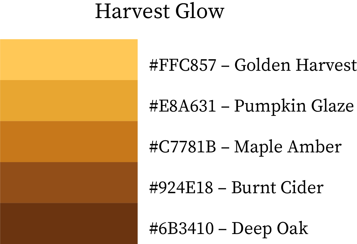
Autumn / Fall Colour Palettes, Swatches & Combinations with HEX Codes & Names
As the warmth of summer fades and the air turns crisp, fall emerges with its signature palette — rich ambers, golden browns, deep greens, and muted oranges that capture the beauty of falling leaves and harvest sunsets.
This season is a perfect blend of warmth and earthiness, making it one of the most versatile color stories for branding, design, fashion, and home décor. Whether you’re evoking the cozy comfort of spiced lattes or the misty calm of an early autumn morning, these curated fall colour palettes are here to inspire.
Why Fall Color Palettes Feel Warm and Grounded
Fall palettes embrace earth tones and cozy moods, ideal for grounded design:
Warm & Comforting – Rich oranges, browns, and reds create warmth and a sense of familiarity.
Natural & Earthy – Tones evoke leaves, wood, and harvest, perfect for eco-conscious or handmade brands.
Nostalgic & Inviting – Fall colors trigger seasonal nostalgia and emotional connection.
Rich & Layered – Deep shades add depth and texture, ideal for layered designs and branding.
Fall palettes make designs feel cozy, trustworthy, and emotionally resonant.
1. Warm Color Swatches of Fall / Autumn
These warm hues reflect the golden glow of harvests, bonfires, and the last rays of autumn sun. Perfect for cozy product designs, fall marketing visuals, and rustic packaging.
| Color Name | Hex Code | Description |
|---|---|---|
| Crisp Maple | #9B2C13 | A deep maple red that mirrors autumn leaves at peak color. |
| Pumpkin Spice | #C1440E | The classic hue of pumpkin and cinnamon warmth. |
| Autumn Blaze | #D95C0C | A fiery orange that brightens any autumn-inspired palette. |
| Harvest Glow | #FF6F32 | Captures the glow of a late fall sunset. |
| Golden Oak | #DC7634 | Warm golden tone reminiscent of oak wood in afternoon light. |
| Caramel Ember | #D16B1F | Toasty caramel shade with a hint of spice. |
| Burnt Acorn | #B85C0F | A bold brown-orange, perfect for grounded accents. |
| Chestnut Heat | #9F4A0F | Classic chestnut brown infused with deep warmth. |
| Spiced Cranberry | #A02E1A | A cranberry tone that feels rich and festive. |
| Maple Syrup Red | #BF3326 | Earthy red with the depth of syrupy sweetness. |
| Bornfire Flame | #E03F2E | Bright orange-red reflecting the flicker of a campfire. |
| Crisp Sunset | #FA6243 | Warm coral-orange for highlighting vibrancy. |
| Toasted Peach | #FBA76A | Gentle peach that softens bold palettes. |
| Golden Nutmeg | #DC8A5D | Balanced warm tan inspired by seasonal spice. |
| Baked Almond | #C6764A | A nutty, roasted hue that pairs beautifully with neutrals. |
| Brown Sugar | #A35F3E | Deep caramel brown ideal for cozy aesthetics. |
Best For: Autumn marketing visuals, cozy brand identities, product packaging, and seasonal decor.


2. Cool Color Swatches of Fall / Autumn
These cool hues bring contrast to fall’s warmth — think foggy mornings, pine woods, and the subtle chill before winter. Great for minimalist layouts, fashion accessories, and nature-themed projects.
| Color Name | Hex Code | Description |
|---|---|---|
| Misty Dawn | #3C4658 | Soft blue-gray that evokes misty autumn mornings. |
| Crisp Air | #293C4F | A cool navy reflecting clear fall skies. |
| Distant Shadows | #1F3147 | Deep blue undertone with a twilight calmness. |
| Autumn Nightfall | #14273D | Midnight navy that adds drama and depth. |
| Frosted Pine | #5A7060 | Muted green with a touch of gray frost. |
| Cool Fern | #3F5B4F | Earthy teal-green that balances warm tones. |
| Olive Creek | #2D4A3D | Subtle olive hue rooted in woodland calm. |
| Deep Moss | #1E3C30 | Rich forest tone for natural designs. |
| Misty Breeze | #6D7D90 | Light slate-blue perfect for background hues. |
| Rainy Fog | #4A647D | Balanced steel-blue with muted coolness. |
| Dusky Tide | #31536A | Cool teal blue inspired by fall rivers. |
| Lake Reflection | #1F4357 | Deep water blue ideal for serene compositions. |
Best For: Nature brands, outdoor product designs, and editorial layouts seeking calm sophistication.


3. True Color Swatches of Fall / Autumn
These are the core autumn hues — perfectly balanced between warm and cool, reflecting everything from earthy leaves to harvest fruits. Ideal for cohesive palettes and timeless visuals.
| Color Name | Hex Code | Description |
|---|---|---|
| Caramel Bark | #A0642A | A golden brown that defines the essence of fall. |
| Autumn Copper | #C17827 | Shining copper hue inspired by falling leaves. |
| Pumpkin Glint | #E99B3A | A cheerful pumpkin tone with golden vibrance. |
| Warm Cider | #F0B35F | Creamy amber tone reminiscent of hot apple cider. |
| Bronzed Oak | #6C512B | Deep bronze brown grounding the palette. |
| Wheat Husk | #8D7344 | Soft golden-brown resembling dried wheat fields. |
| Dusty Grain | #A28F6C | Neutral beige that ties together warm combinations. |
| Toffee Beige | #D1B68A | Light golden hue adding warmth to minimal designs. |
| Forest Moss | #3B4A2E | Earthy green echoing moss-covered trees. |
| Olive Leaf | #576943 | Natural green balancing warmth with calm. |
| Herbal Earth | #768E5C | Leafy tone that complements rustic colors. |
| Sagebrush | #A1A568 | Pale greenish tint adding freshness. |
| Crackling Ember | #AF6752 | Muted red-brown reflecting burnt leaves. |
| Clay Rose | #D98773 | Gentle blush tone for soft contrasts. |
| Blushed Terracotta | #E6B3A1 | Subtle pinkish clay for modern palettes. |
| Toasted Linen | #F5D3C0 | Warm beige that acts as a perfect neutral. |
Best For: Fall branding systems, website color themes, apparel collections, and stationery design.


4. Cool & Warm Colour Combinations of Fall / Autumn (5-Color Combo Palettes)
Harvest Glow
A radiant mix of oranges and golds that perfectly mirror a glowing autumn sunset.
Golden Harvest (#FFC857) provides a cheerful foundation, while Pumpkin Glaze (#E8A631) and Maple Amber (#C7781B) build warmth and depth. Burnt Cider (#924E18) and Deep Oak (#6B3410) finish with earthy balance.
Best for: Seasonal packaging, cozy fall web banners, and outdoor product branding.
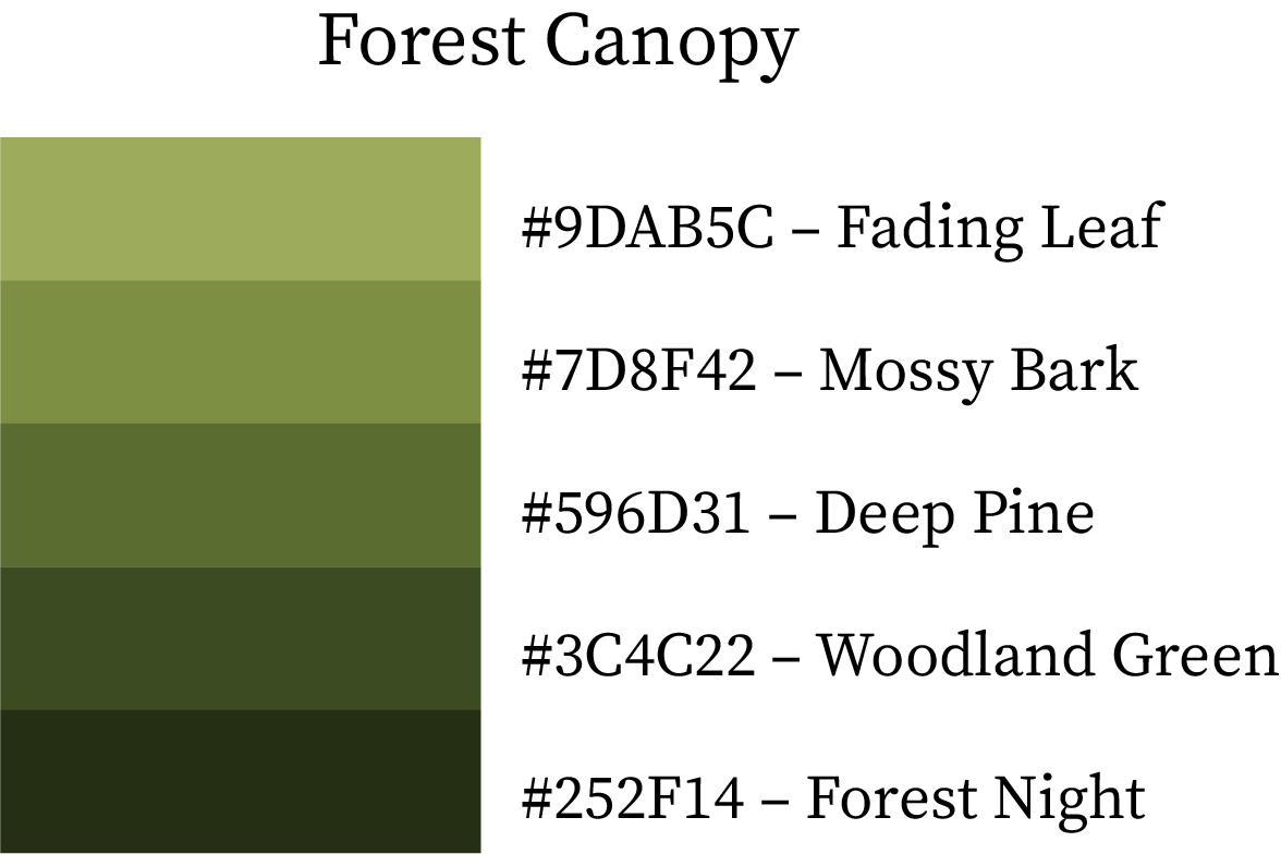
Forest Canopy
Inspired by woodland walks beneath turning leaves, this palette blends muted greens and browns with timeless harmony.
Fading Leaf (#9DAB5C) brings freshness, Mossy Bark (#7D8F42) and Deep Pine (#596D31) anchor the base, while Woodland Green (#3C4C22) and Forest Night (#252F14) evoke deep forest tranquility.
Best for: Nature-themed visuals, adventure branding, and organic packaging.
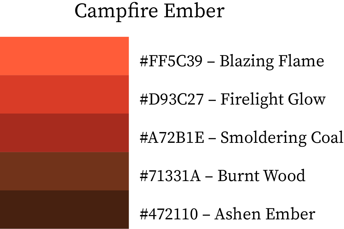
Campfire Ember
A passionate autumn palette of glowing reds and smoldering browns.
Blazing Flame (#FF5C39) ignites warmth, Firelight Glow (#D93C27) adds intensity, and Smoldering Coal (#A72B1E) deepens the effect. Burnt Wood (#71331A) and Ashen Ember (#472110) give it an earthy finish.
Best for: Cozy café branding, festival themes, and creative lifestyle visuals.
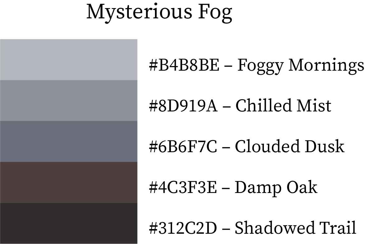
Mysterious Fog
A moody yet sophisticated blend of smoky grays and shadowed neutrals.
Foggy Mornings (#B4B8BE) and Chilled Mist (#8D919A) lay the misty base, while Clouded Dusk (#6B6F7C) adds texture. Damp Oak (#4C3F3E) and Shadowed Trail (#312C2D) ground the palette in cool depth.
Best for: Minimalist branding, fall interiors, and photography presets.
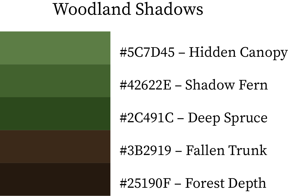
Woodland Shadows
A deep green-brown palette that mirrors the quiet strength of old forests.
Hidden Canopy (#5C7D45) pairs with Shadow Fern (#42622E) for lush greenery, while Deep Spruce (#2C491C), Fallen Trunk (#3B2919), and Forest Depth (#25190F) complete the natural balance.
Best for: Outdoor gear brands, eco-friendly campaigns, and adventure visuals.
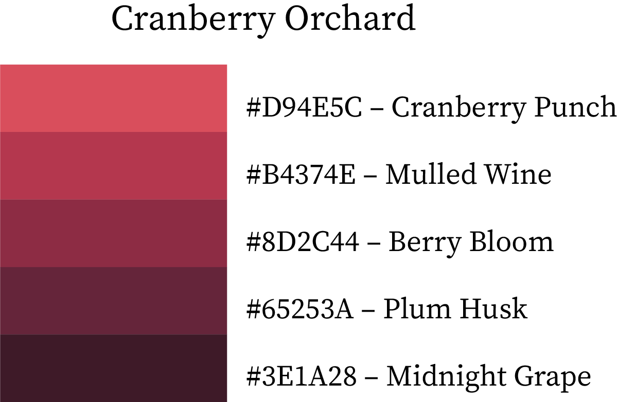
Cranberry Orchard
Rich berry tones evoke mulled wine and cozy autumn evenings.
Cranberry Punch (#D94E5C) brightens the palette, Mulled Wine (#B4374E) and Berry Bloom (#8D2C44) provide depth, while Plum Husk (#65253A) and Midnight Grape (#3E1A28) finish it with luxury.
Best for: Fall fashion, event branding, and elegant digital art.
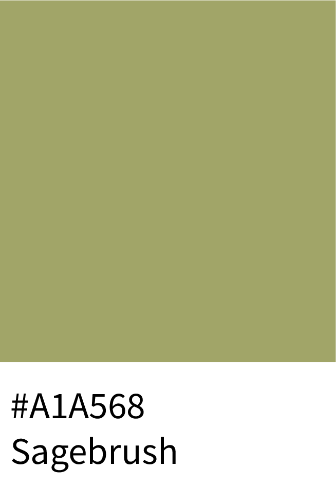
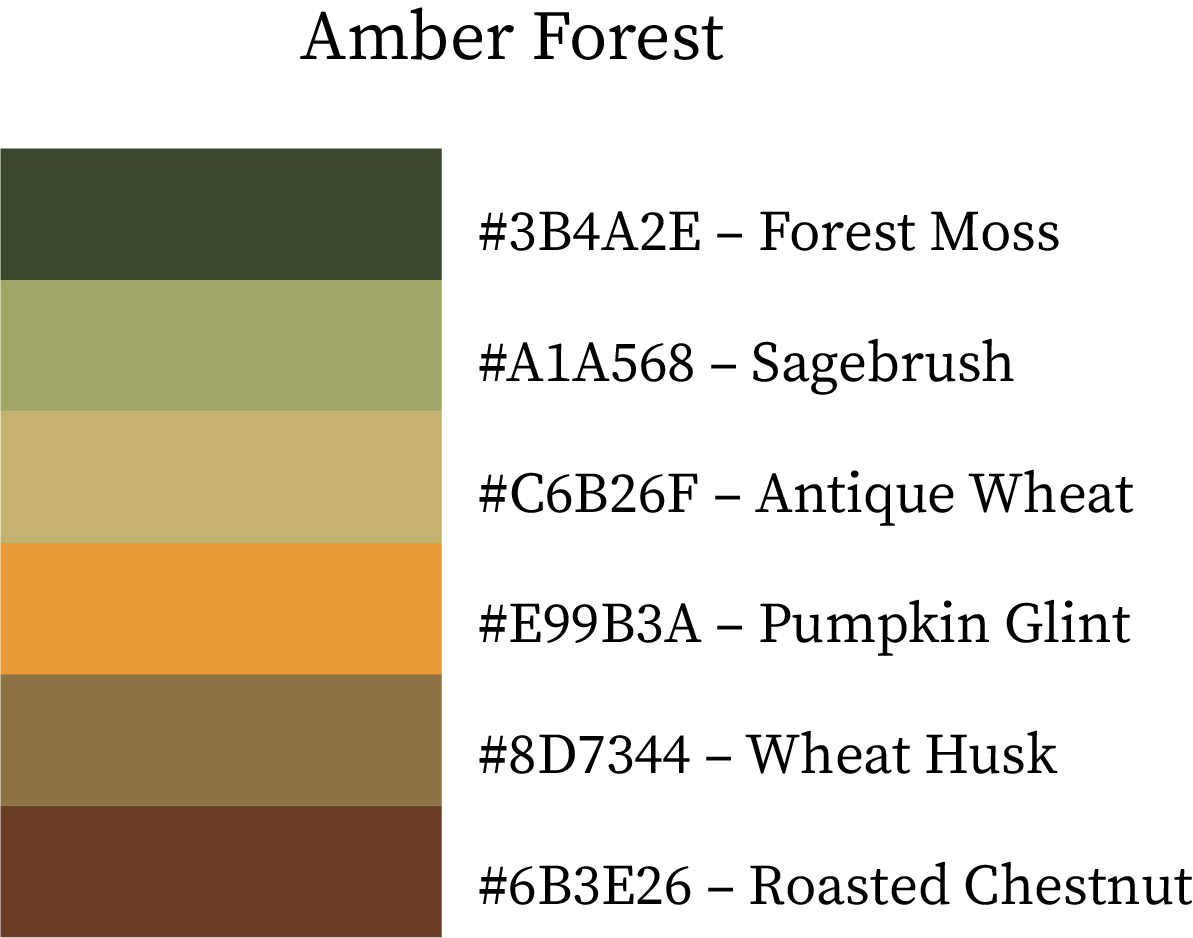
5. True Color Combinations of Fall / Autumn (6-Color Palettes)
Amber Forest
A balanced palette of forest greens and warm golds that feels deeply natural.
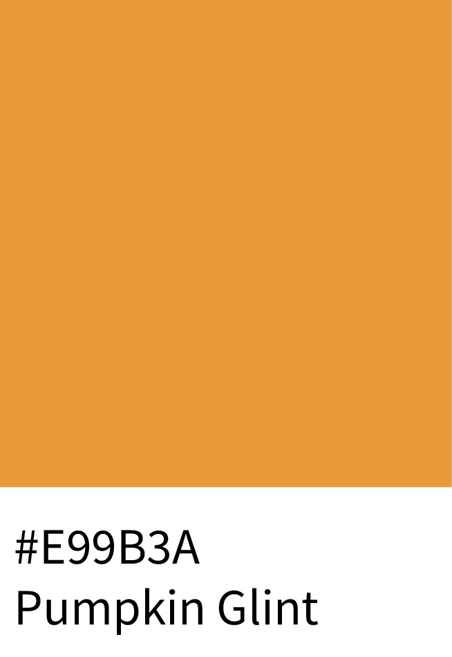
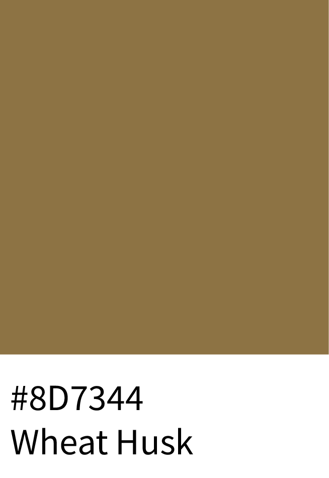
Forest Moss (#3B4A2E) and Sagebrush (#A1A568) form the earthy base, Antique Wheat (#C6B26F) and Pumpkin Glint (#E99B3A) bring golden warmth, while Wheat Husk (#8D7344) and Roasted Chestnut (#6B3E26) add grounding depth.
Best for: Organic lifestyle brands, sustainable packaging, and cozy fall décor.
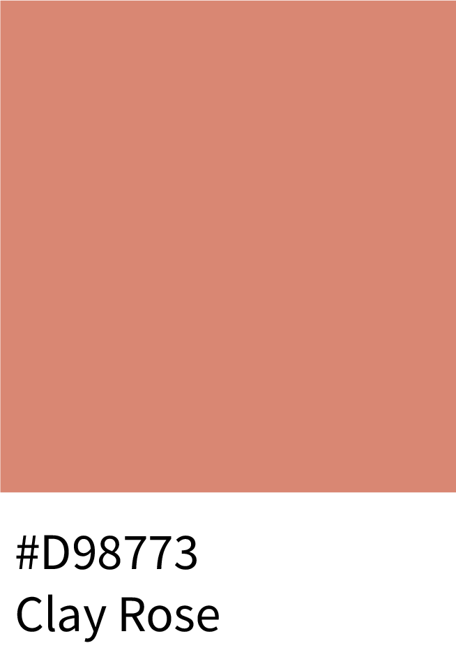
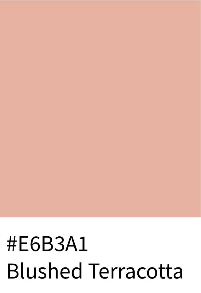
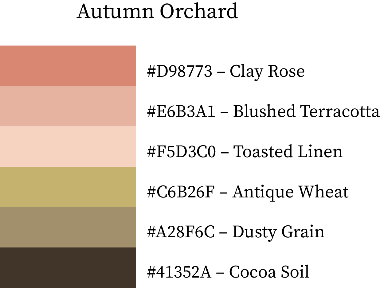
Autumn Orchard
A soft, romantic mix of peaches and beige tones that reflect fall afternoons.
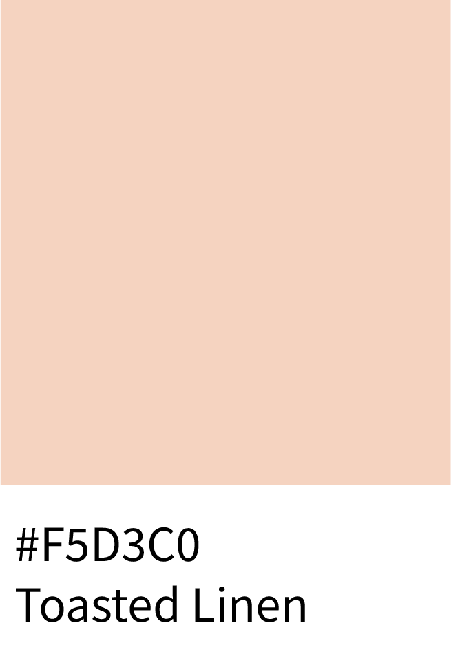
Clay Rose (#D98773) and Blushed Terracotta (#E6B3A1) add warmth, Toasted Linen (#F5D3C0) brings softness, and Antique Wheat (#C6B26F) ties it together with harmony. Cocoa Soil (#41352A) gives it a strong anchor.
Best for: Lifestyle photography, fall-inspired web design, and product branding.
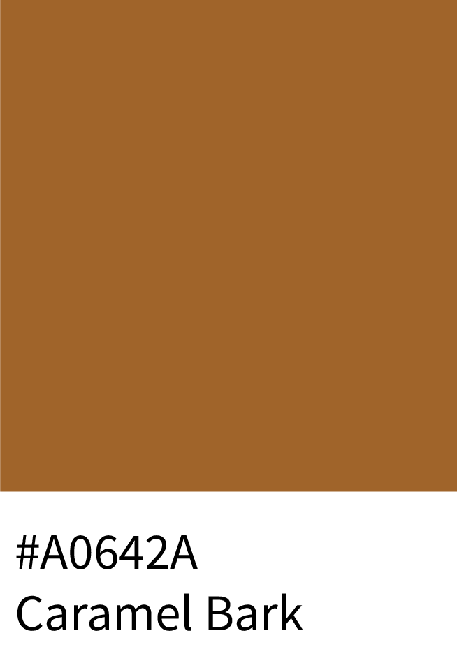
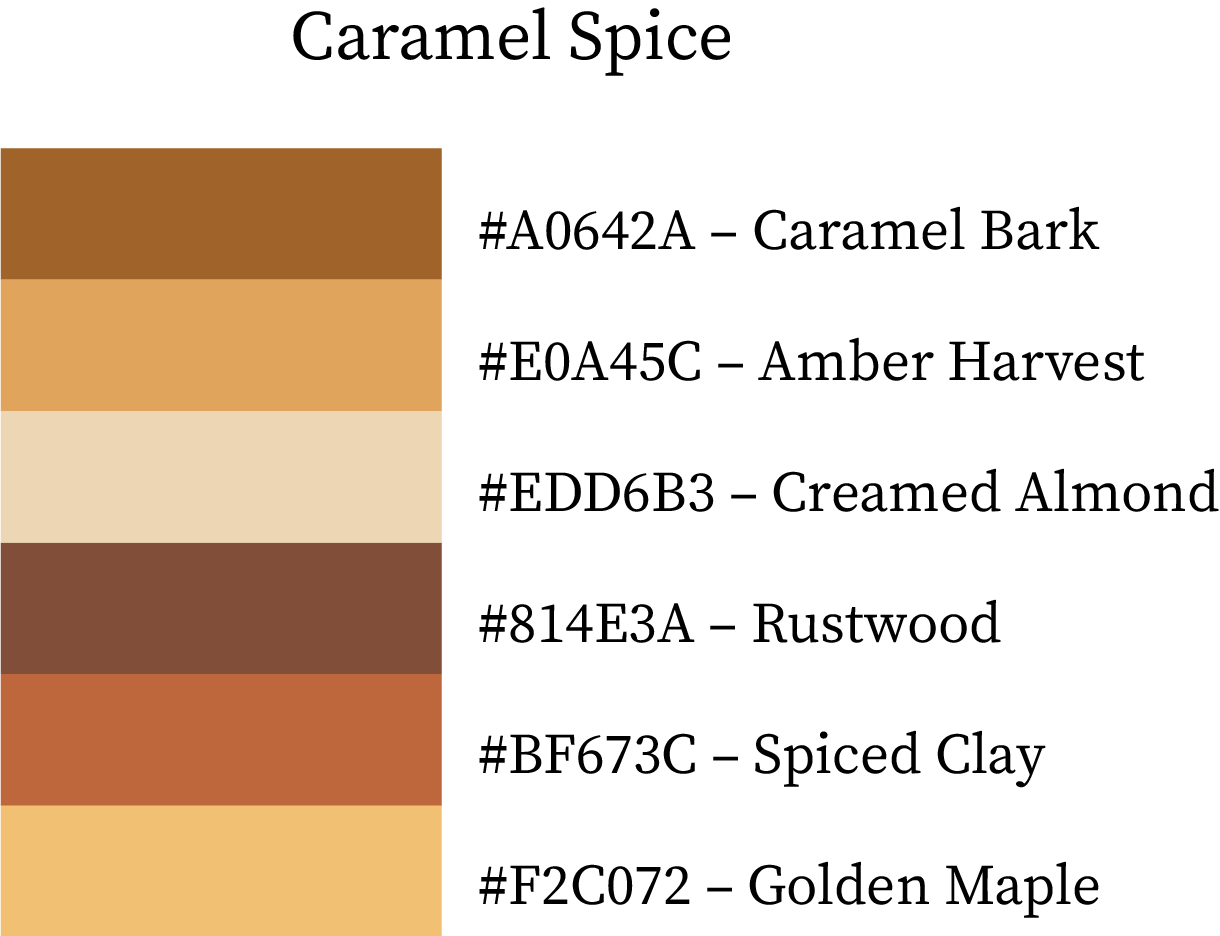
Caramel Spice
Sweet and cozy with rich caramel and soft golden tones.
Caramel Bark (#A0642A) and Amber Harvest (#E0A45C) form a rich base, while Creamed Almond (#EDD6B3) lightens the mood. Rustwood (#814E3A), Spiced Clay (#BF673C), and Golden Maple (#F2C072) complete the palette.
Best for: Bakery packaging, autumn marketing, and comforting product visuals.
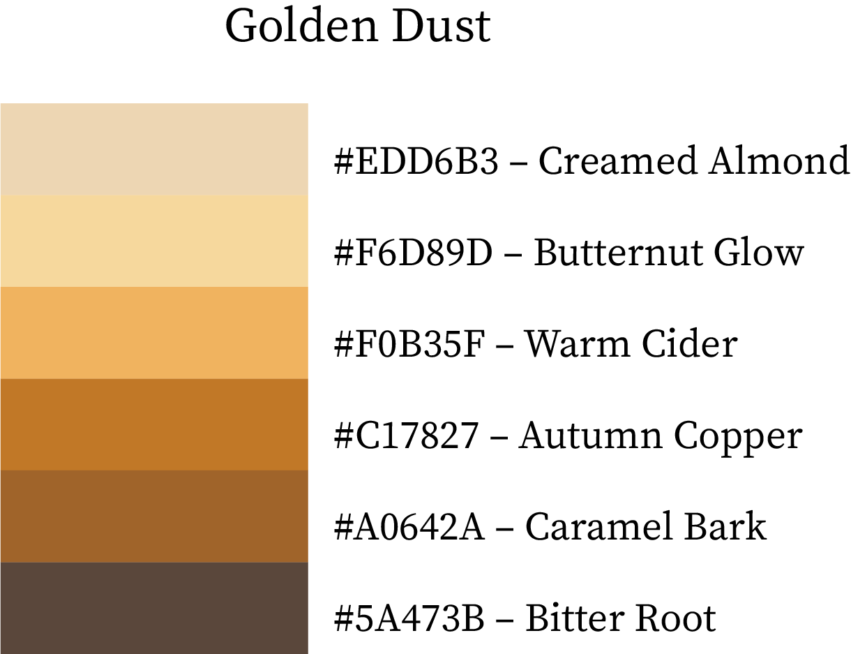
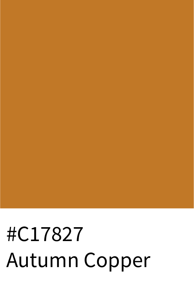
Golden Dust
Soft, creamy, and timelessly elegant.
Creamed Almond (#EDD6B3) and Butternut Glow (#F6D89D) brighten the palette, while Warm Cider (#F0B35F) and Autumn Copper (#C17827) add rich warmth. Caramel Bark (#A0642A) and Bitter Root (#5A473B) balance it perfectly.
Best for: Elegant branding, neutral product design, and minimalist aesthetics.

Pairing Autumn Colors for Cozy, Elegant Designs
Autumn palettes are warm, earthy, and grounded, perfect for creating inviting atmospheres:
Interiors & Decor – Use terracotta, mustard, and olive for cozy, layered rooms.
Branding & Packaging – Earthy tones communicate authenticity, tradition, and sustainability.
Fashion & Lifestyle – Deep oranges, browns, and reds evoke warmth and seasonal style.
Complementary Pairings – Mix muted shades with highlights to create depth and visual interest.
Textures & Materials – Wood, leather, and natural fabrics work perfectly with autumn colors.
Frequently Asked Questions (FAQs)
1. What are the best colors for an autumn color palette?
The best autumn colors blend warmth, richness, and earthy depth. Think shades like Burnt Orange (#CC5500), Goldenrod (#DAA520), Olive Green (#708238), Deep Burgundy (#800020), and Rust Brown (#B7410E). These tones mirror the fall landscape — turning leaves, golden fields, and cozy sunlight — perfect for branding, fashion, or seasonal design.
2. What color combinations represent fall?
Classic fall color combinations include Pumpkin Orange (#FF7518) and Forest Green (#228B22) for balance, or Burgundy (#800020) paired with Mustard Yellow (#FFDB58) for warmth and energy. If you want a more muted scheme, try Taupe (#D8BFD8) and Olive (#808000) for a sophisticated, neutral fall vibe.
3. Which fall colors look good together in design?
Fall colors work best when pairing one dominant warm hue (like Amber (#FFBF00) or Copper (#B87333)) with 2–3 supporting neutrals such as Cream (#FFFDD0), Stone Gray (#8D918D), or Charcoal (#36454F). This balance keeps your palette seasonal yet elegant — ideal for interior designs, website themes, or fashion lookbooks.
4. What are muted fall colors?
Muted fall colors are softer versions of traditional autumn hues — think Dusty Rose (#C48793), Muted Ochre (#D2B48C), Soft Olive (#9AA777), and Faded Terracotta (#D99058). These subdued shades create a calm, cozy aesthetic perfect for minimalist fall branding or lifestyle visuals.
5. What are trendy fall color palettes for 2025?
For 2025, trending fall palettes mix earthy browns, burnt oranges, and creamy neutrals with a hint of plum or midnight blue. Try Autumn Clay (#B66E41), Maple Red (#C23B22), Soft Cream (#F5E6CC), and Ink Blue (#283655) for a modern, cozy aesthetic that feels timeless and seasonal.
Conclusion: Embrace the Fall / Autumn Palette Magic
Fall is a season of transformation — a time when nature paints in layers of gold, orange, and amber. These autumn and fall colour palettes and swatches embody that transition, blending warmth with grounded earth tones and hints of cool serenity.
From branding and marketing visuals to home décor and fashion palettes, these combinations can infuse your projects with comfort, nostalgia, and timeless balance.
Let the colors of autumn guide your creativity — warm like spiced lattes, cool like misty mornings, and true to the heart of nature.
Tip: Always test contrast (especially with text), and pair warm, earthy tones with soft neutrals for that perfect autumn harmony.

